Seattle Sounders FC 2020 Season
Project InfoAhead of the 2020 mls season, the Seattle Sounders came to us to refresh the brand system we had developed for the previous year’s campaign. With this new iteration, the goal was to simplify the set of graphic tools utilized throughout the visuals in an attempt to achieve better consistency throughout the design of assets. In a further effort to elevate the quality of output, we worked closely with the internal design team providing creative direction, design critiques and ultimately inspiring an overall shift in the organization’s creative process.
The design system we developed for the 2020 season was intended to elevate the overall look and feel, while at the same time providing an underlying set of guidelines to streamline the internal team’s workflow—yet allow for creative flexibility when necessary. With time often being limited in the news-centric nature of the sports world, this flexible brand system enables success in a variety of complexities from simple to elaborate.
Design System
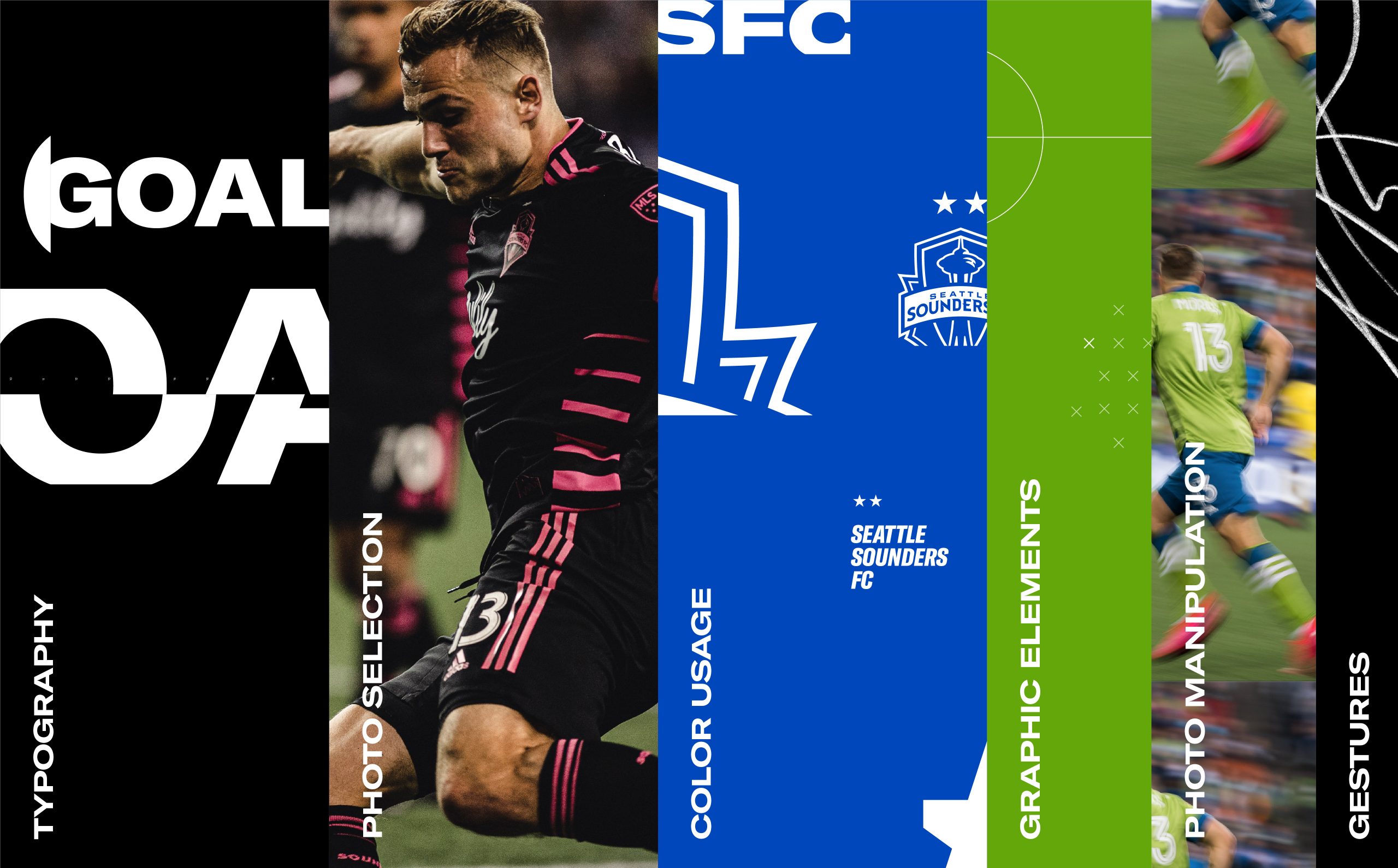
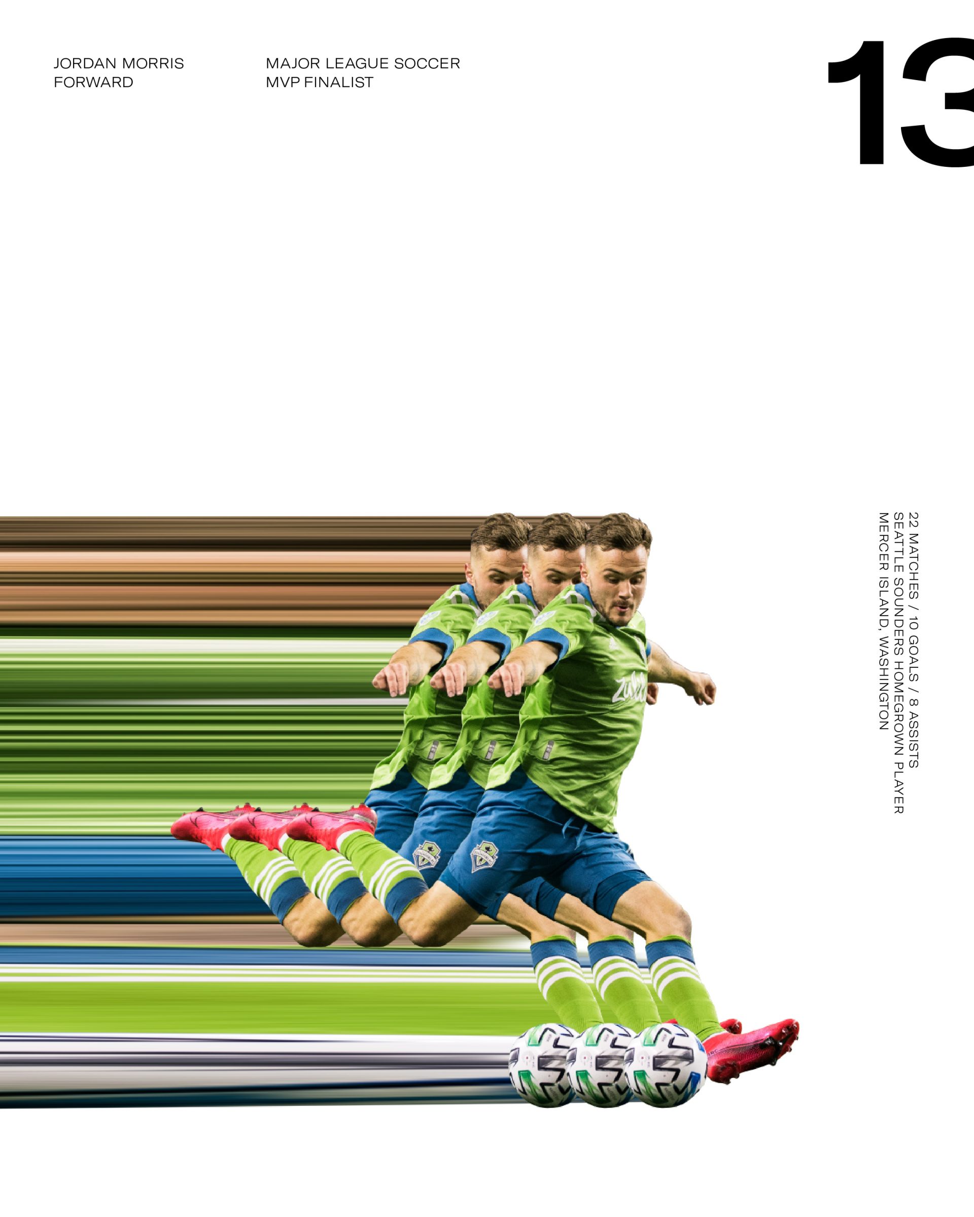
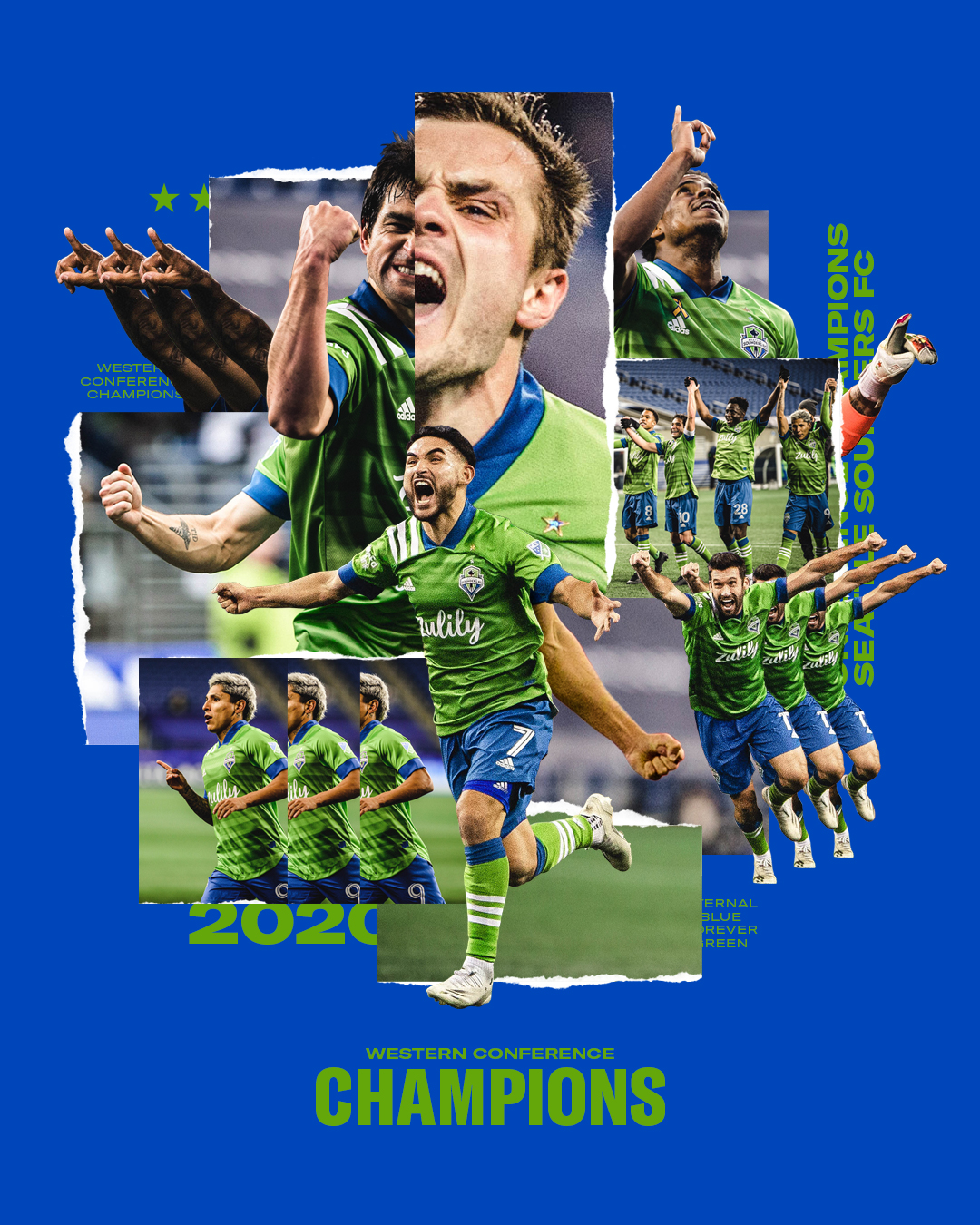
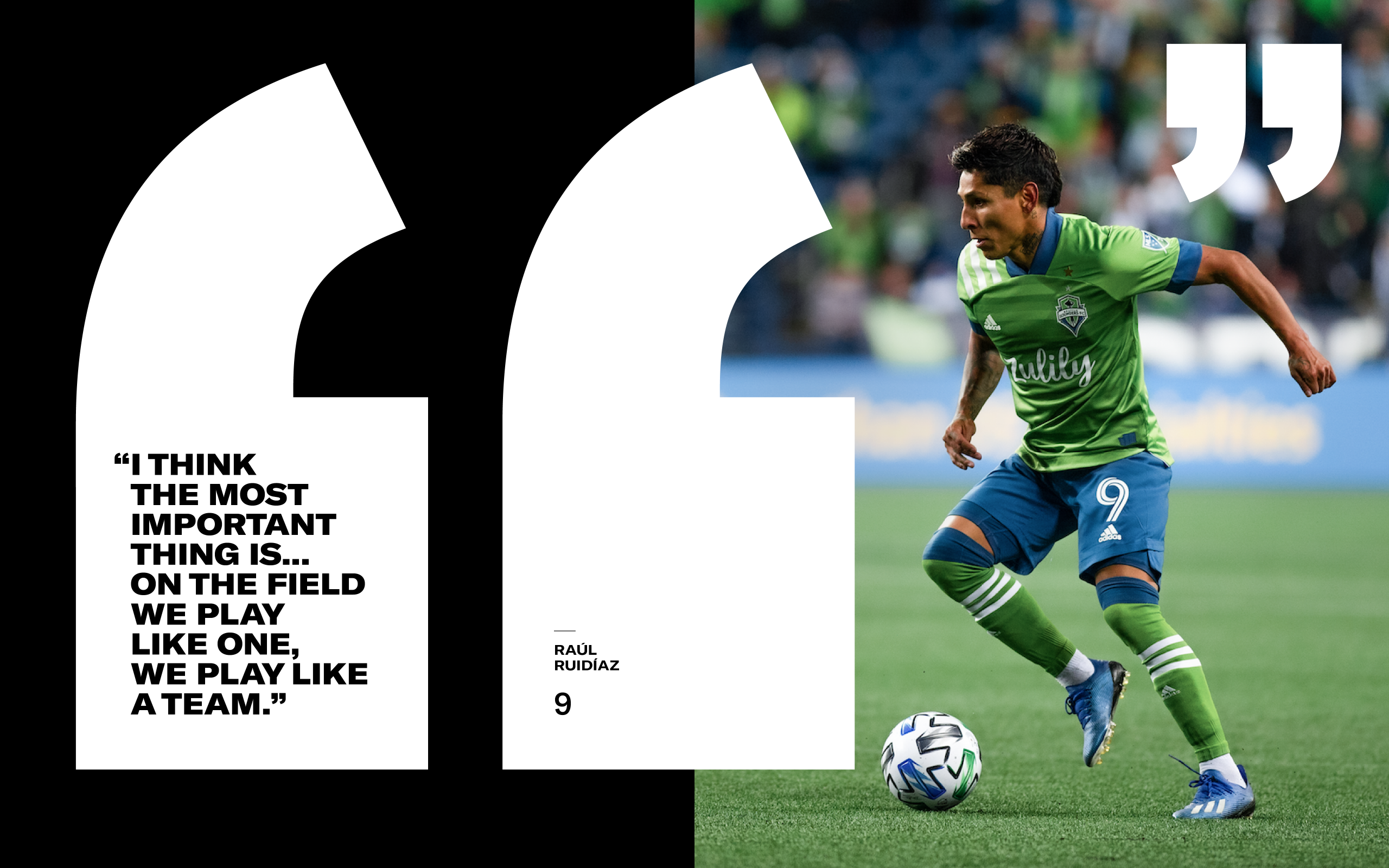
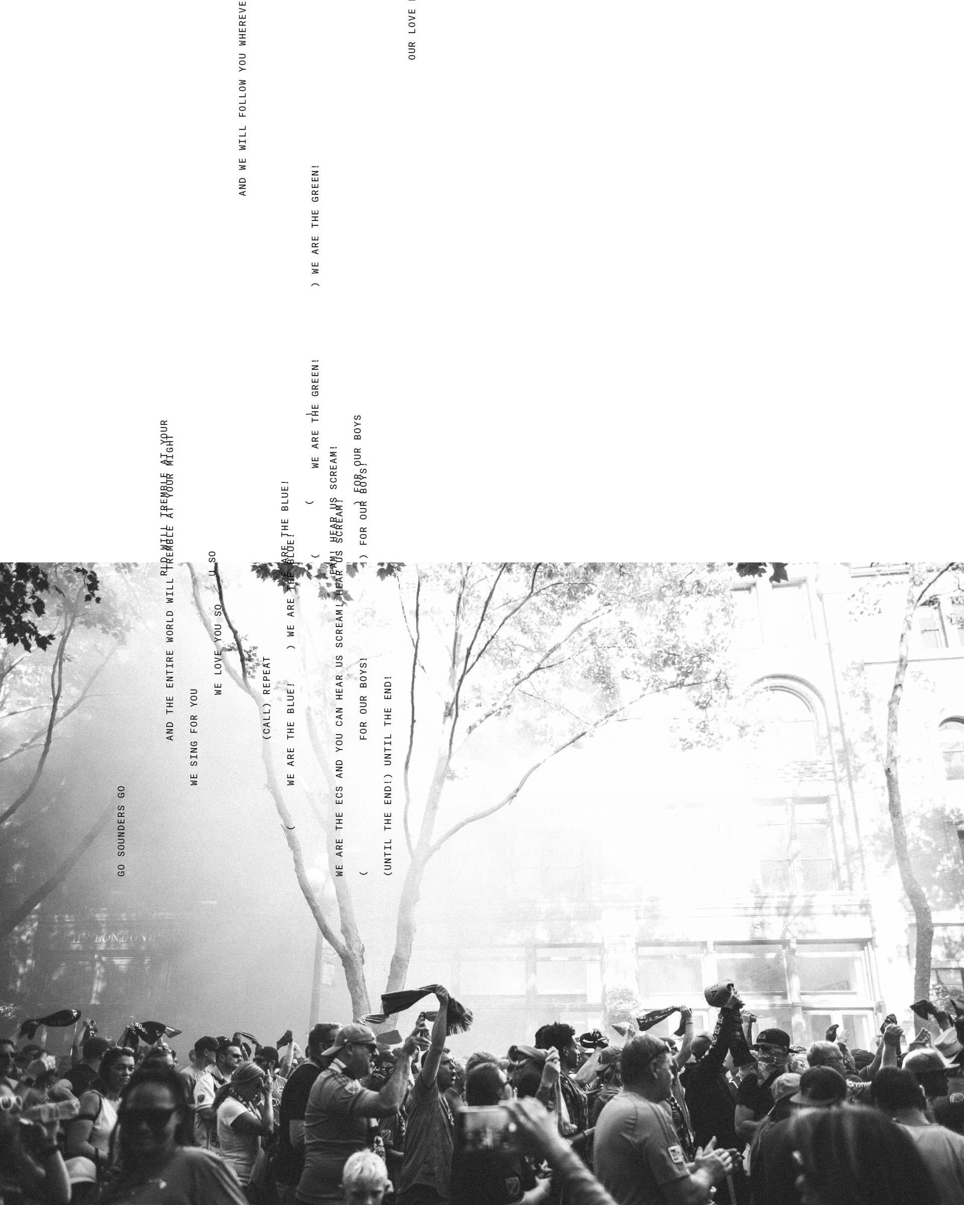
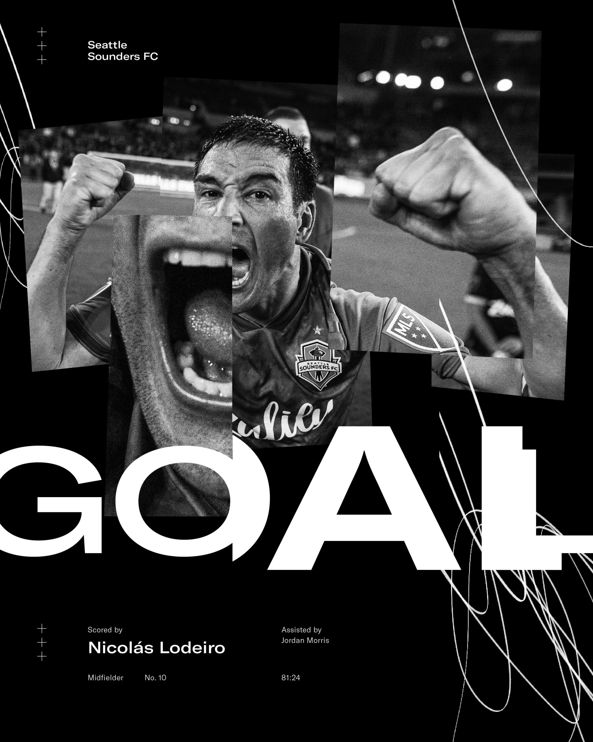
The design system is comprised of multiple assets with typography—ranging from disciplined to expressive—being the foundation. This provides a solid platform to then incorporate color and engaging imagery or—when appropriate—graphic elements, photo manipulation techniques and/or gestures to further activate a composition.
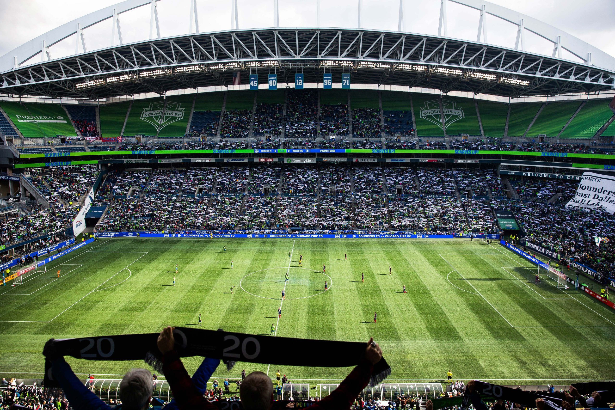
Matchday Experience
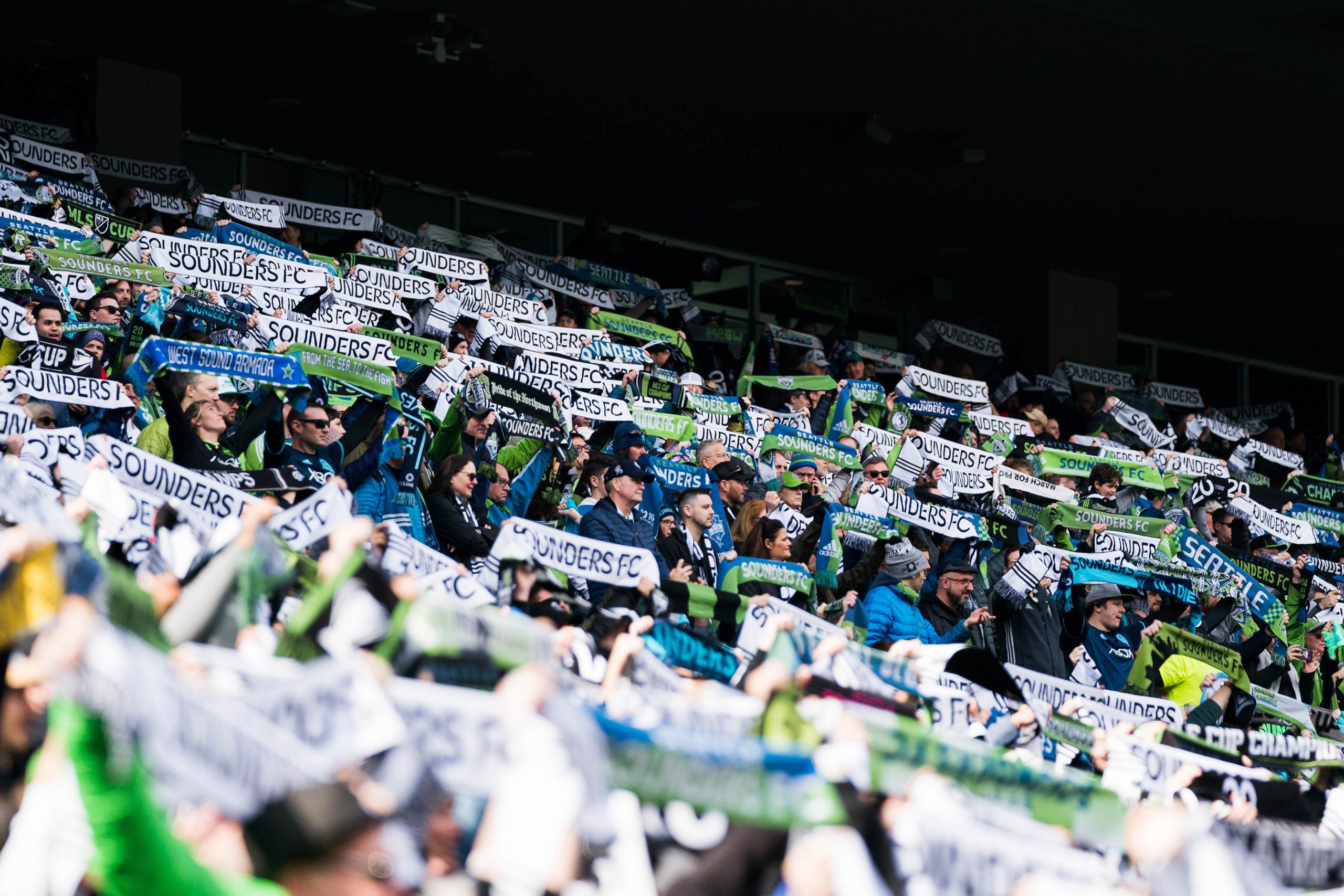
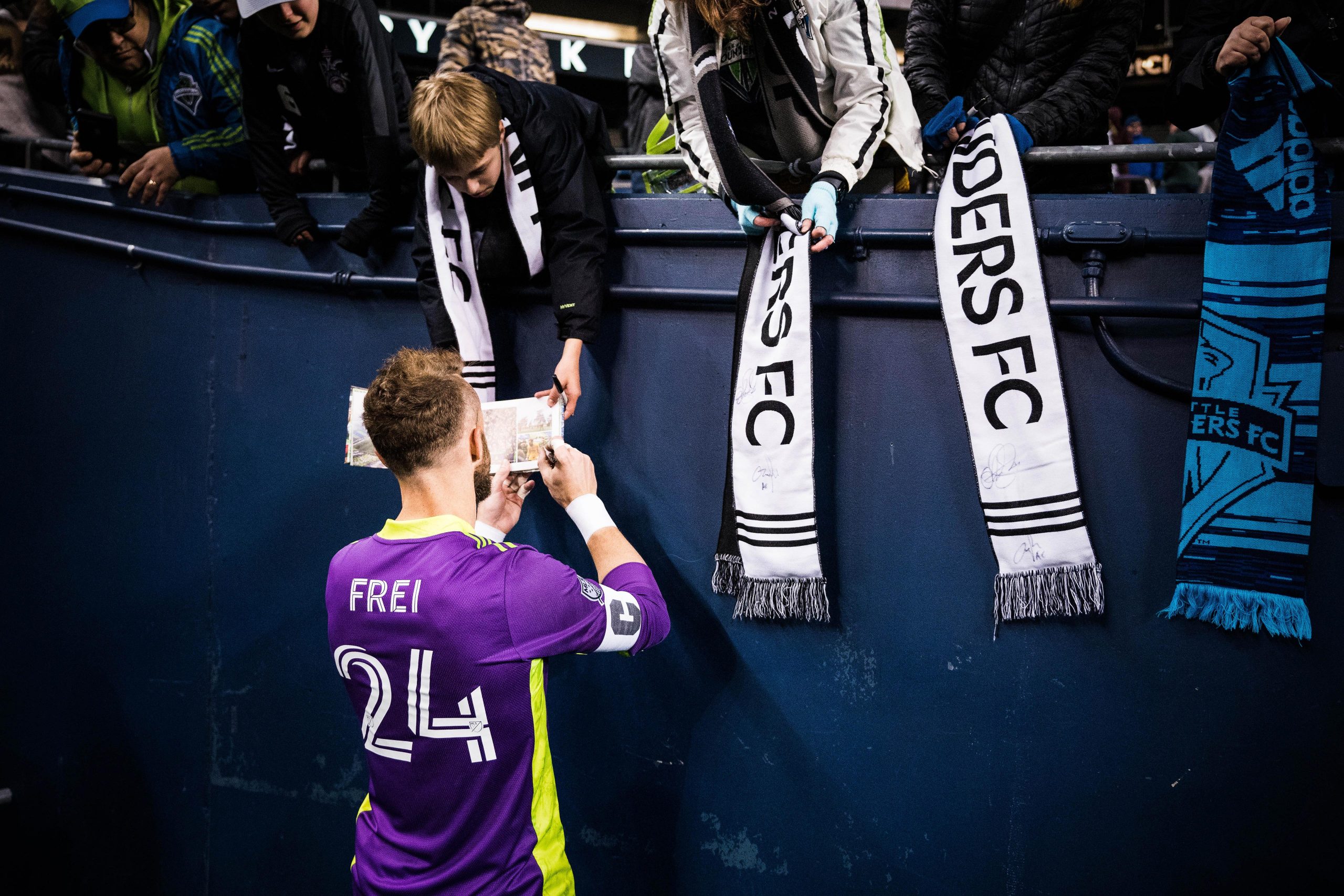
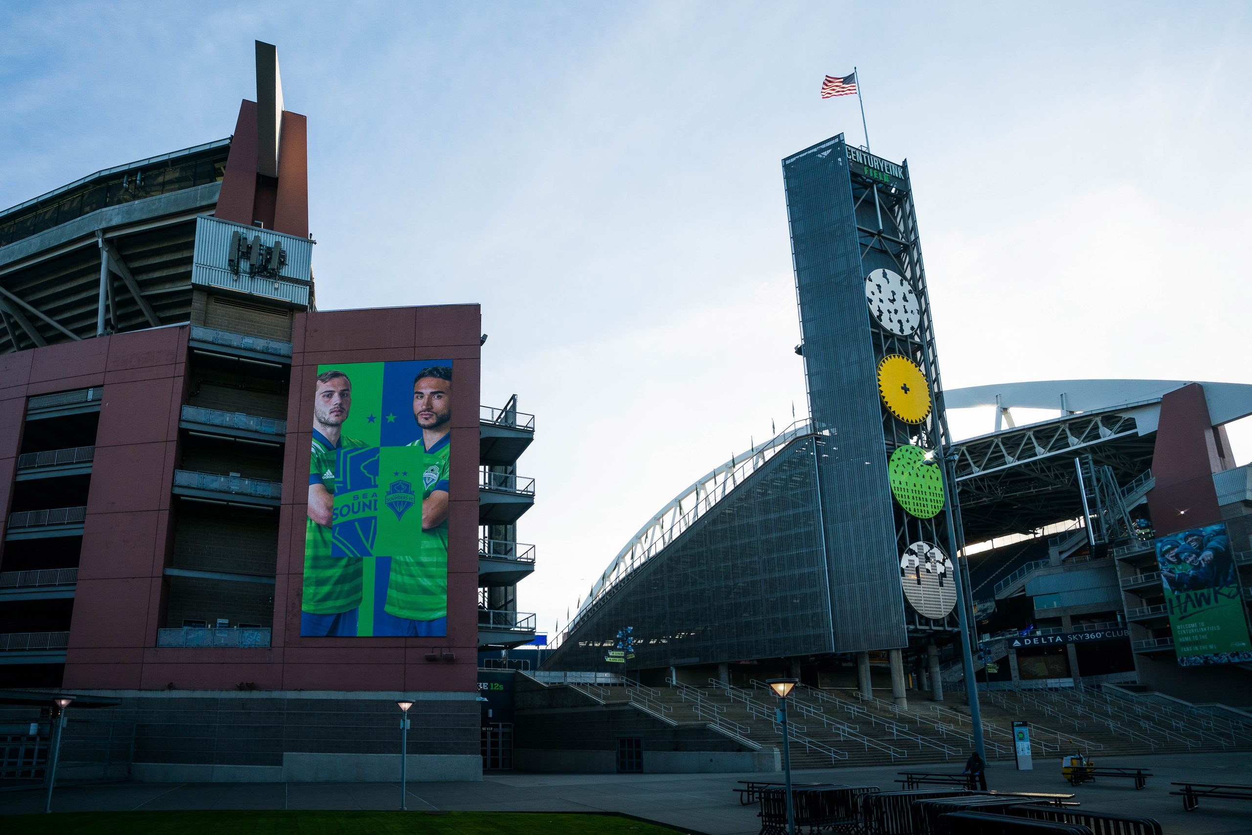
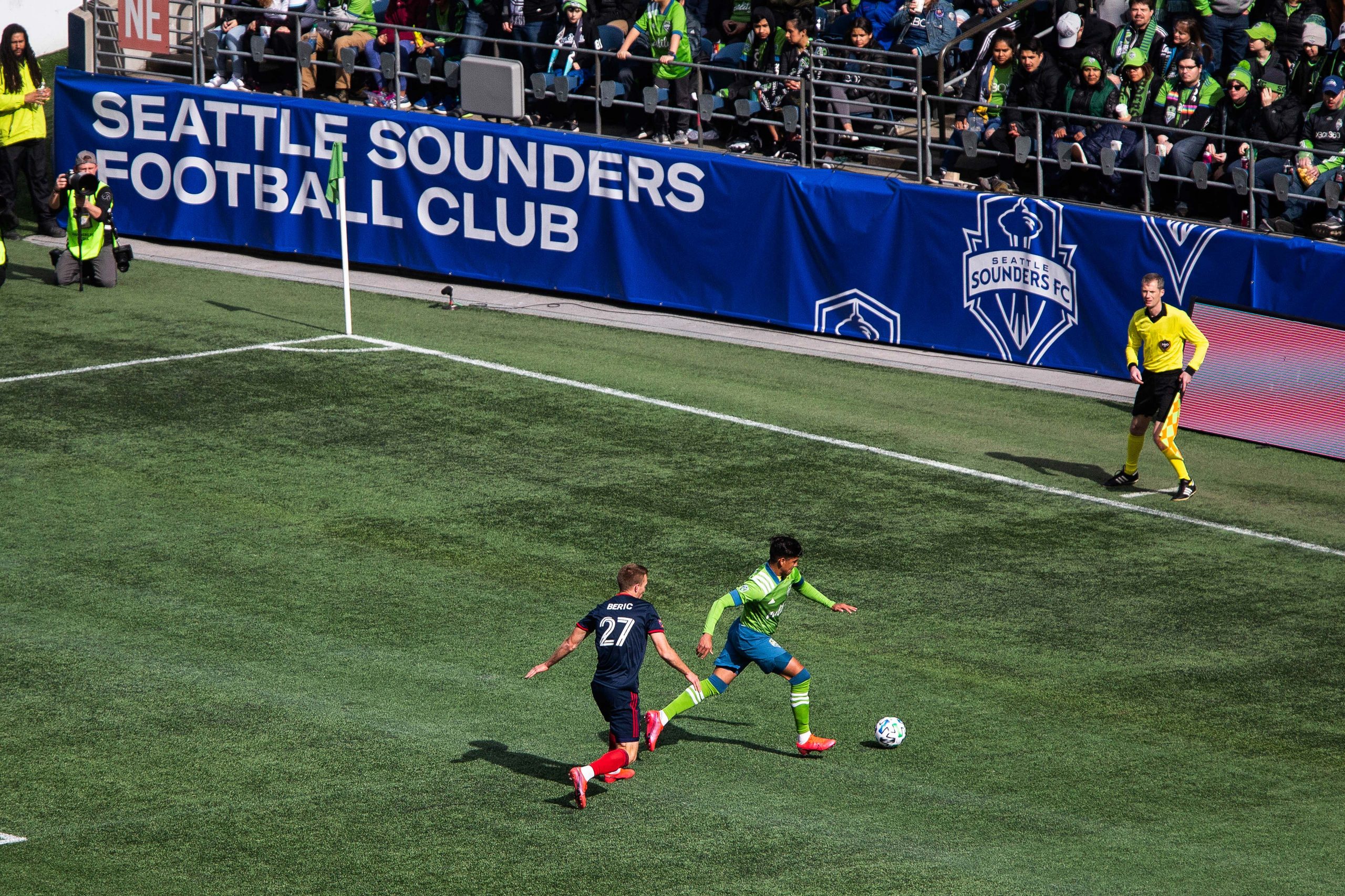
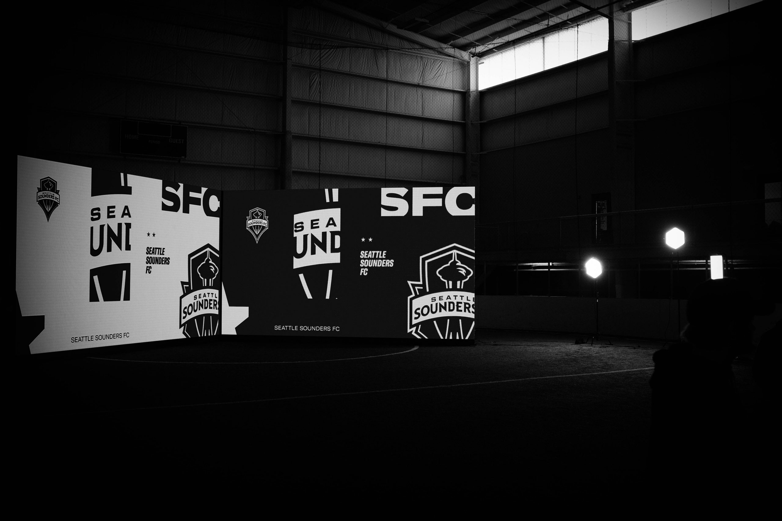
One of the primary applications that was prioritized was revamping the in-stadium matchday experience. The Sounders are known for having one of the most vibrant home atmospheres in the league, so we looked to match that energy in the graphic elements, color palette and expressive motion language.
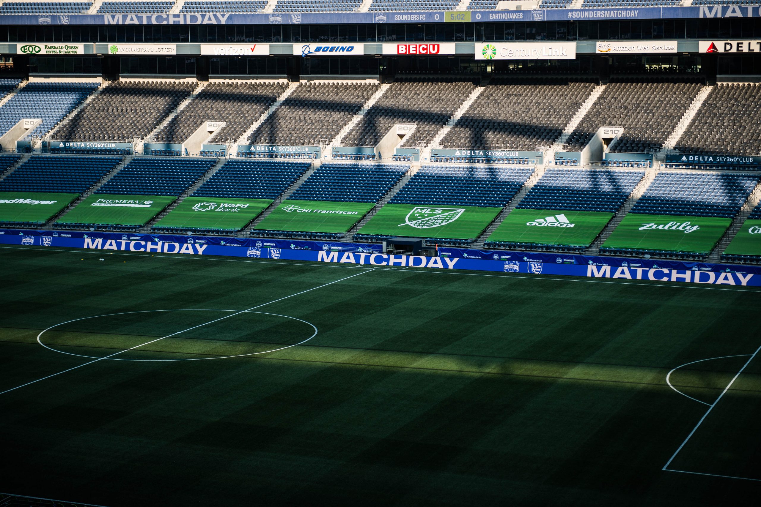
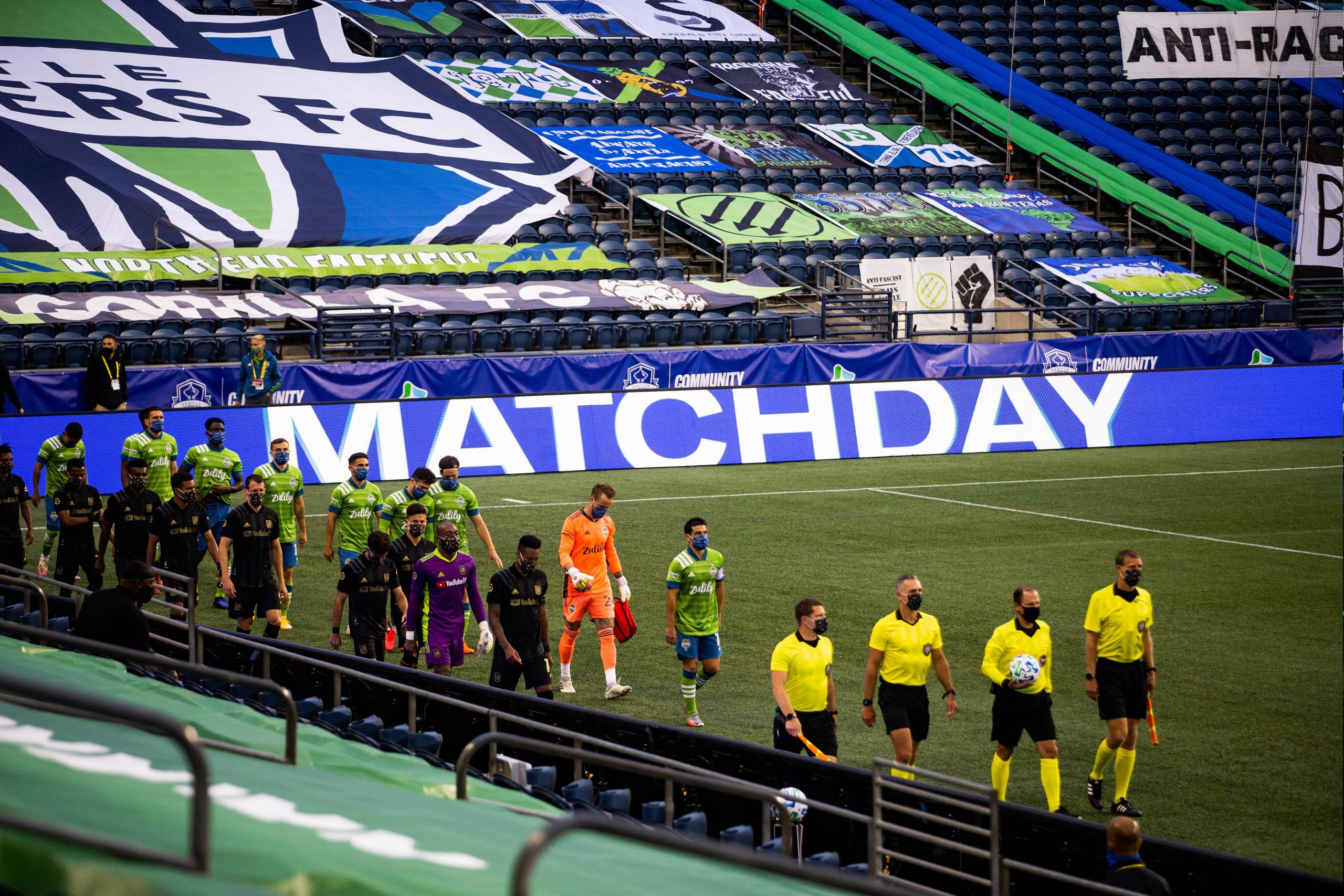
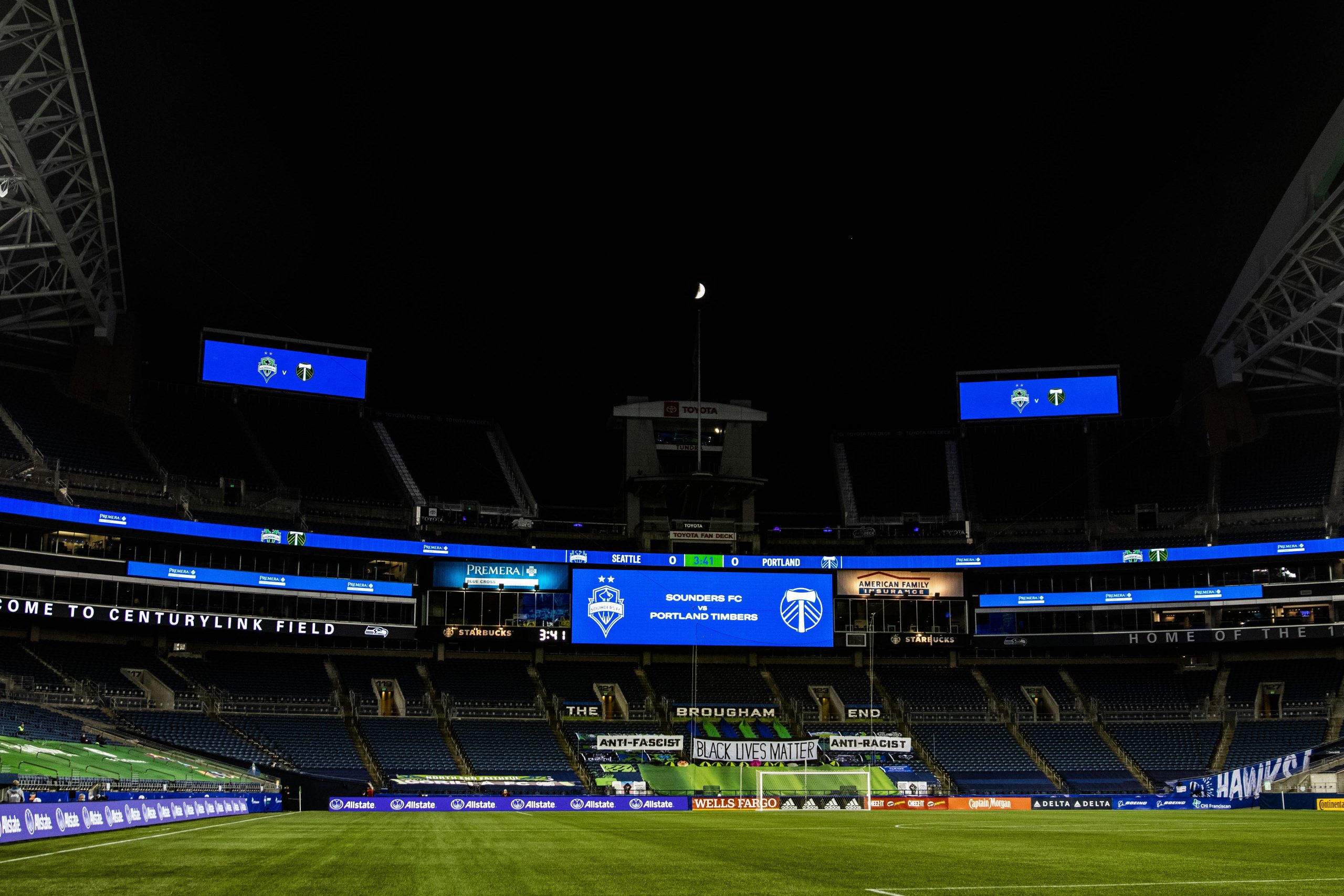
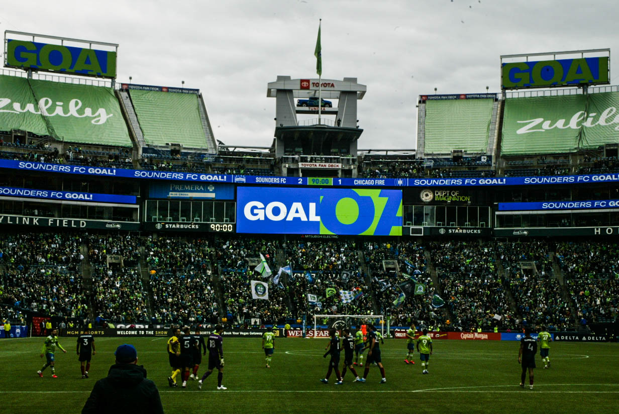
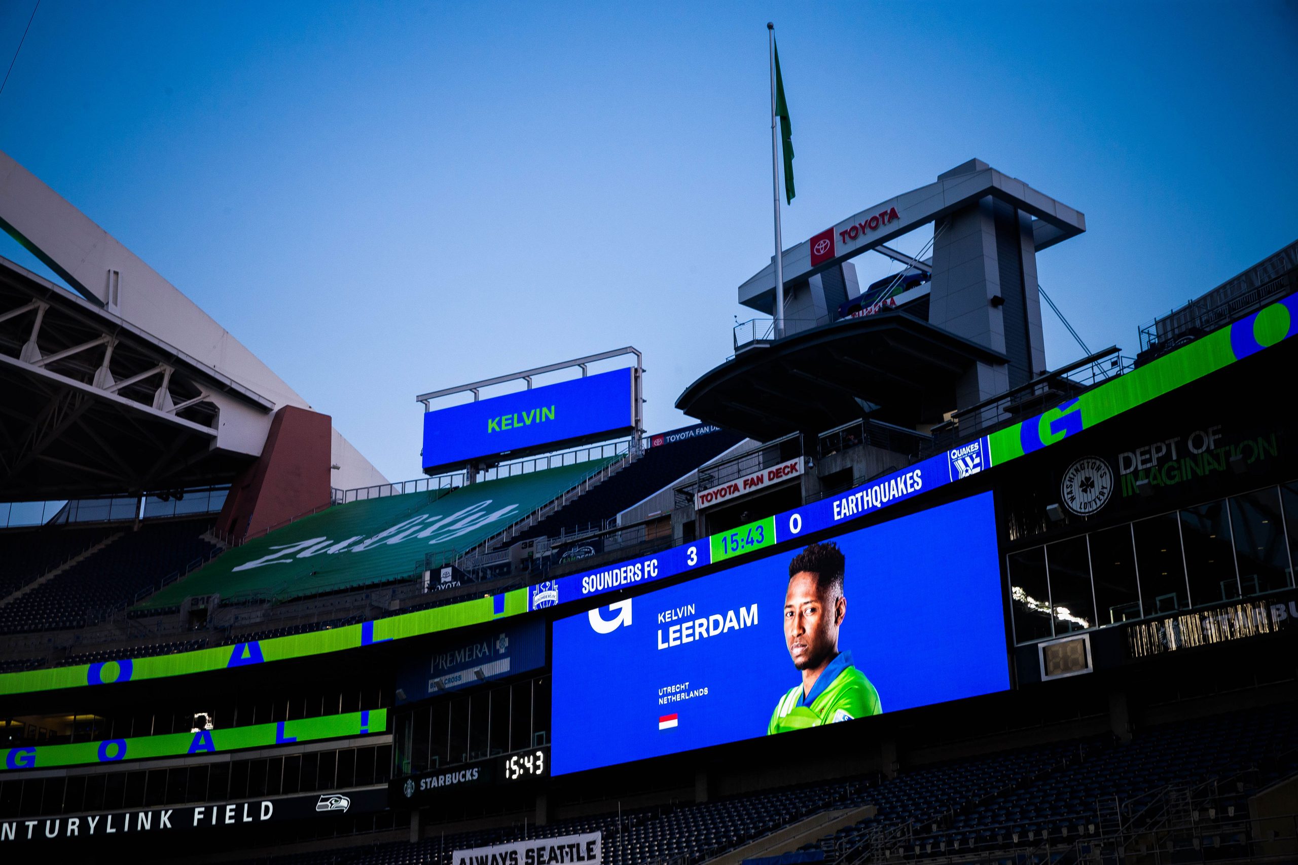
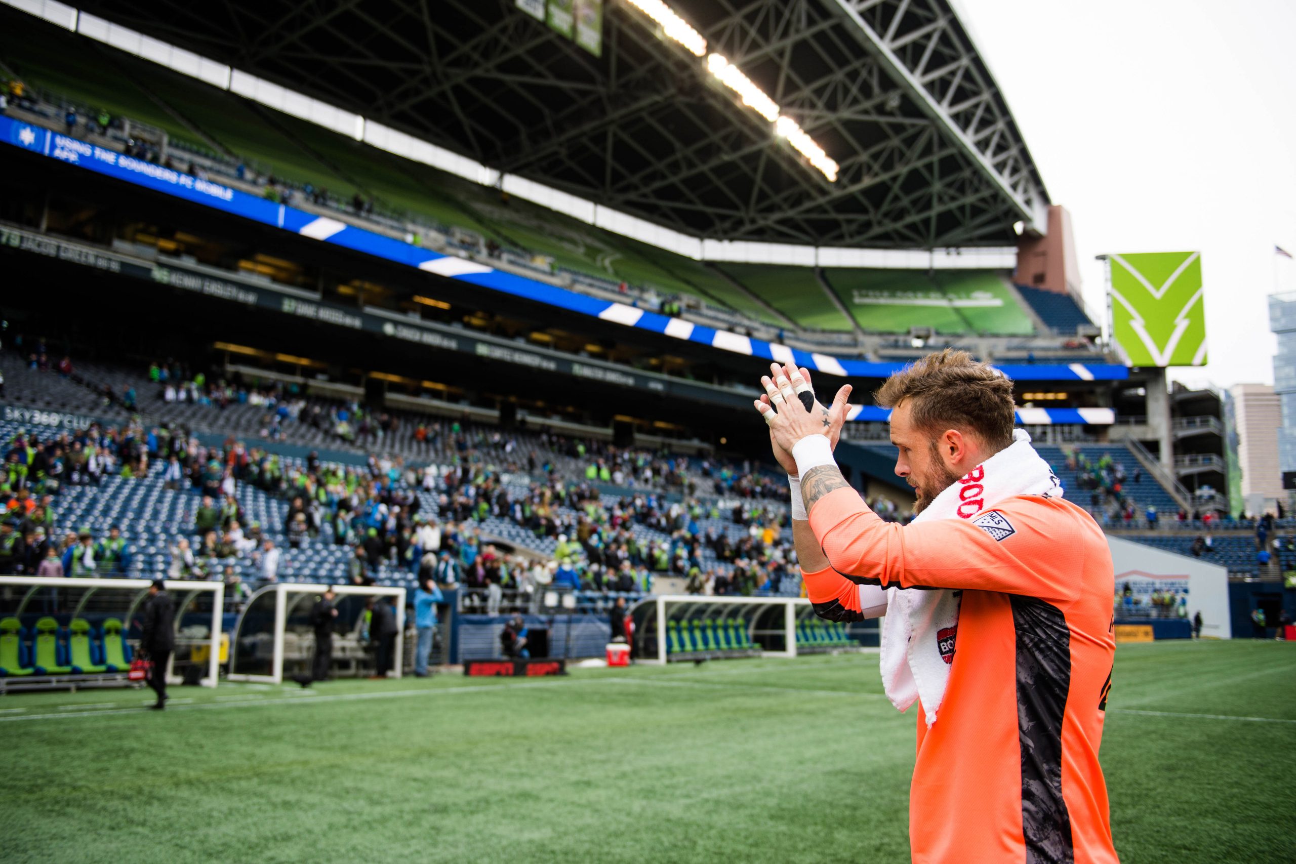
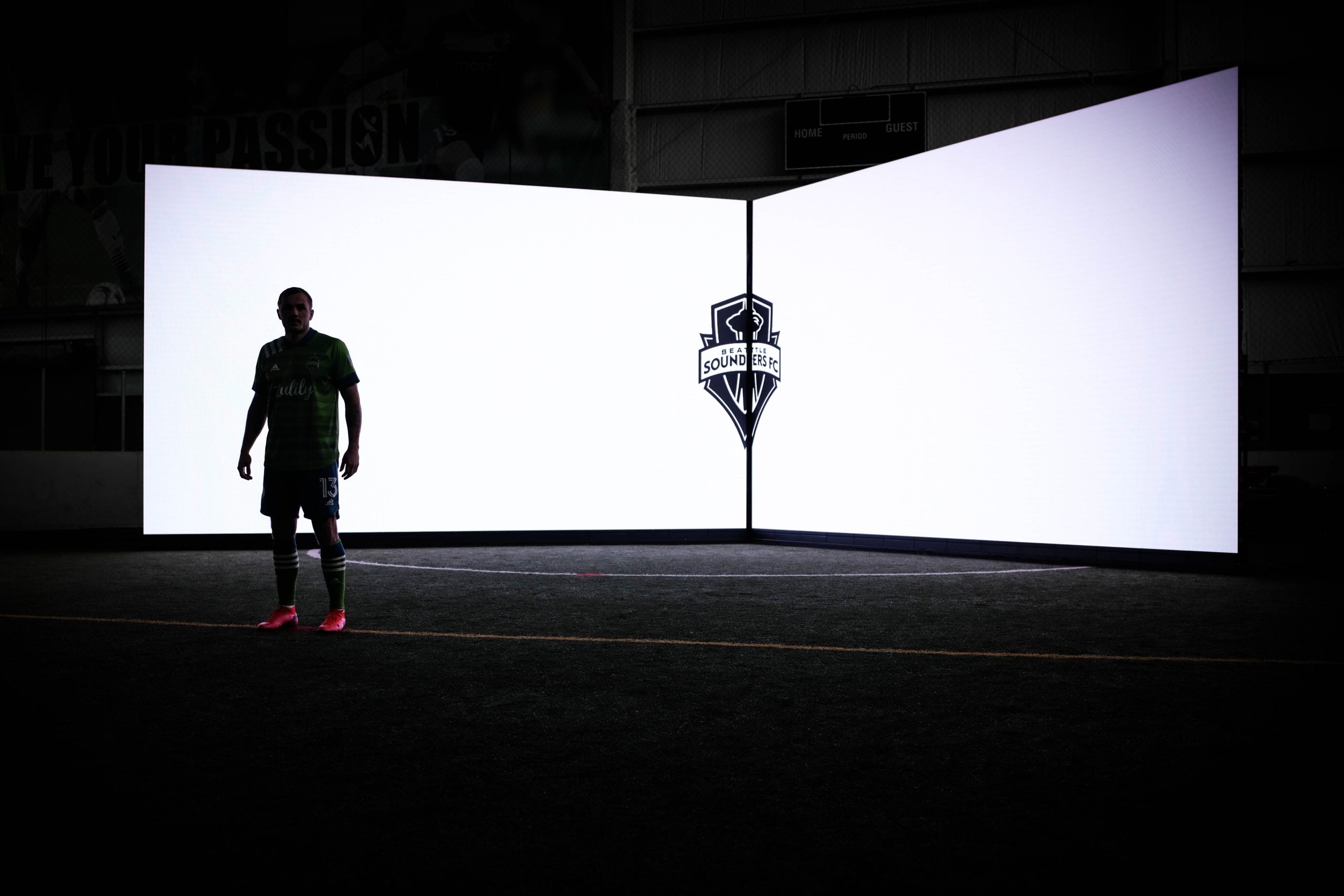
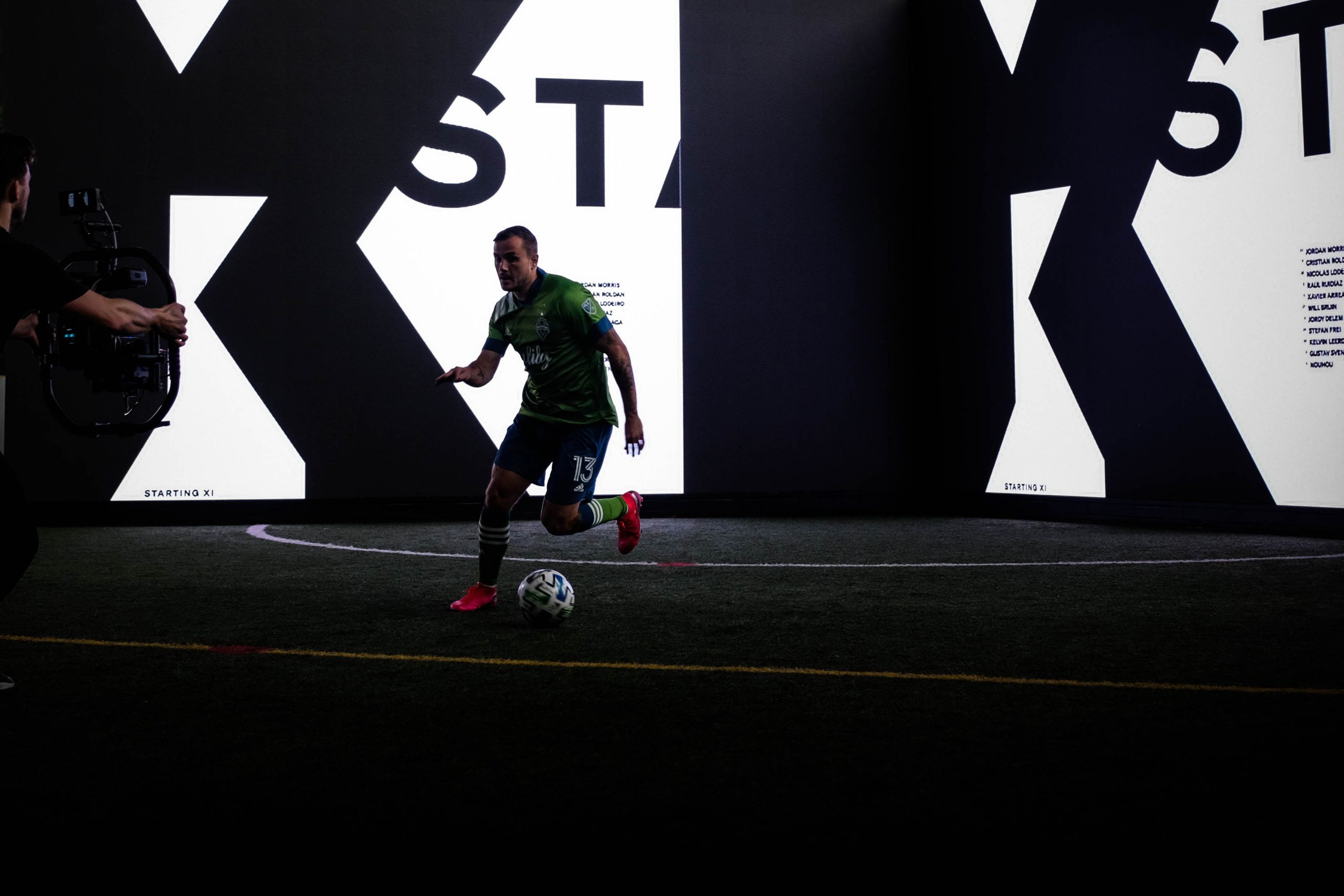
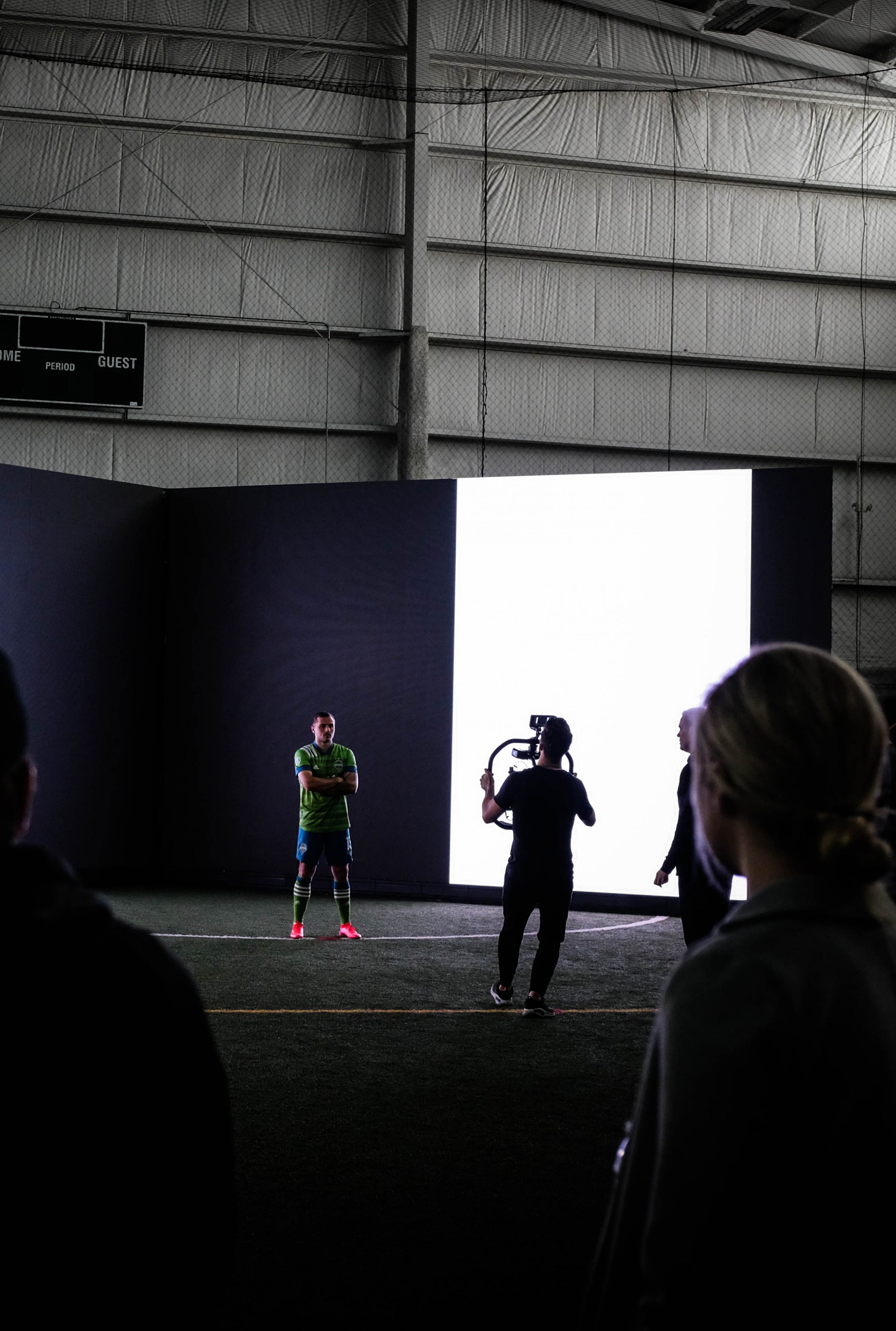
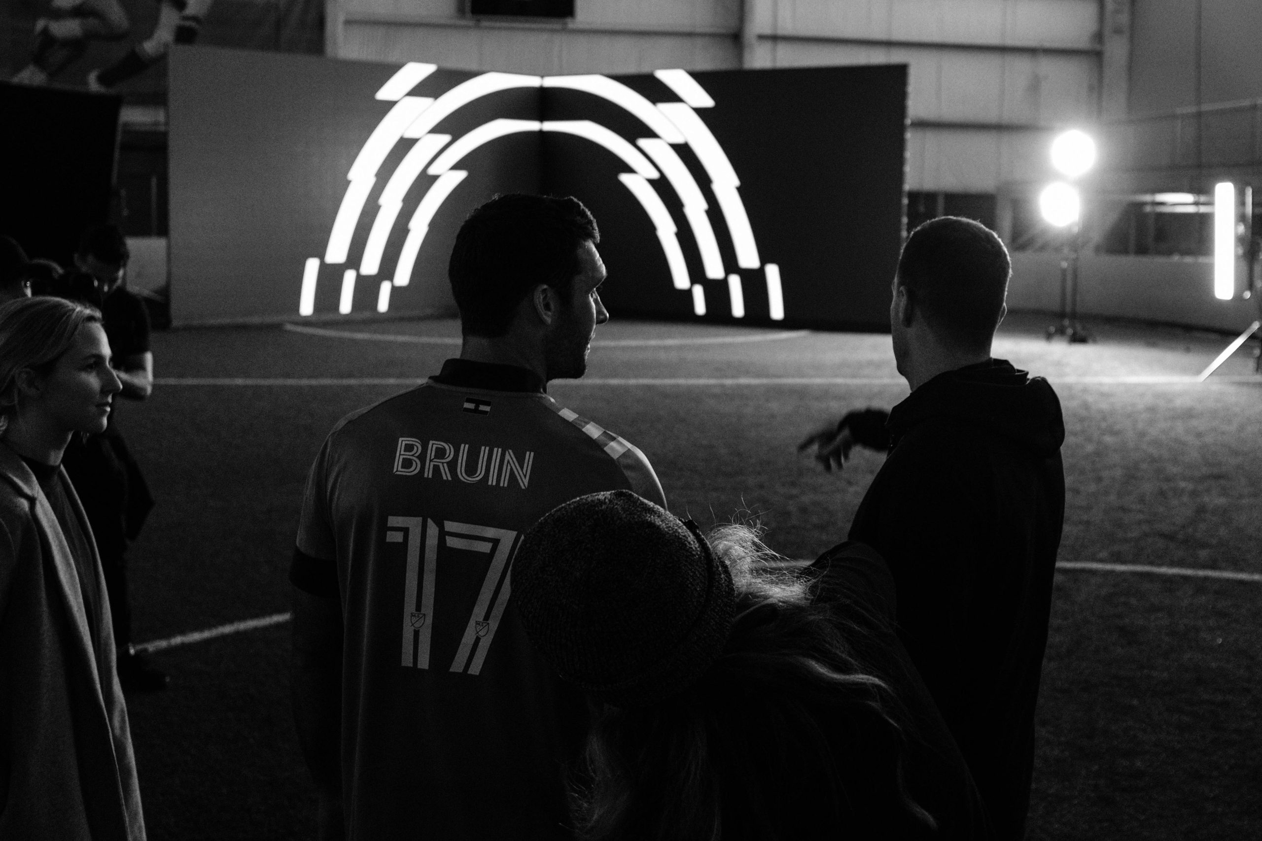
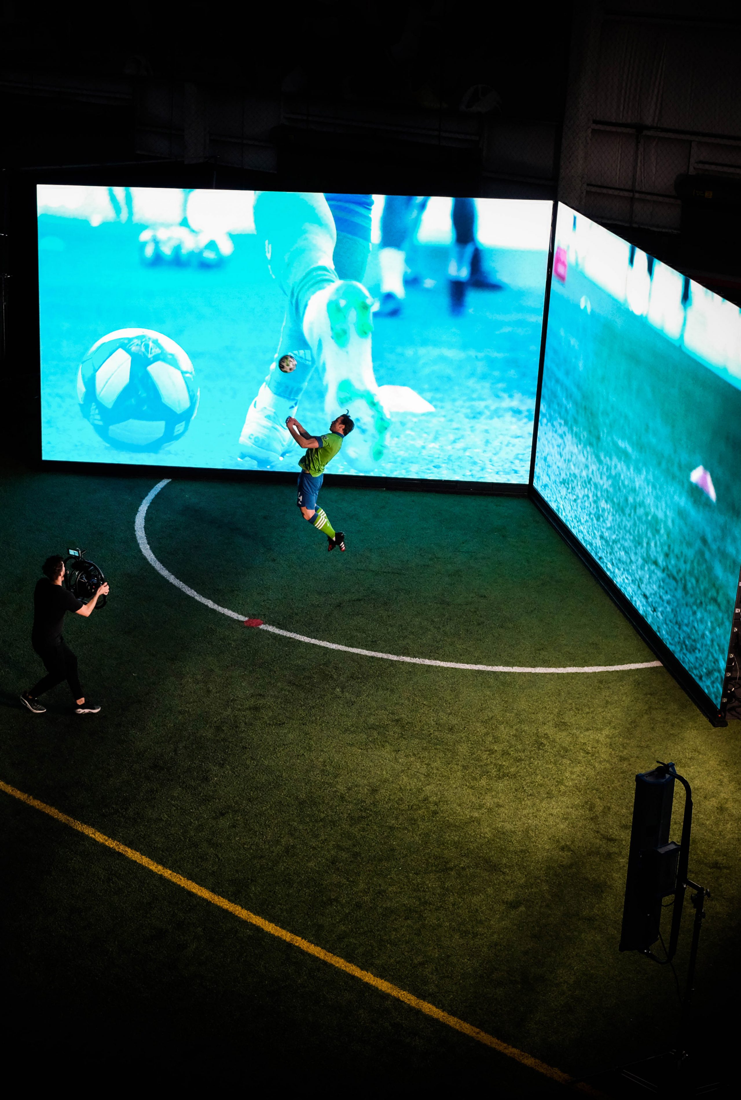
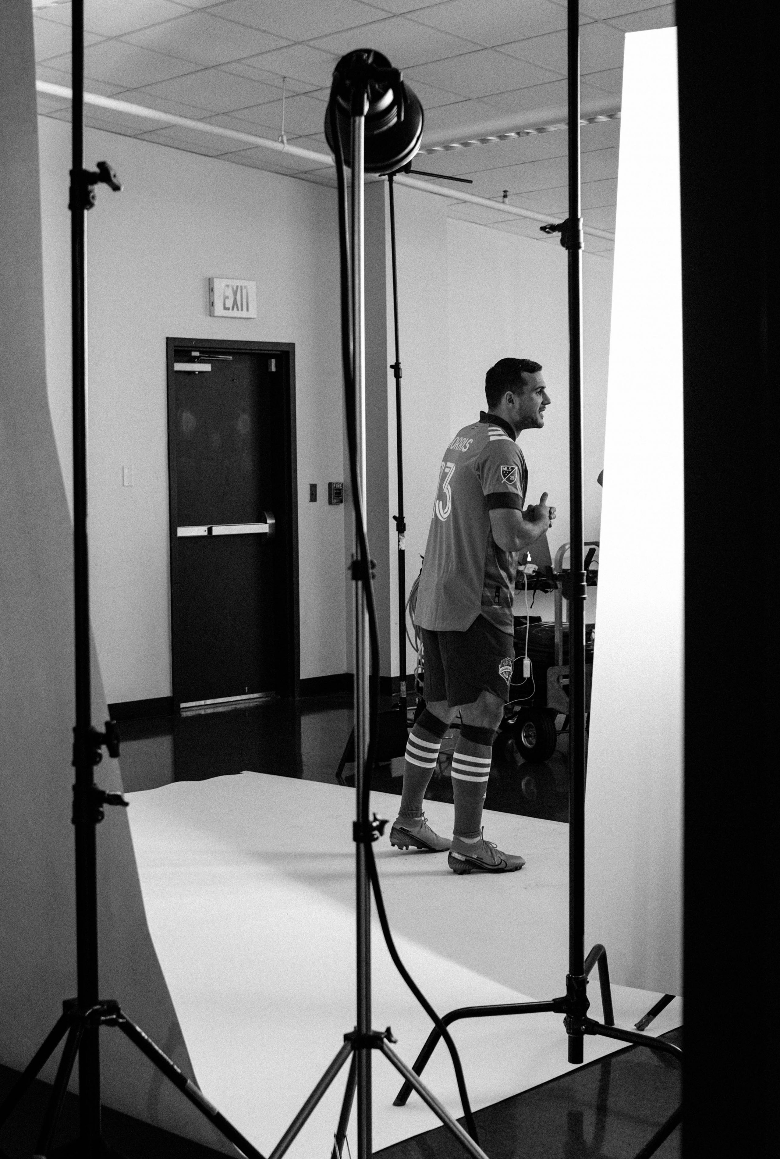
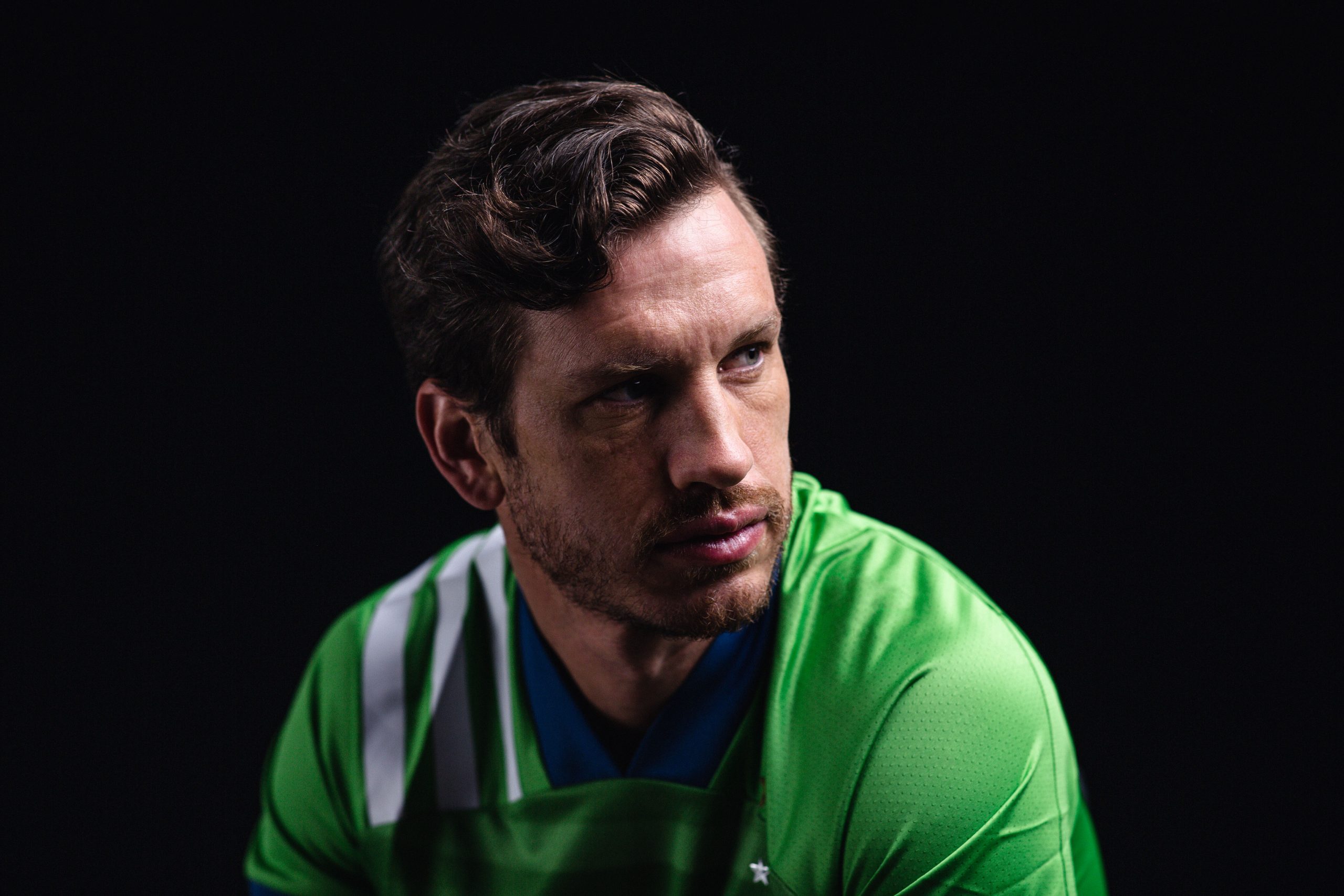
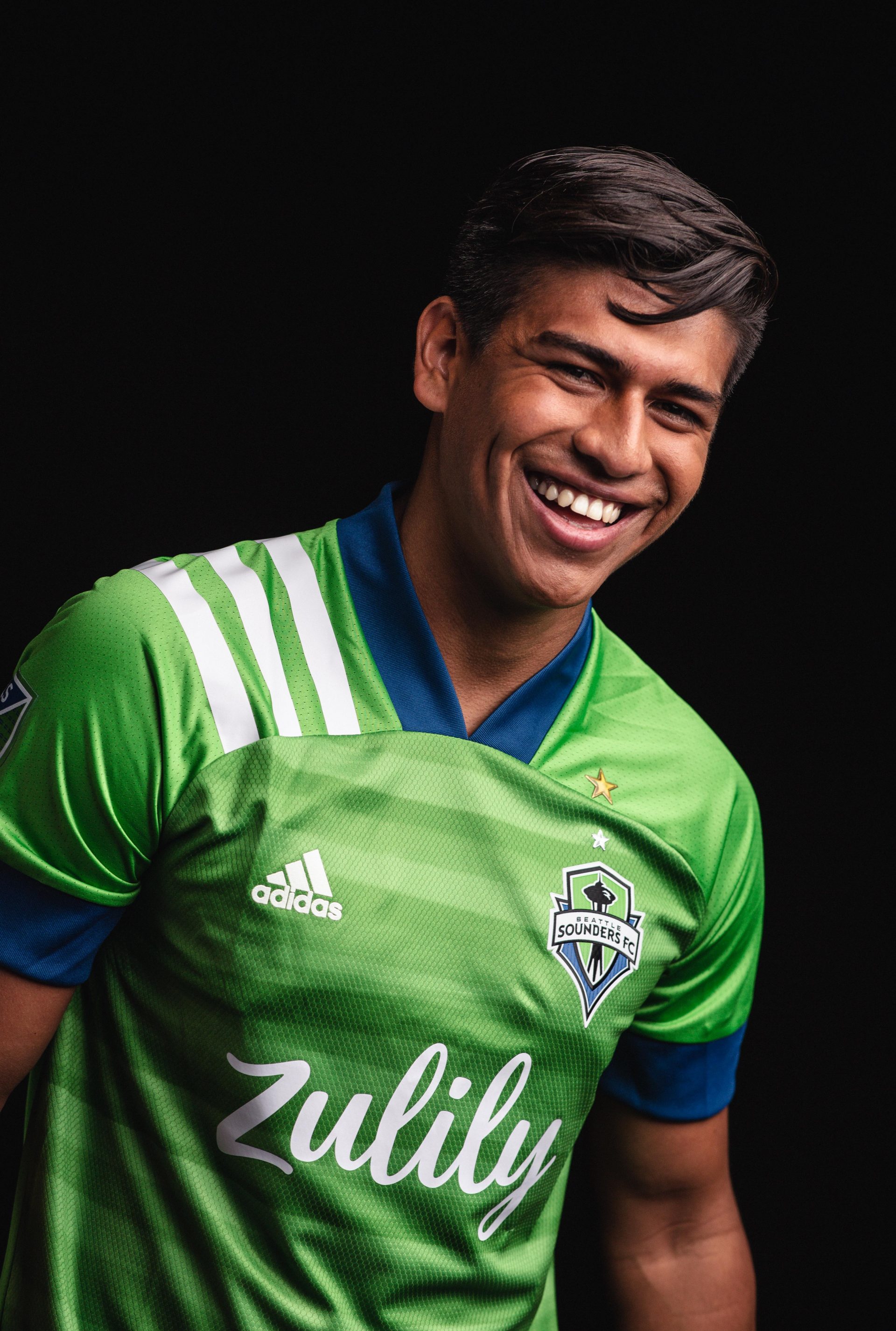
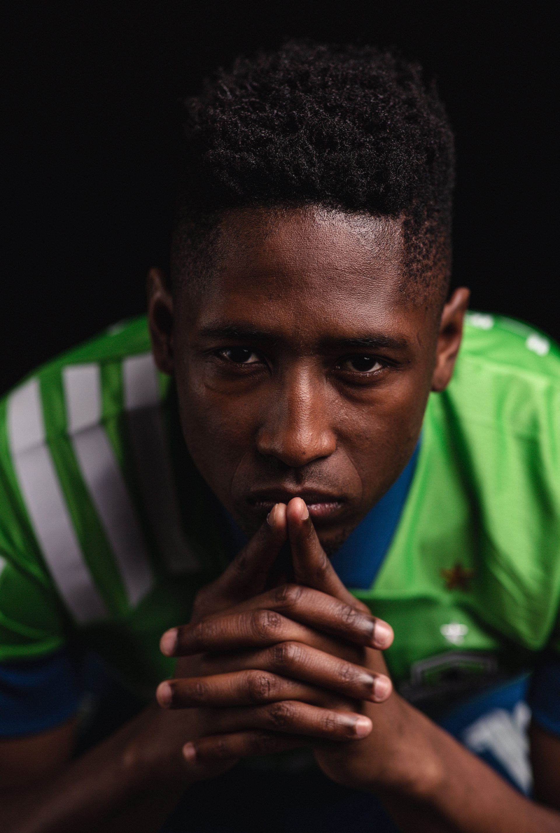
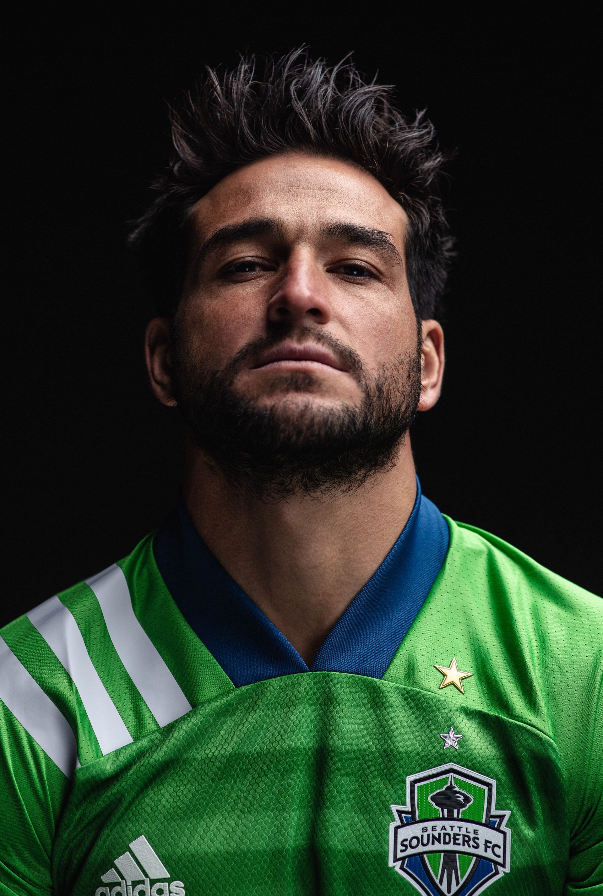
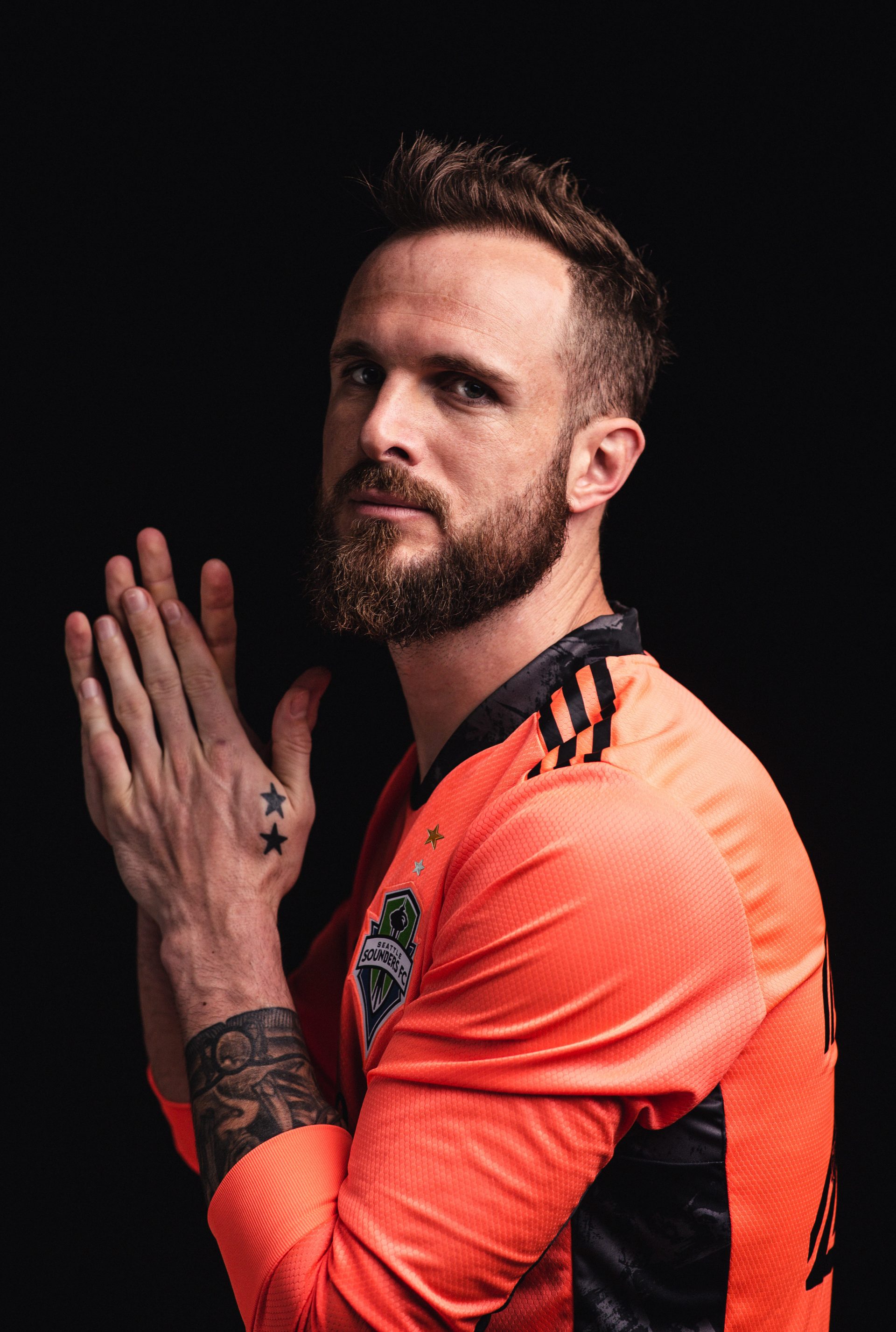
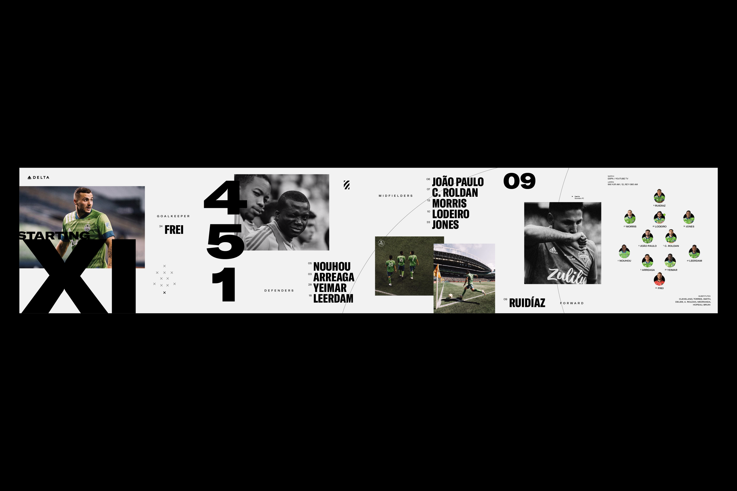
We provided creative direction for a series of photo and video shoots to capture imagery and footage to be used for key brand pieces, as well as across various assets throughout the season. A pre-match hype video, starting eleven graphics, and stadium signage were just a few scenarios in which these assets were applied.
Digital Assets
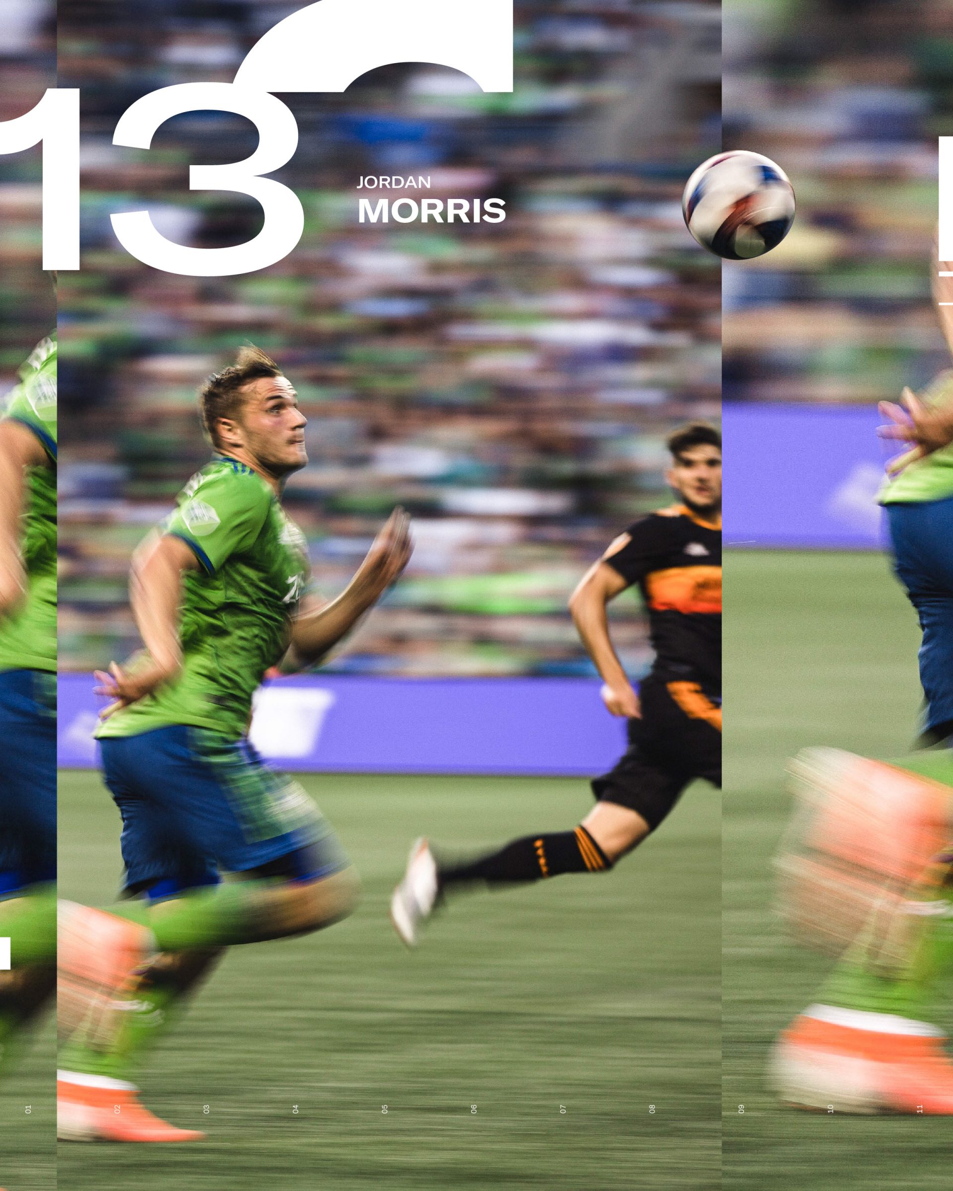
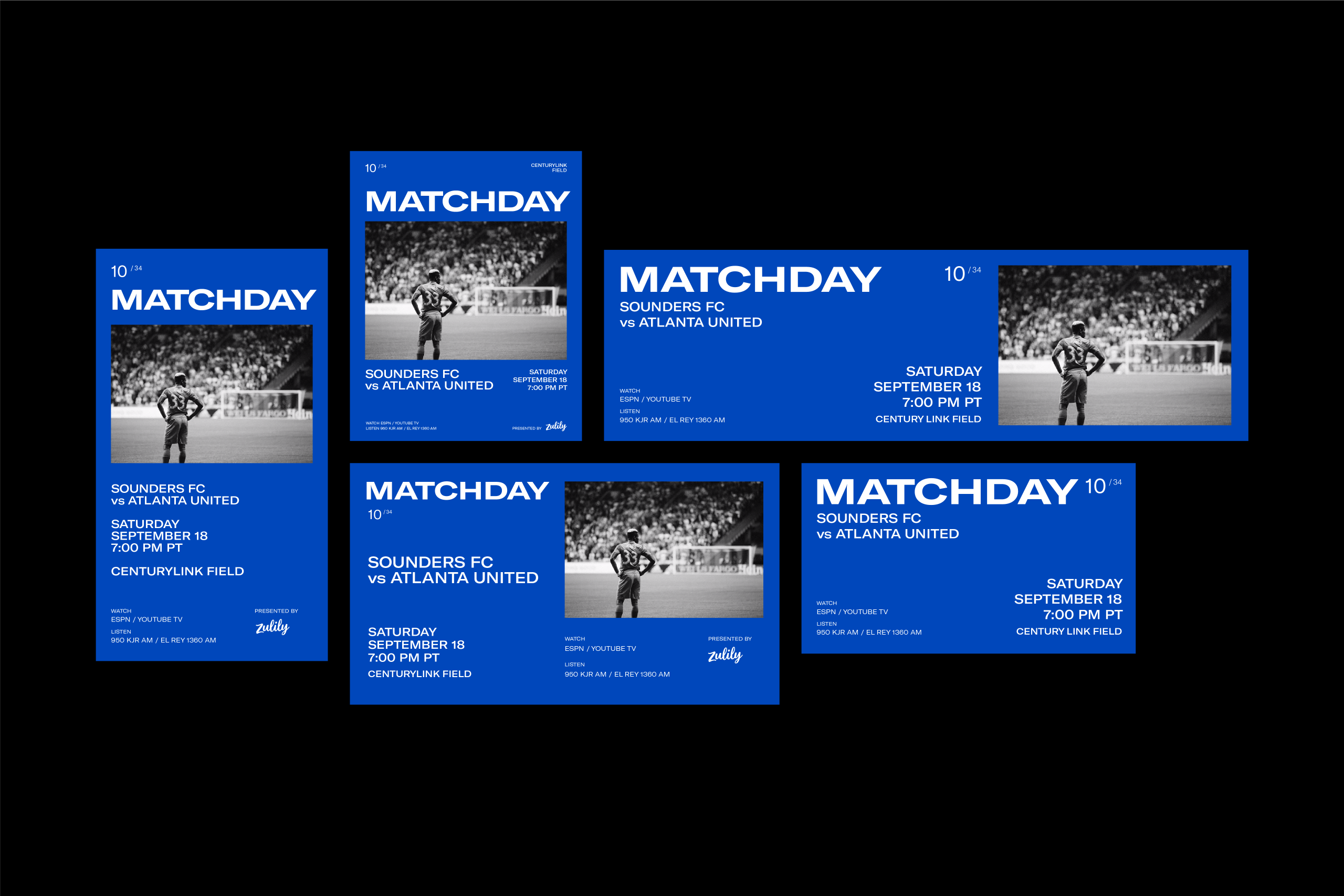
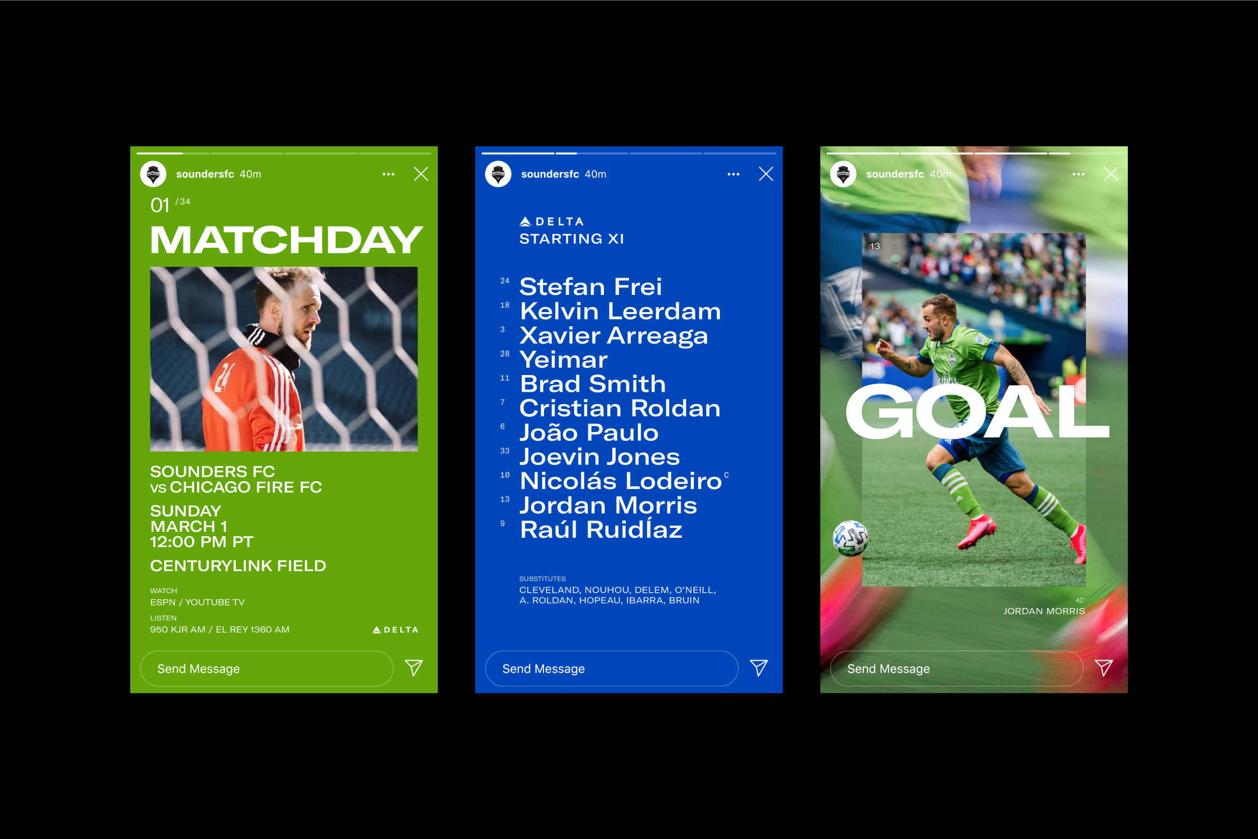
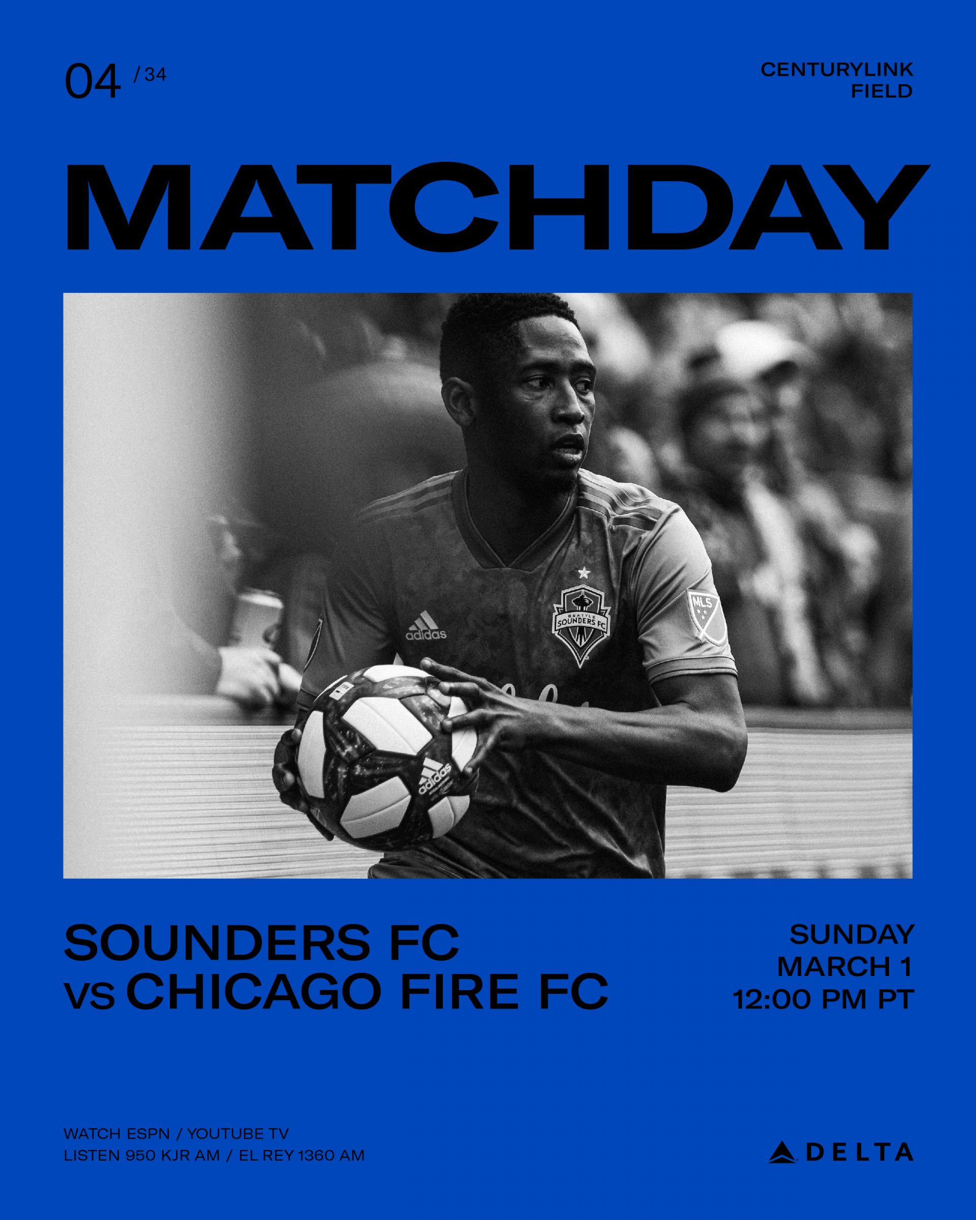
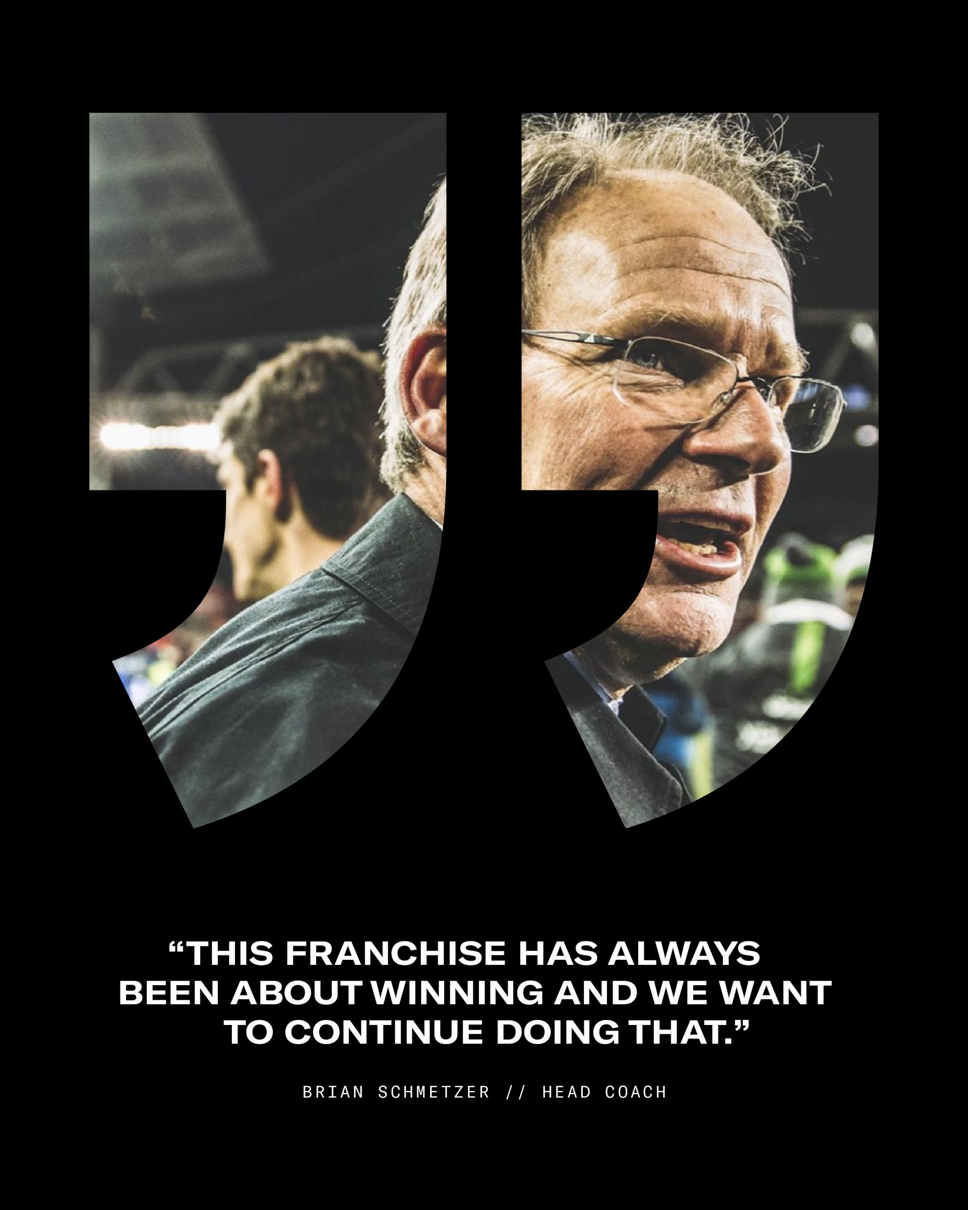
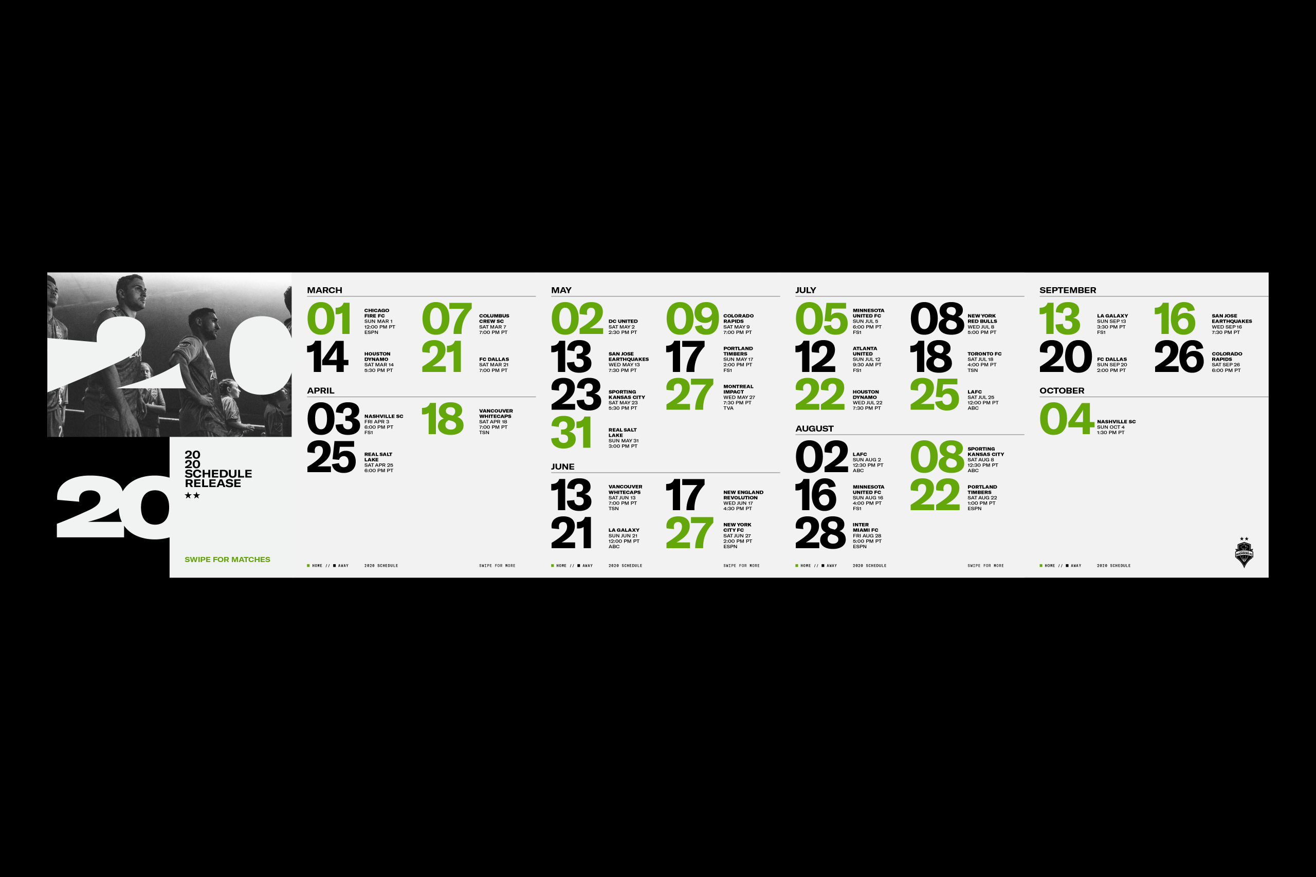
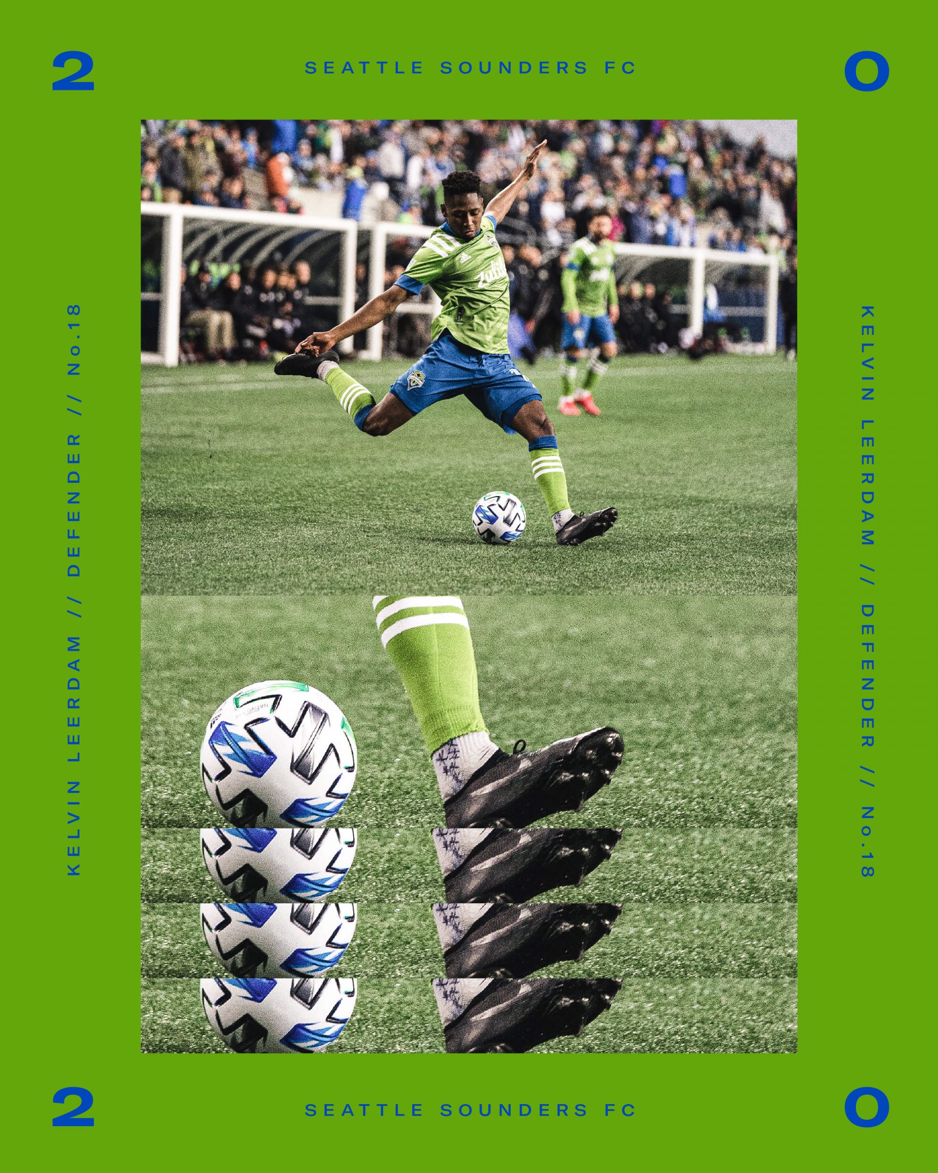
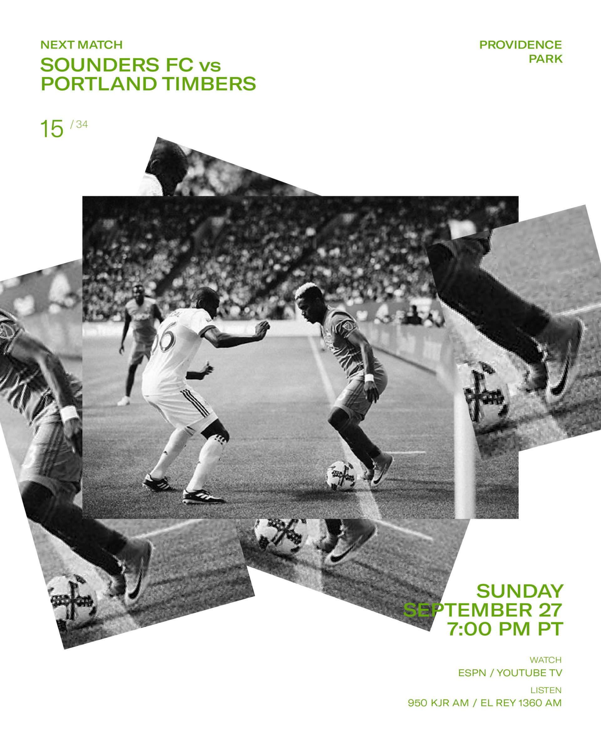
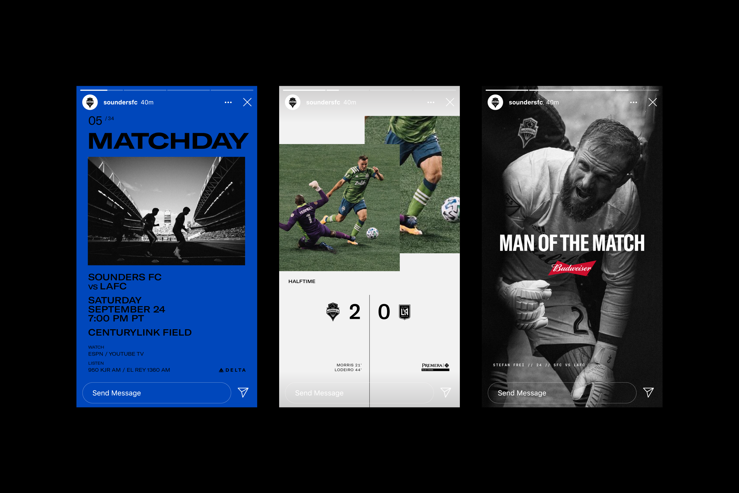
We created a range of template-based digital assets to revamp the overall look, as well as streamline the process for the internal team to churn out content on matchday.
To follow suit with the comprehensive brand system, these layouts placed an added emphasis on color choice, disciplined typography and image selection—allowing the photography to set the stage and portray the storyline of each match.


Additional Touchpoints
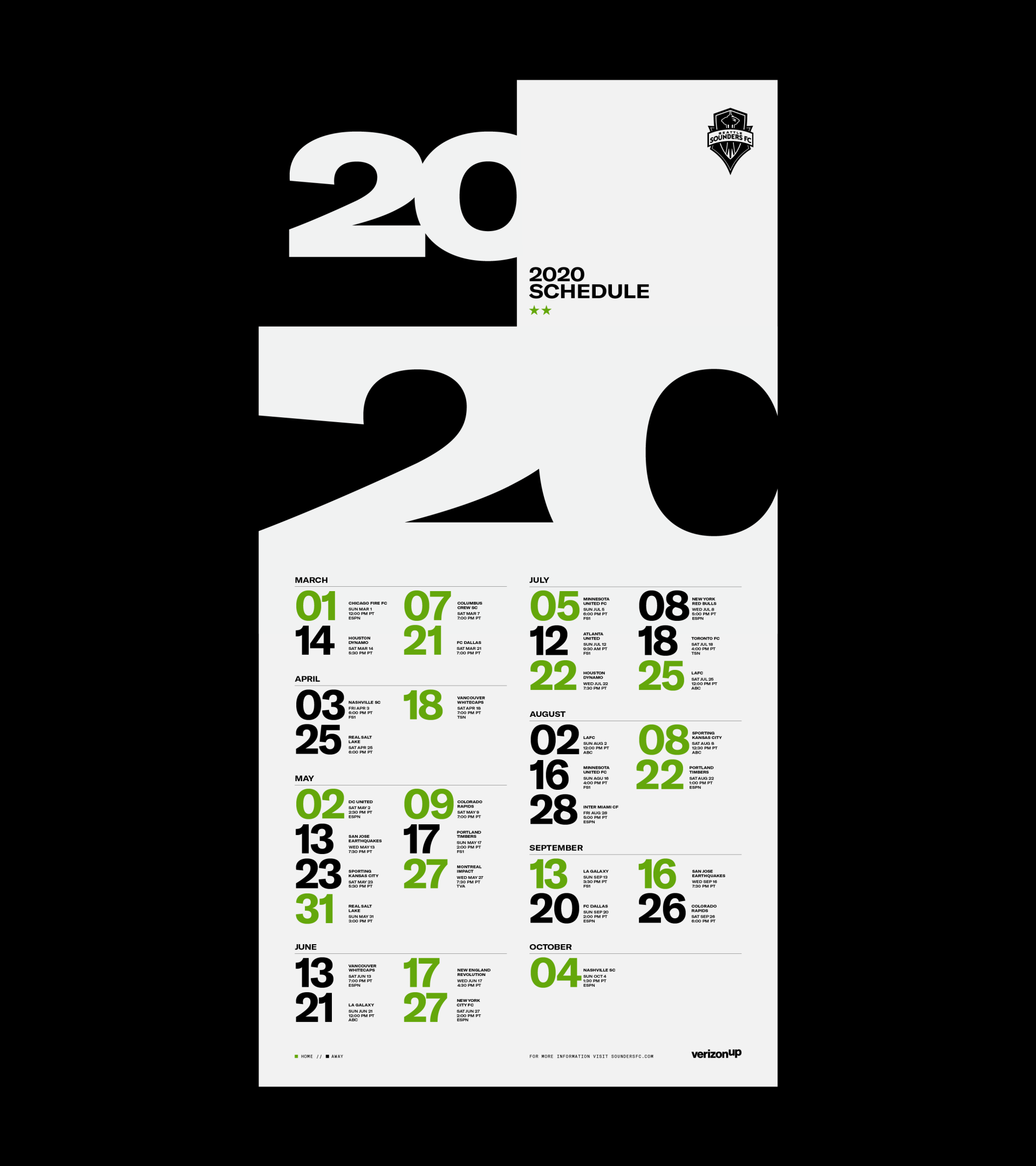
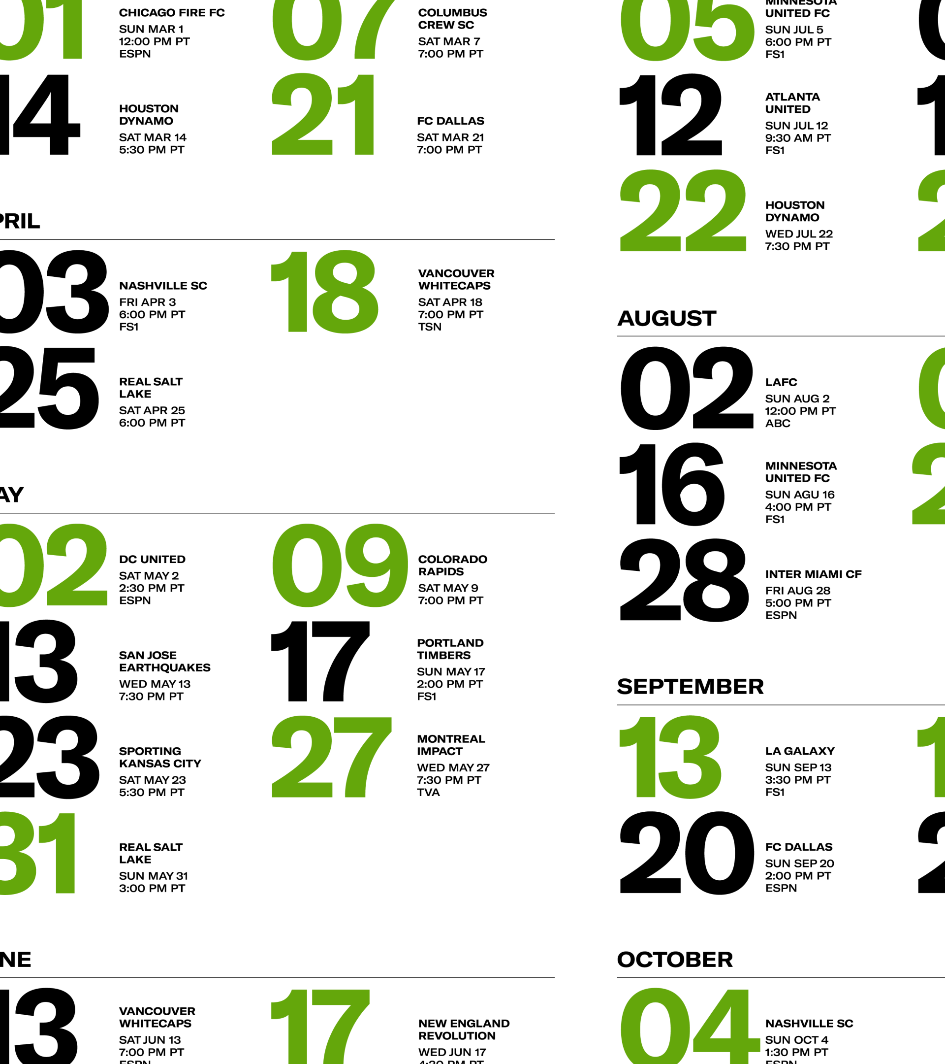
From the iconic 2020 Alliance Member scarf to the wide range of ticket packages as well as the stadium signage, we expanded the look and feel into a variety of additional touchpoints—each adding to the energy and enthusiasm around the team.
