E9 Brewing Co
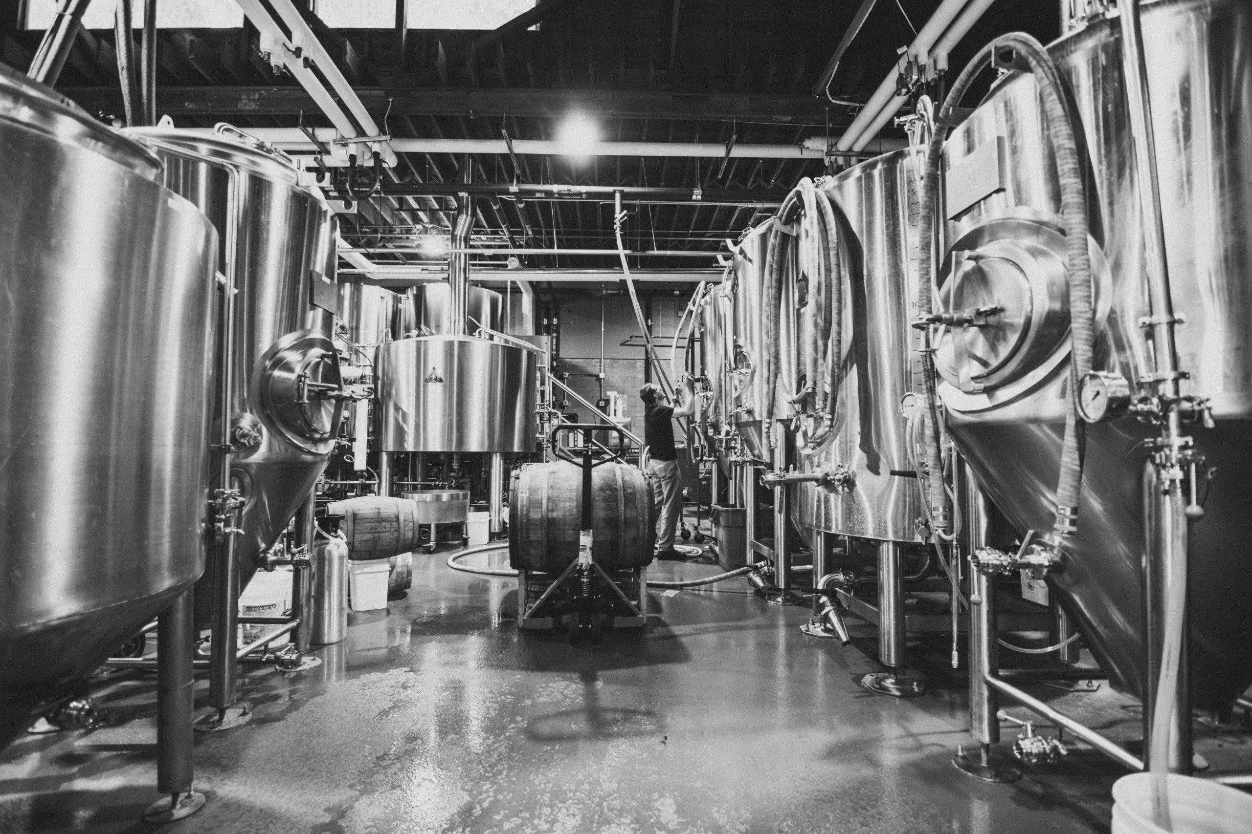
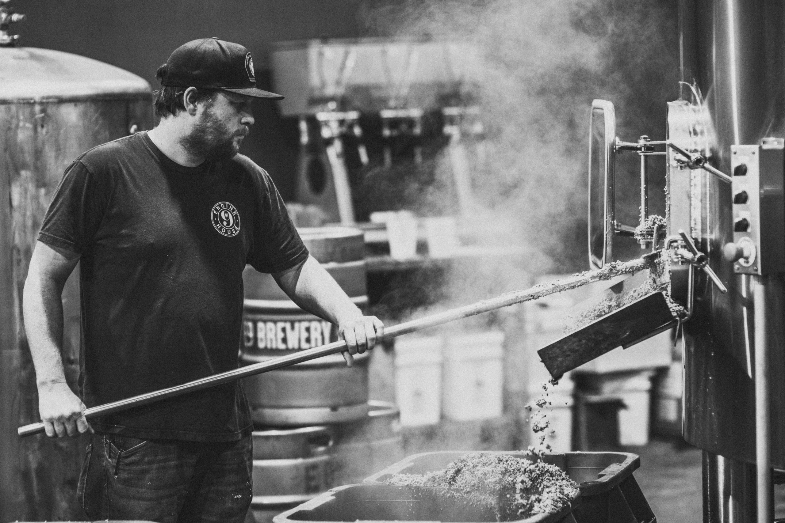
Project InfoIn what was once the fire department’s historic Engine House No. 9, E9 opened their doors as Tacoma’s first craft brewery in 1995. From then until now they’ve garnered a reputation as one of the region’s grittiest breweries, producing some of the most unique and expertly crafted beers in the Northwest. In an effort to expand their operation while retaining their well earned reputation, they partnered with Column to do a full overhaul on the brand from packaging to the in-store experience.
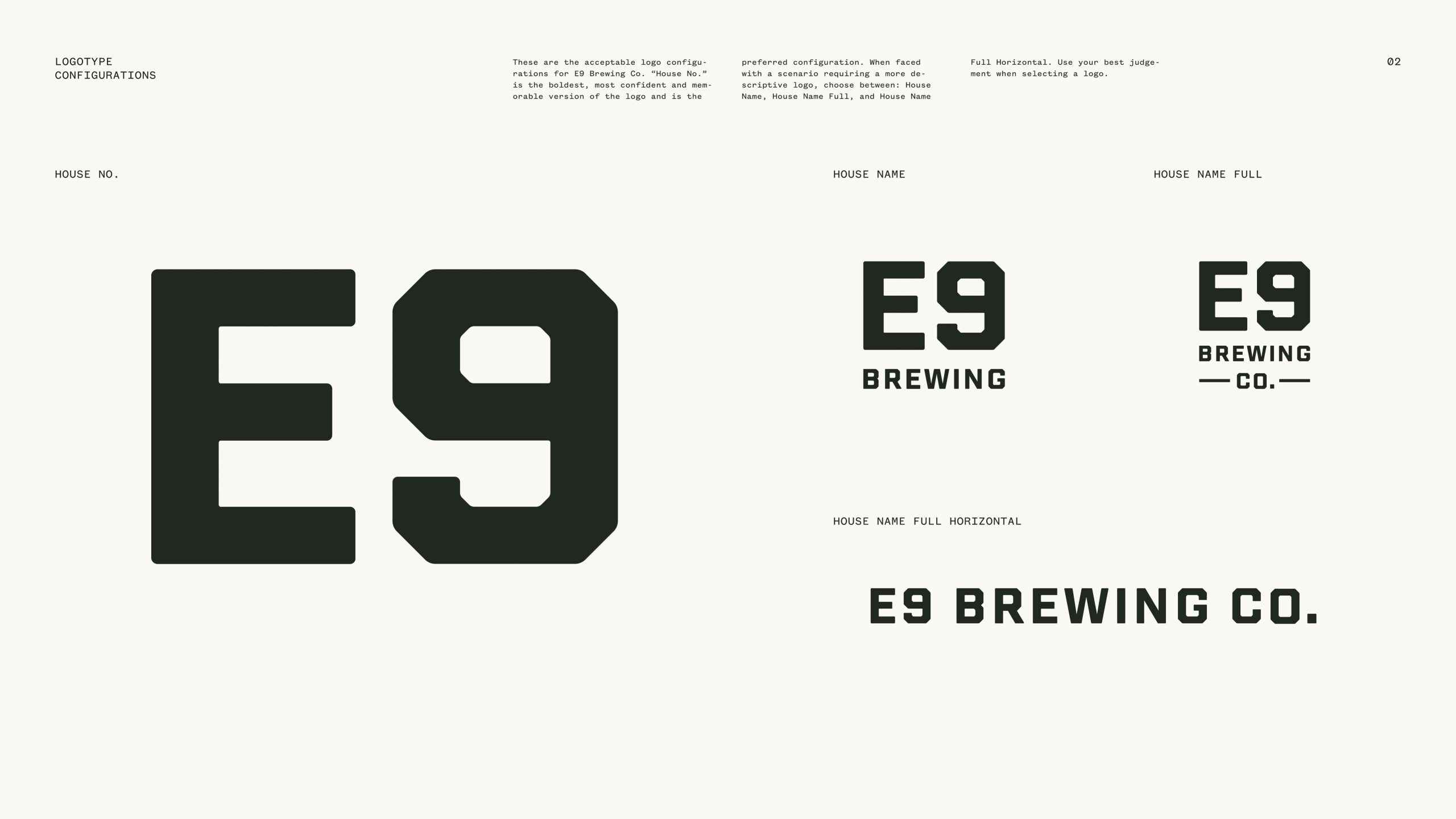
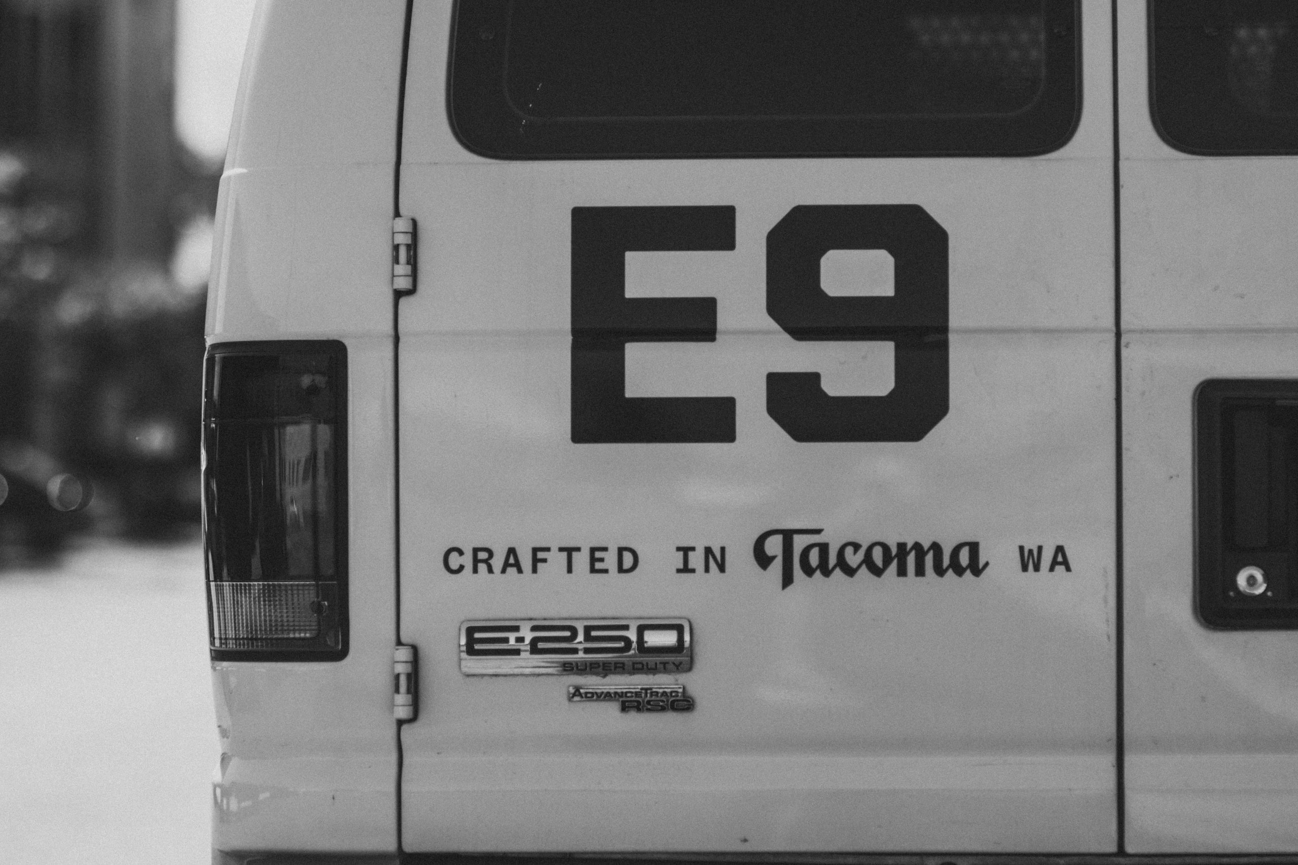
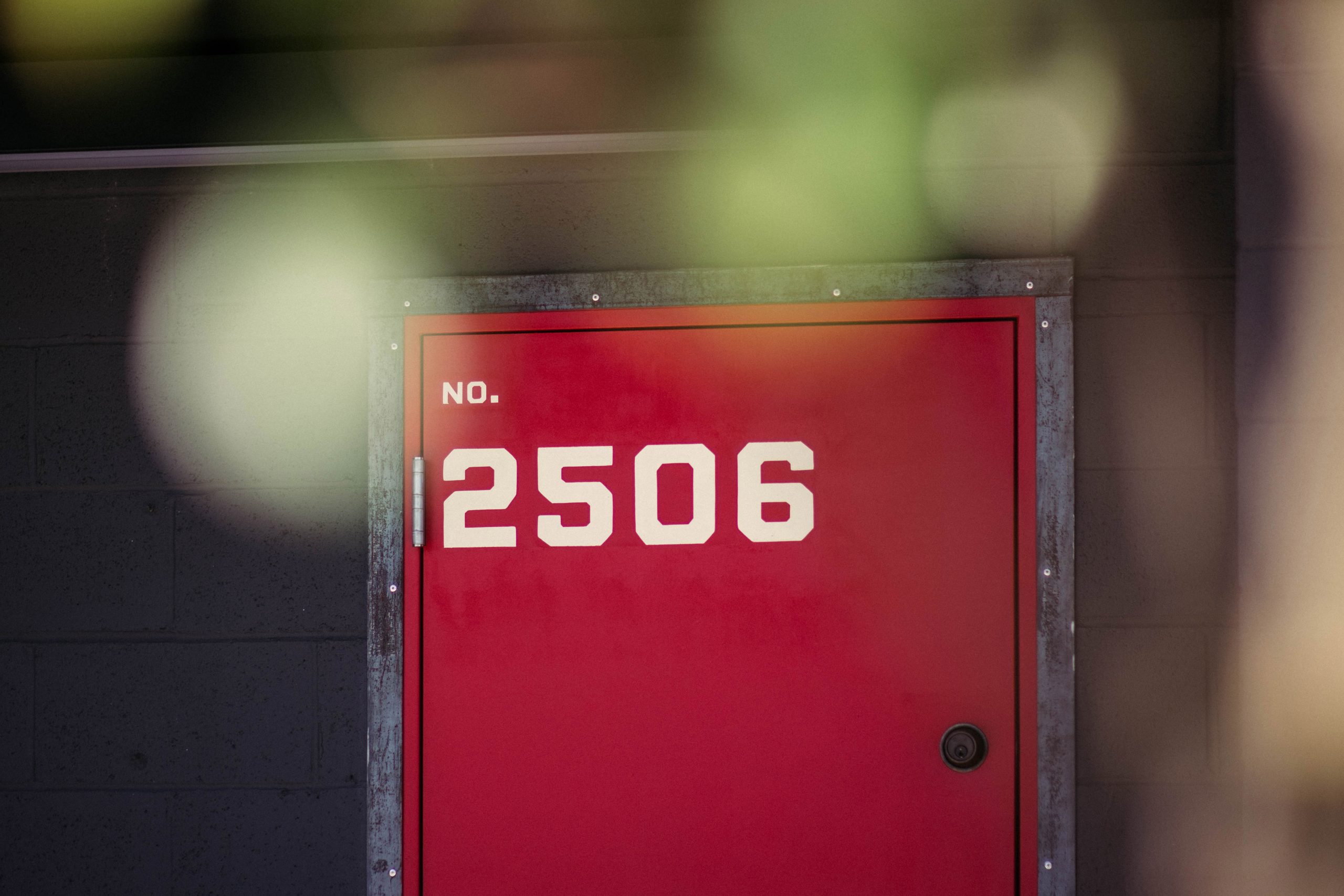
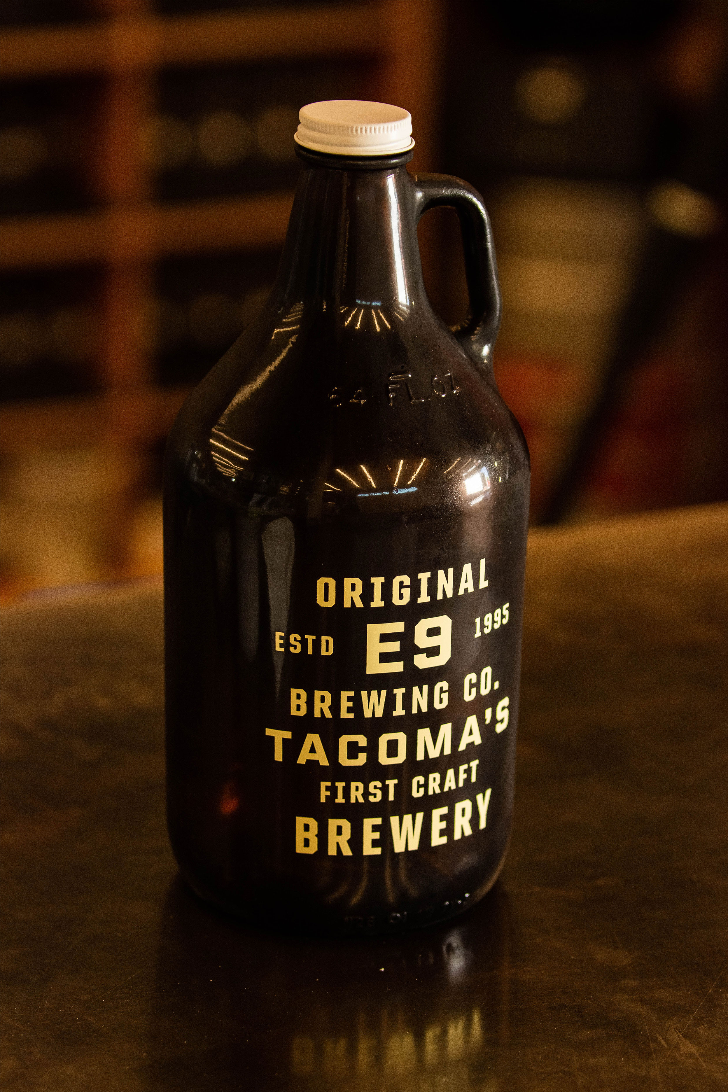
The mark was inspired by fire engine numbers and utilitarian typography of the 1920’s (the timeframe of when the original engine house was in operation). Simple, authentic, recognizable and easily applied in any scenario.
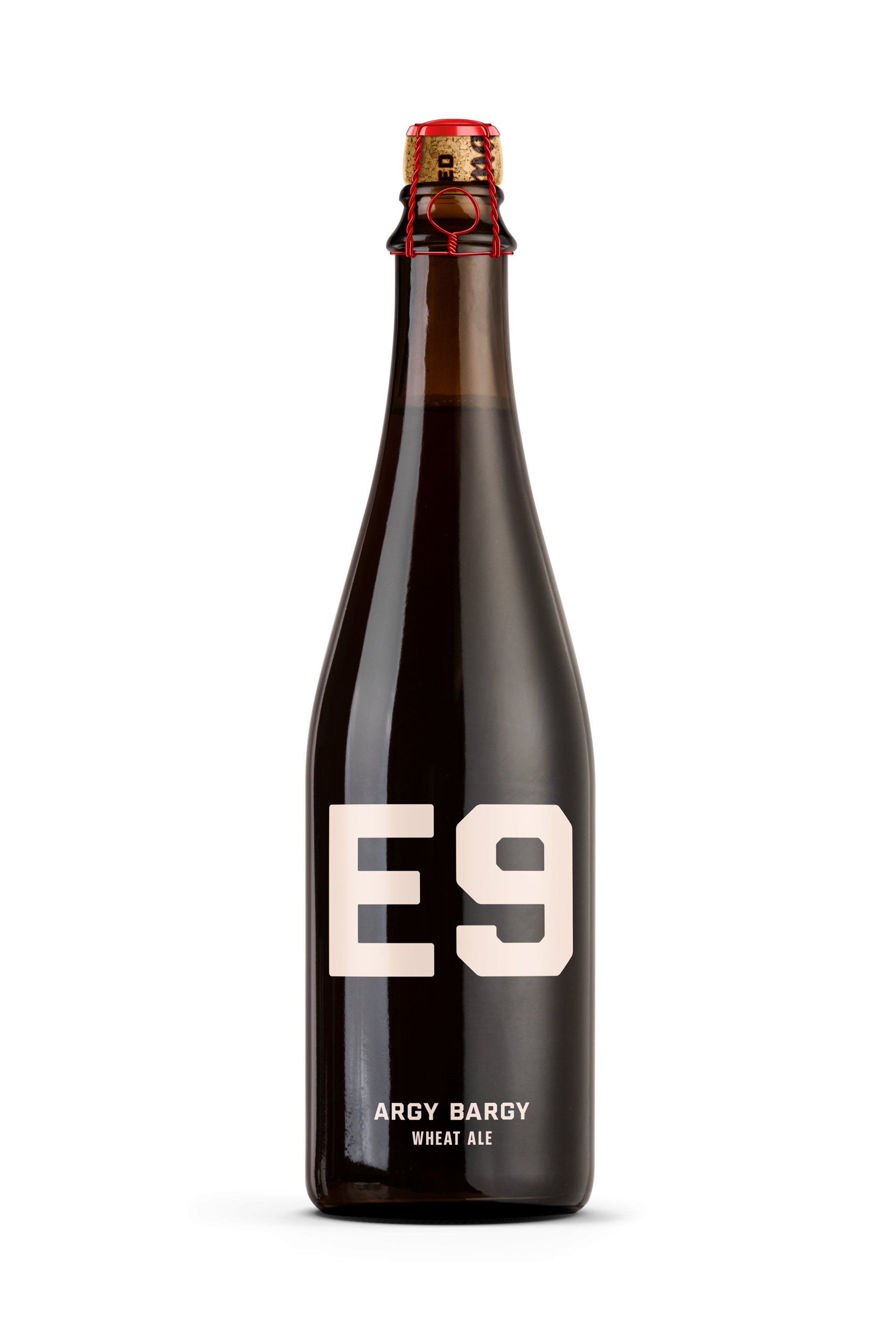
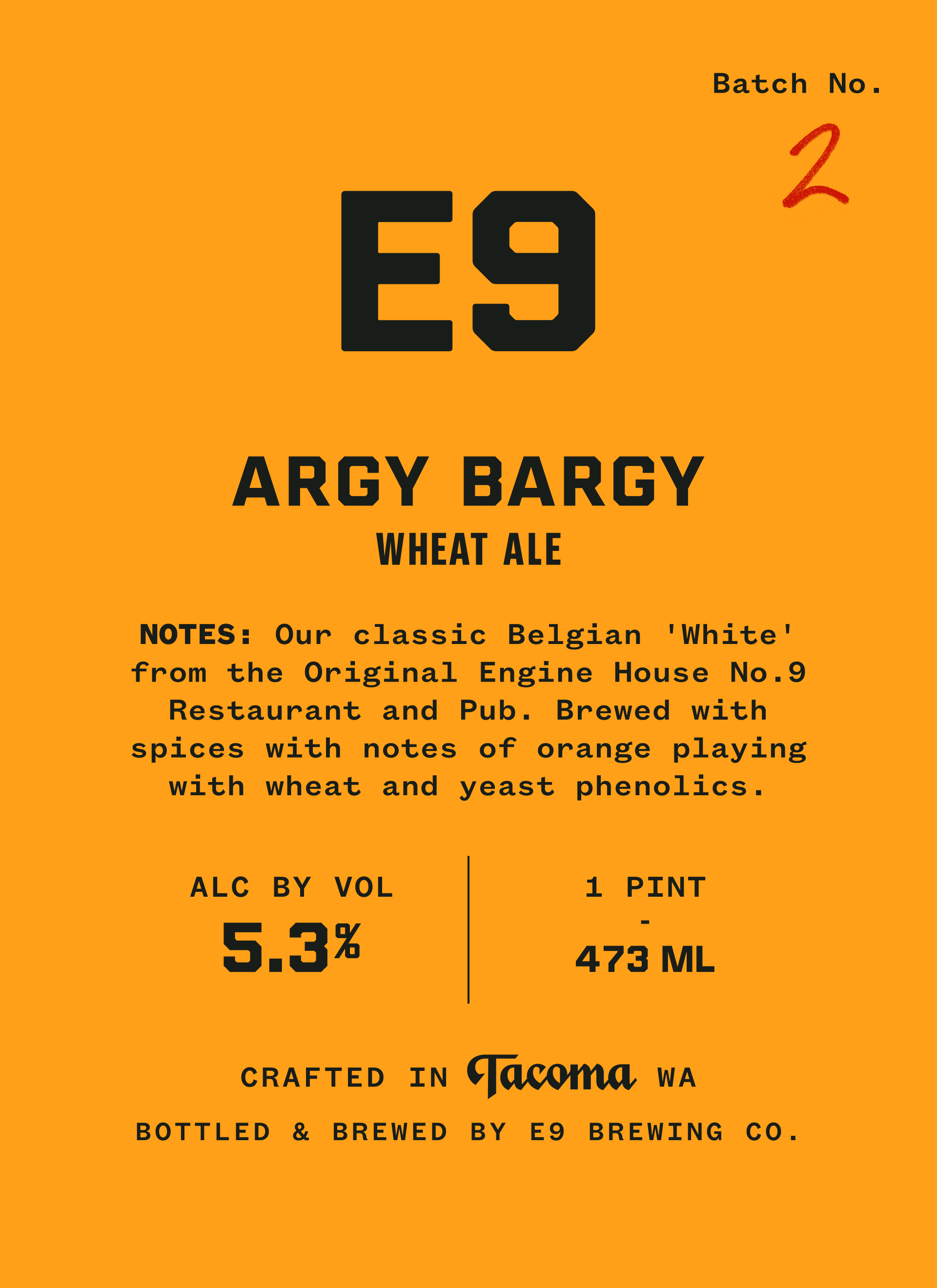
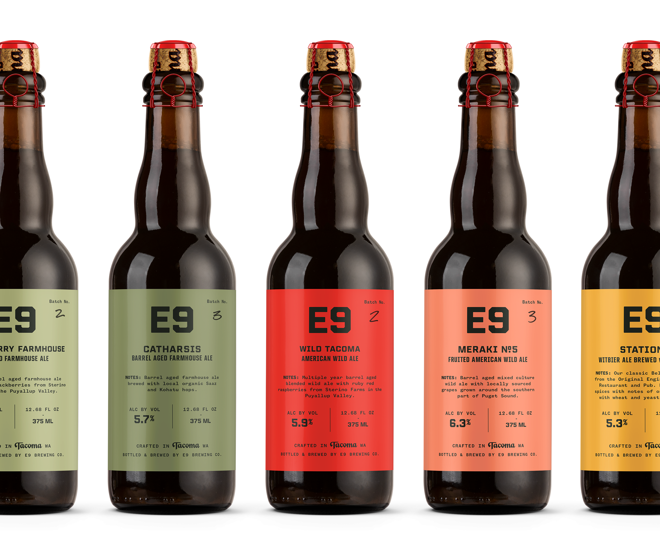
Packaging System
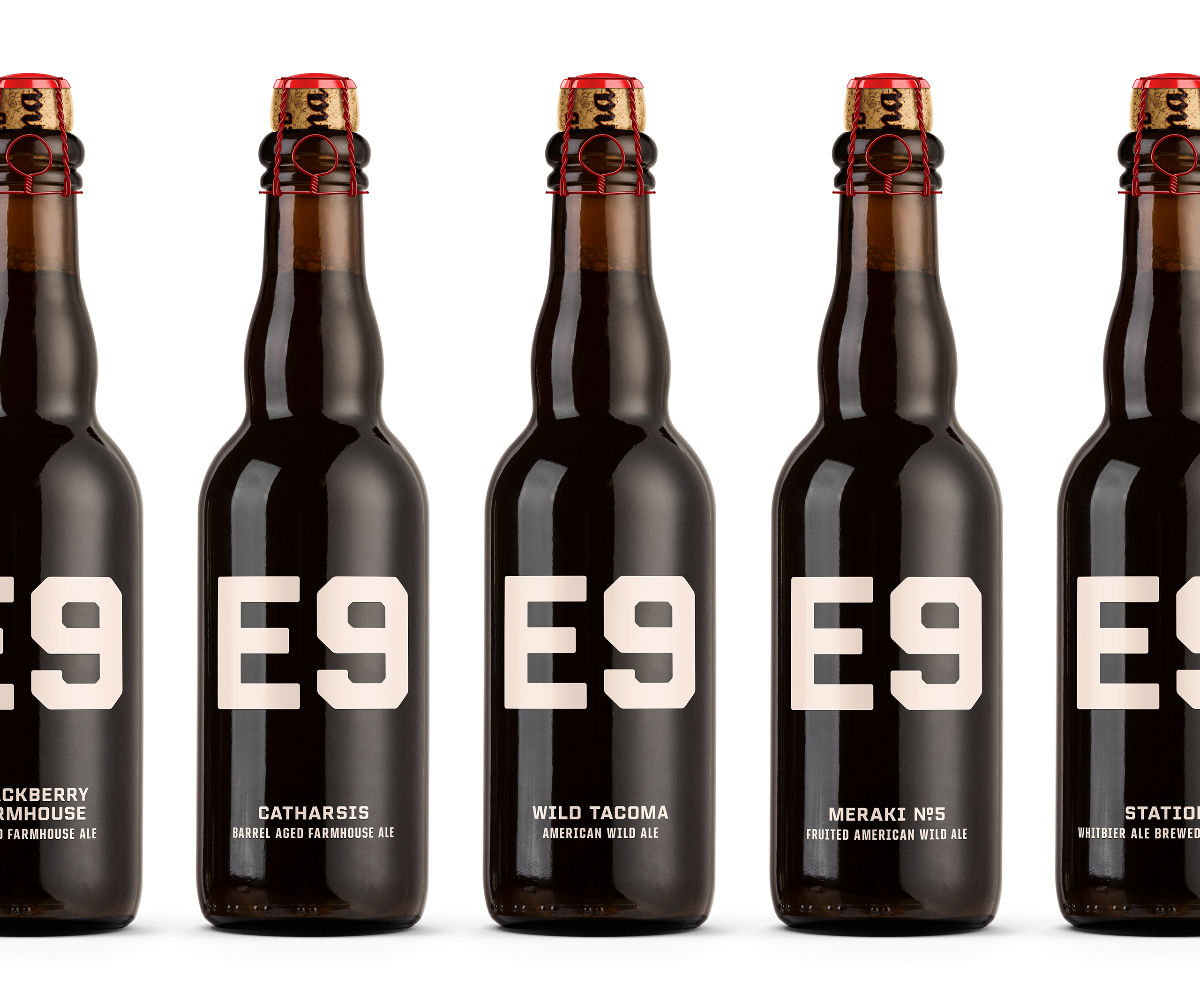
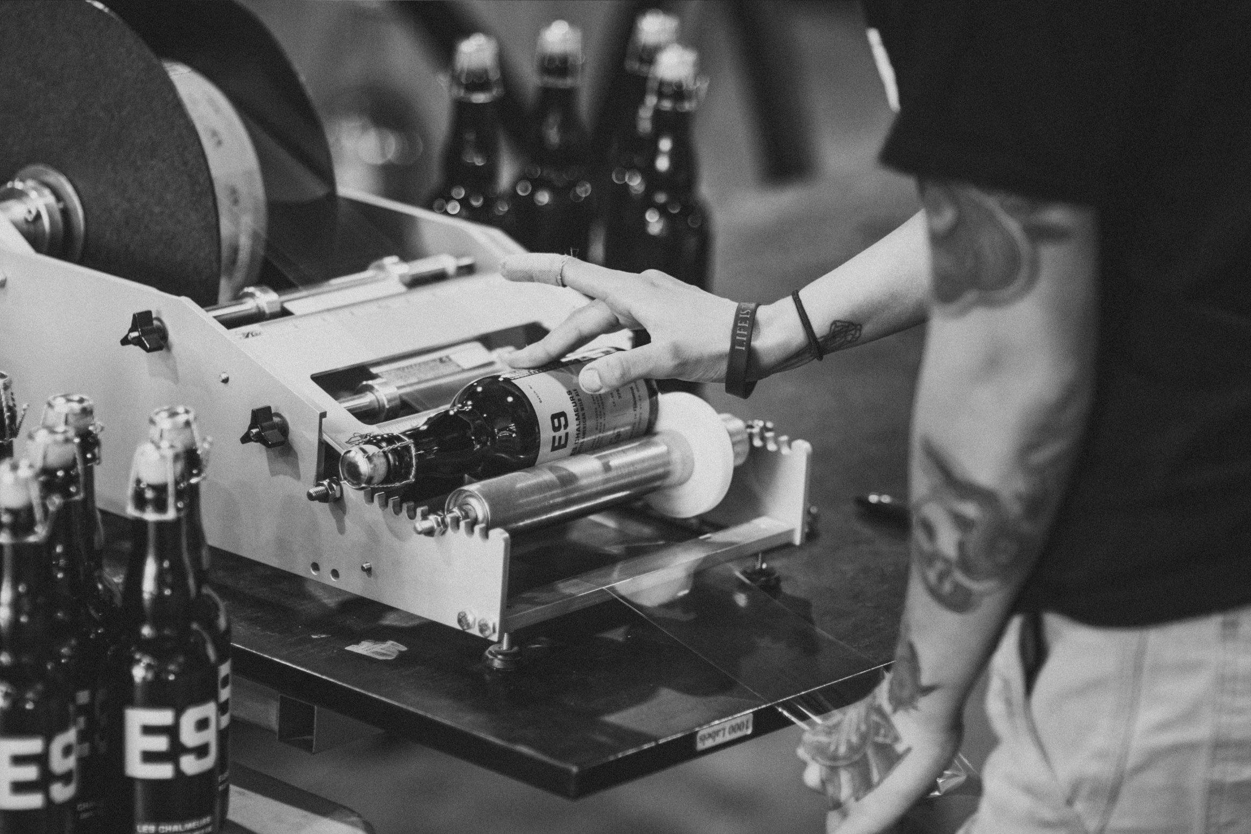
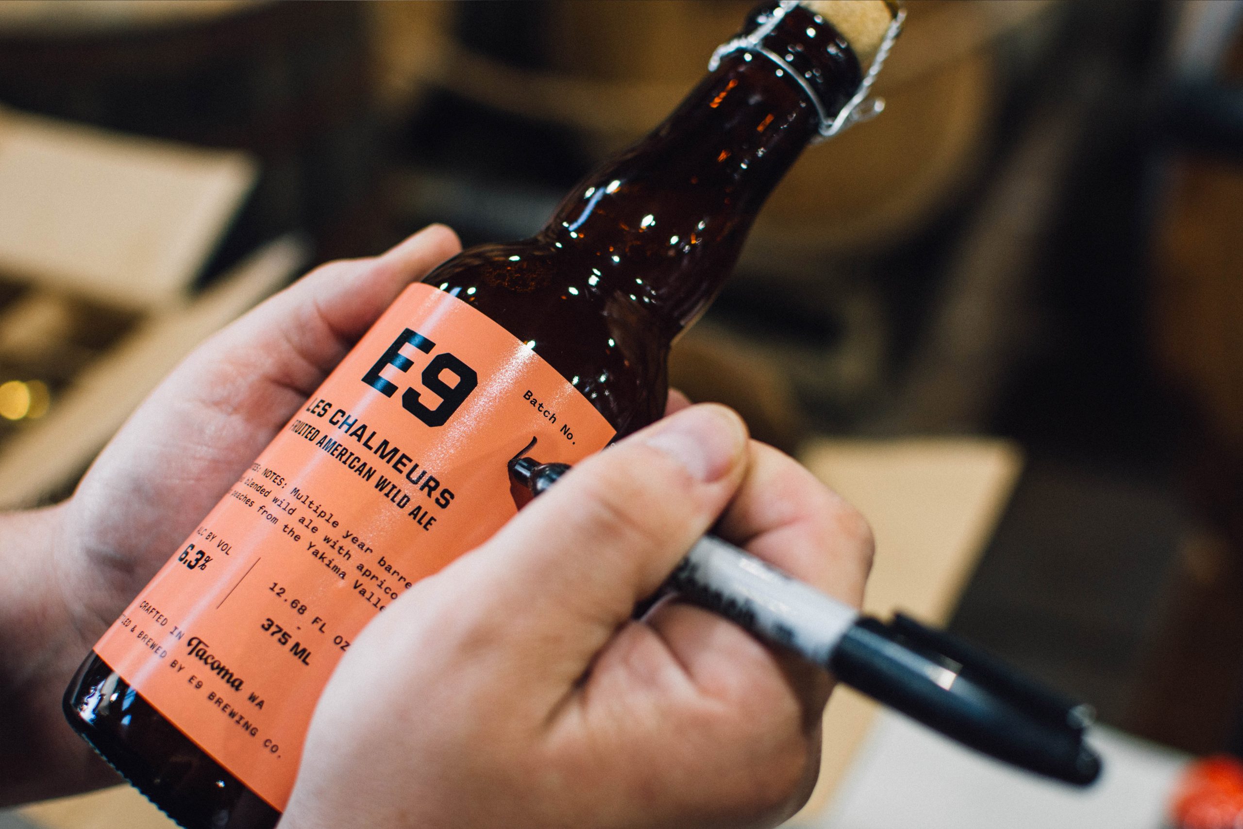
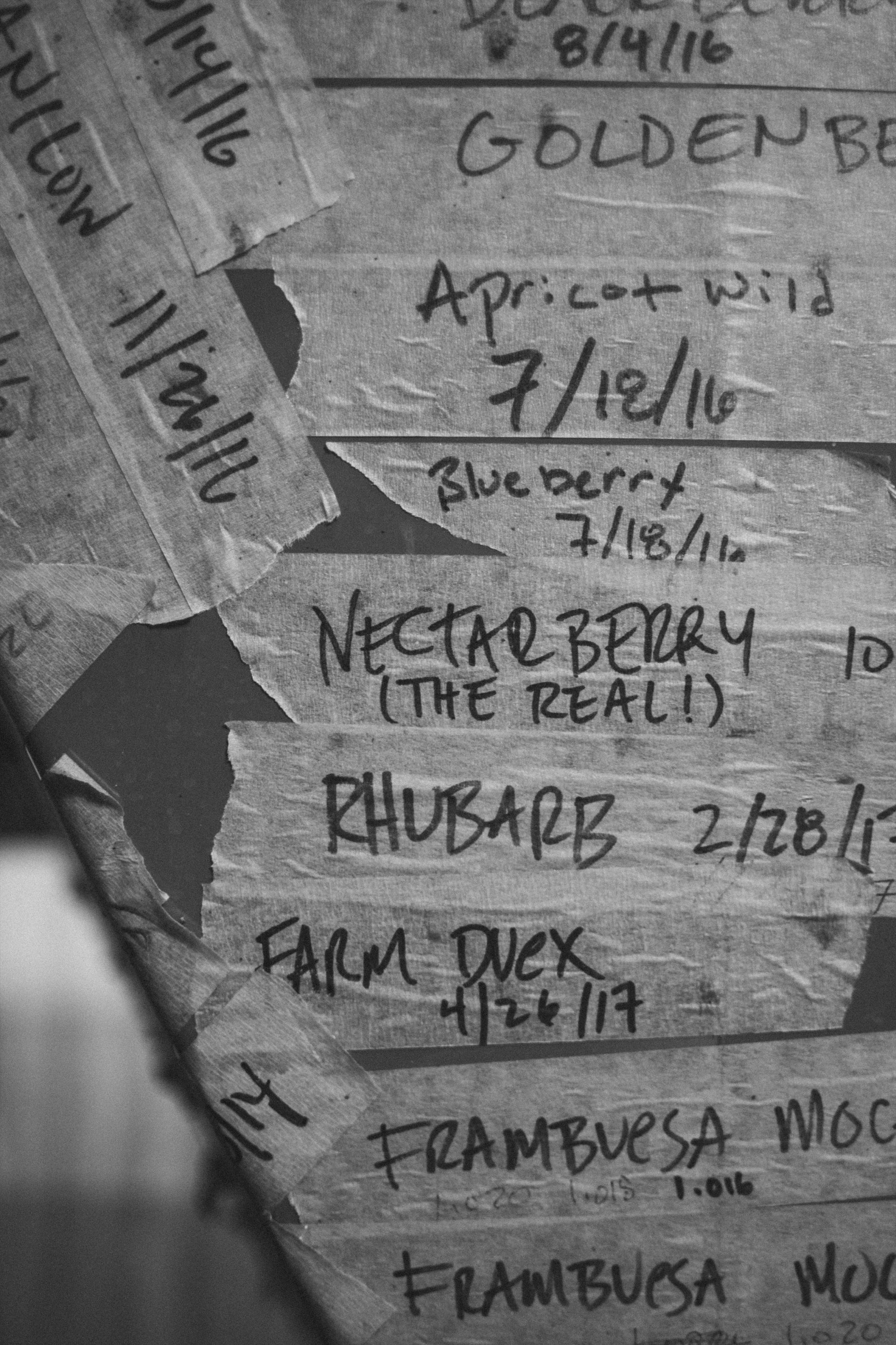
A hallmark of E9 is the shear variety of beer they produce every year. Solving for this was our top priority for designing this packaging system. We began by simplifying the overarching color categorization then married it with a utilitarian typographic design language. The solution was simple, efficient, predictable and never slows down production schedule.
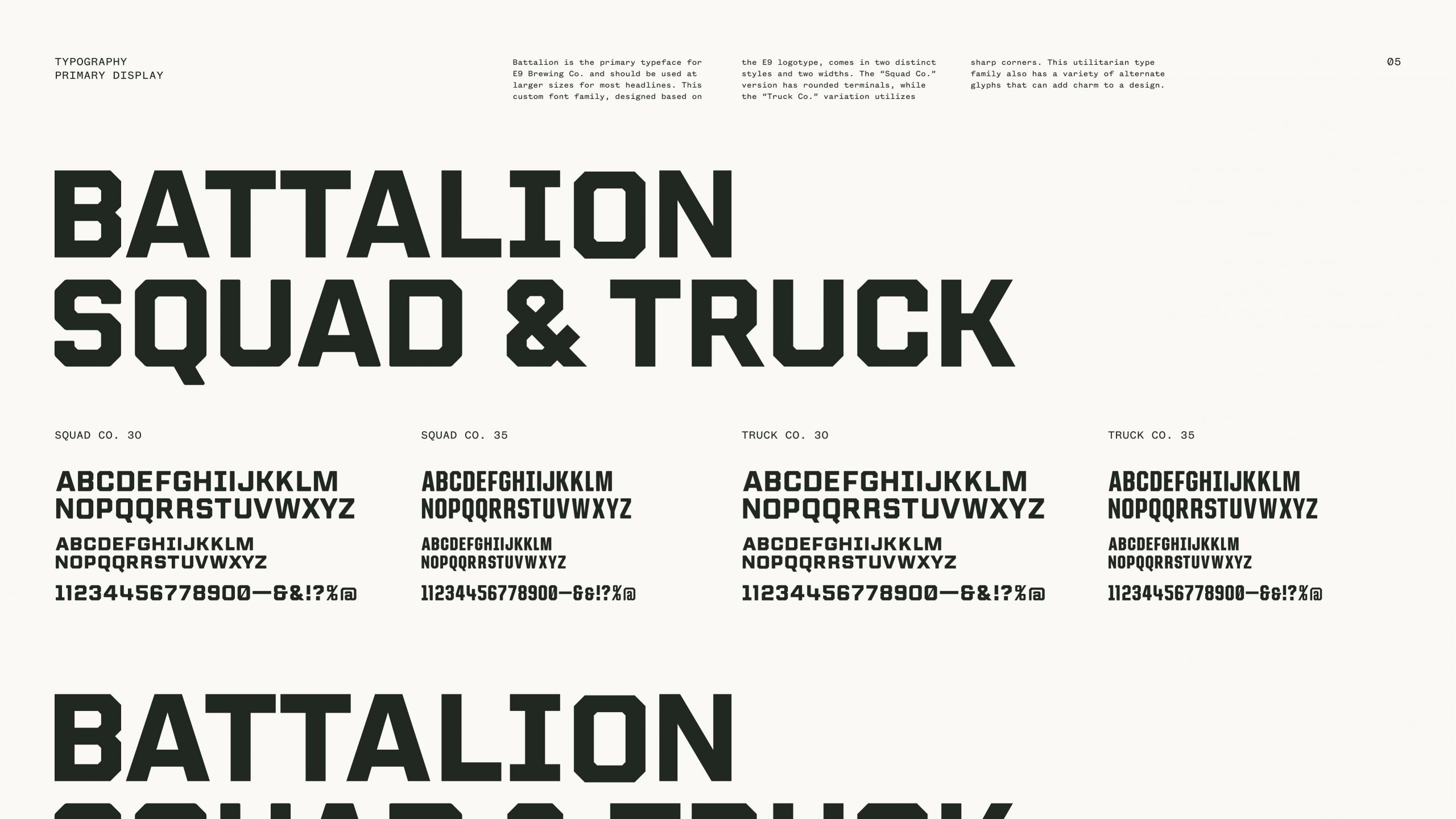
Battalion Typeface
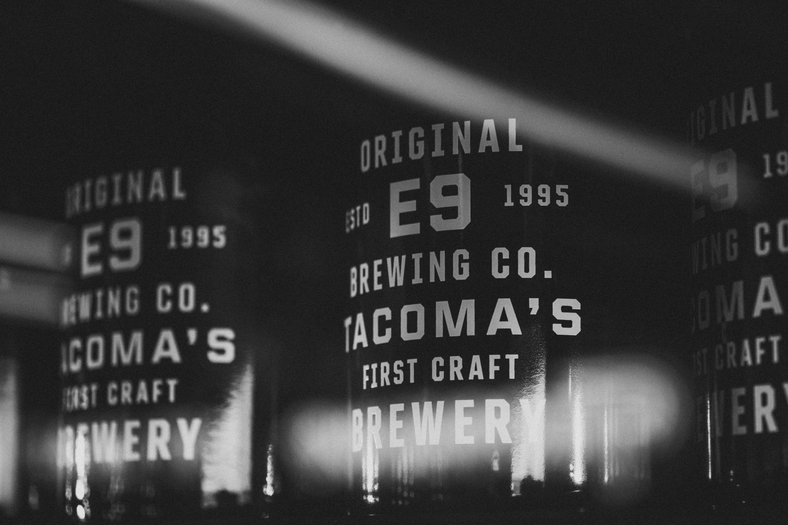
Because the E9 brand system relies so heavily on typography we developed a custom type family proprietary to E9. It comes in two widths and two finishes with a variety of alternates.
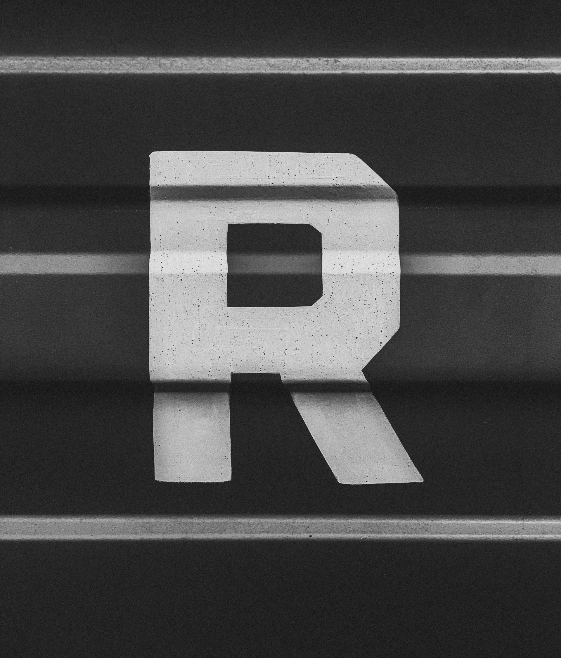
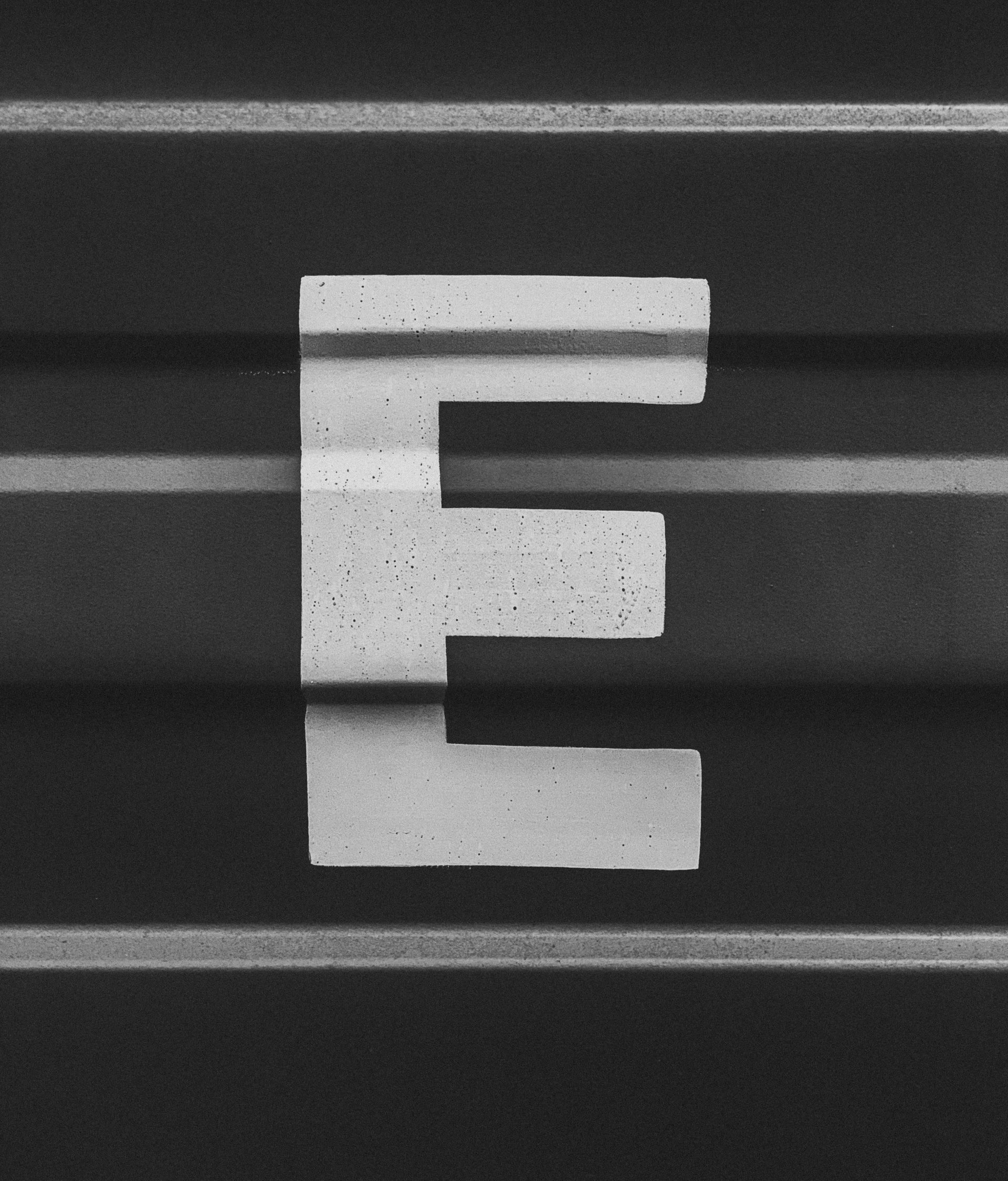
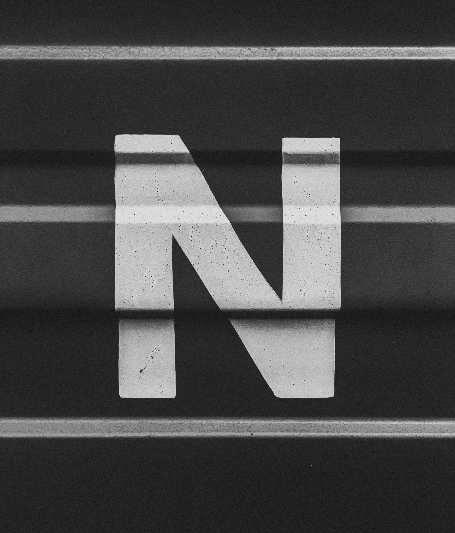
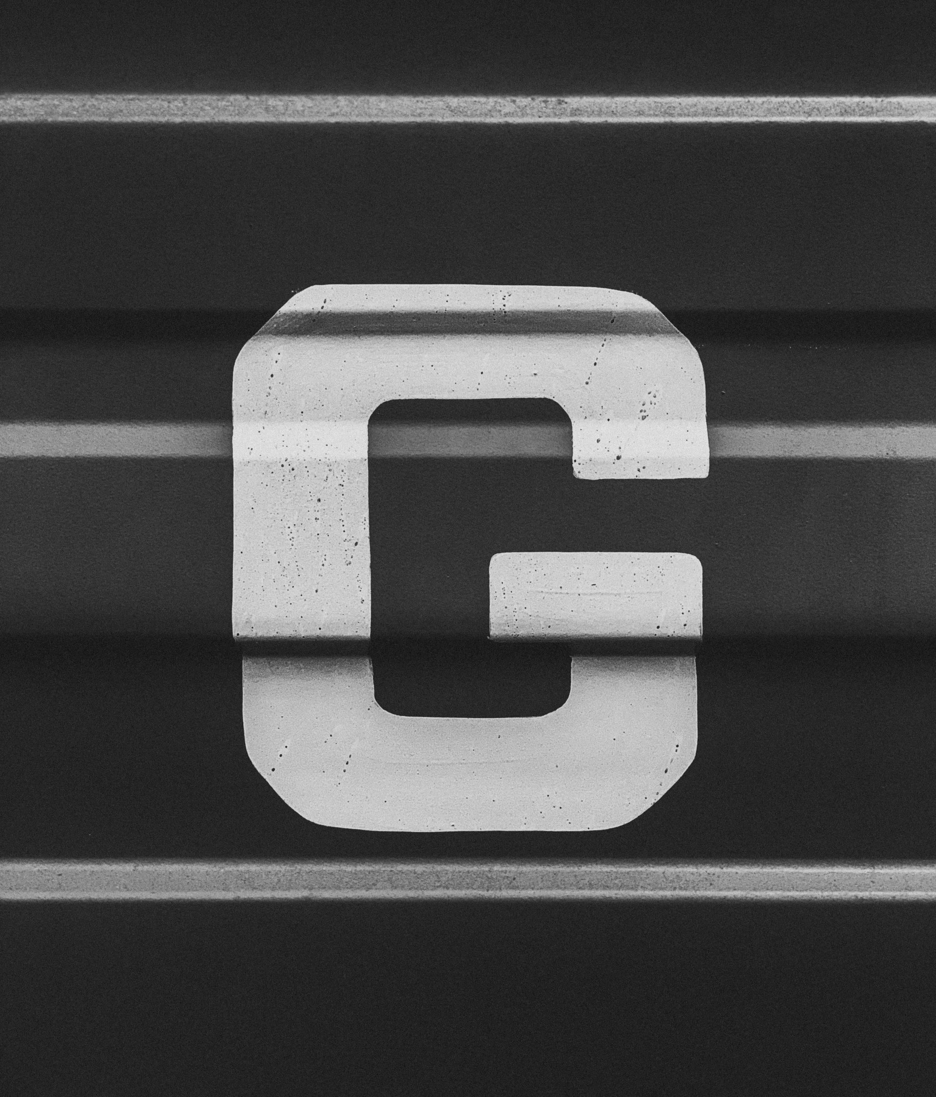
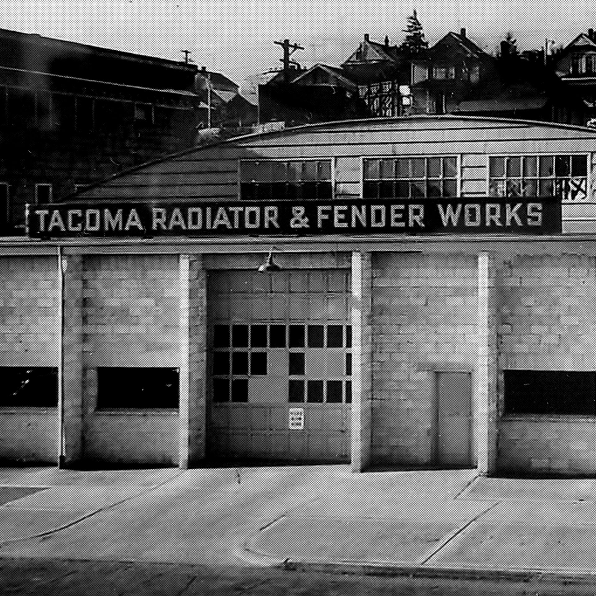
E9 expanded from its original engine house location into an old radiator shop. When developing the typeface, we took inspiration from the utilitarian letterforms on the building’s original signage to tie it to the history of their new location.
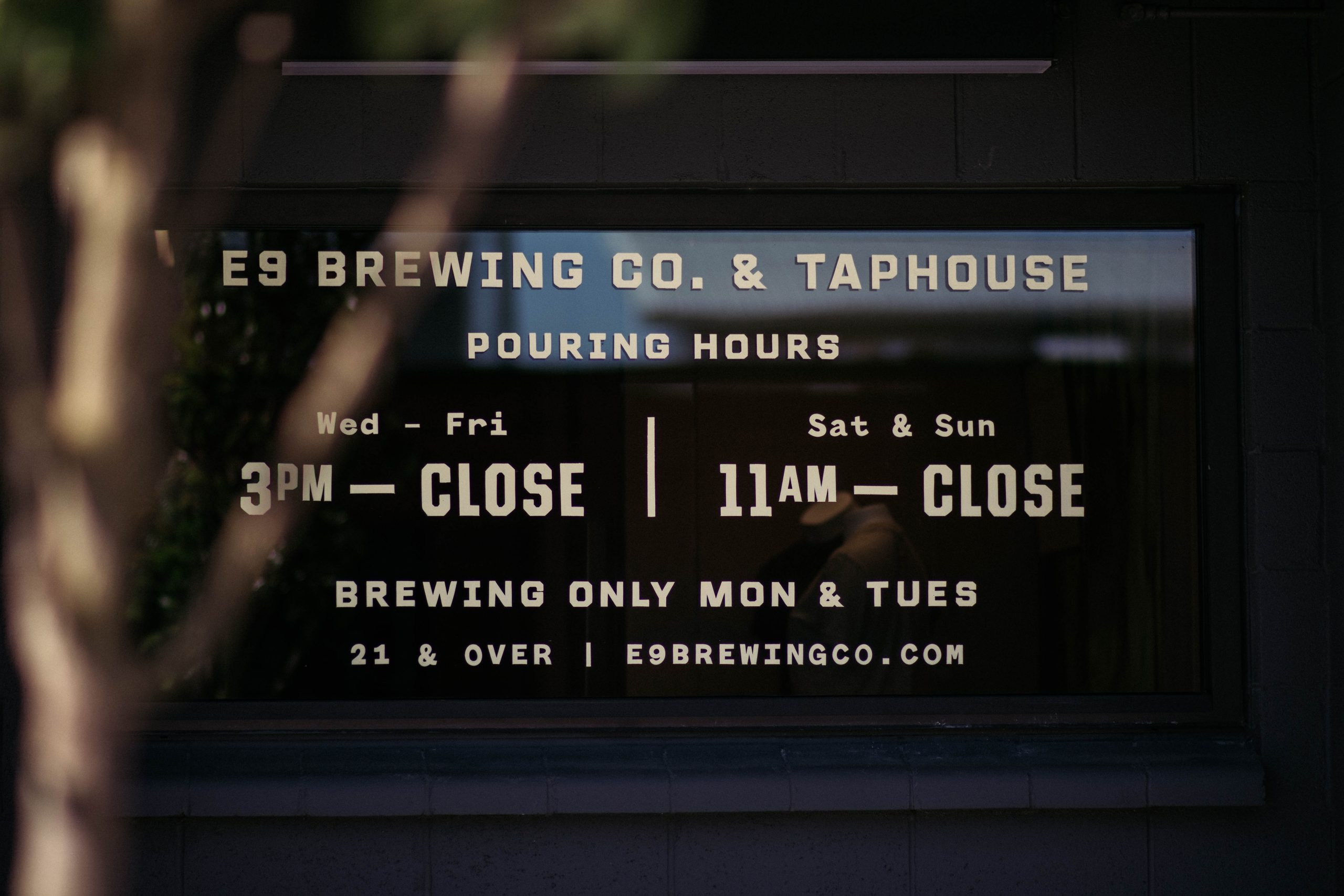
Signage
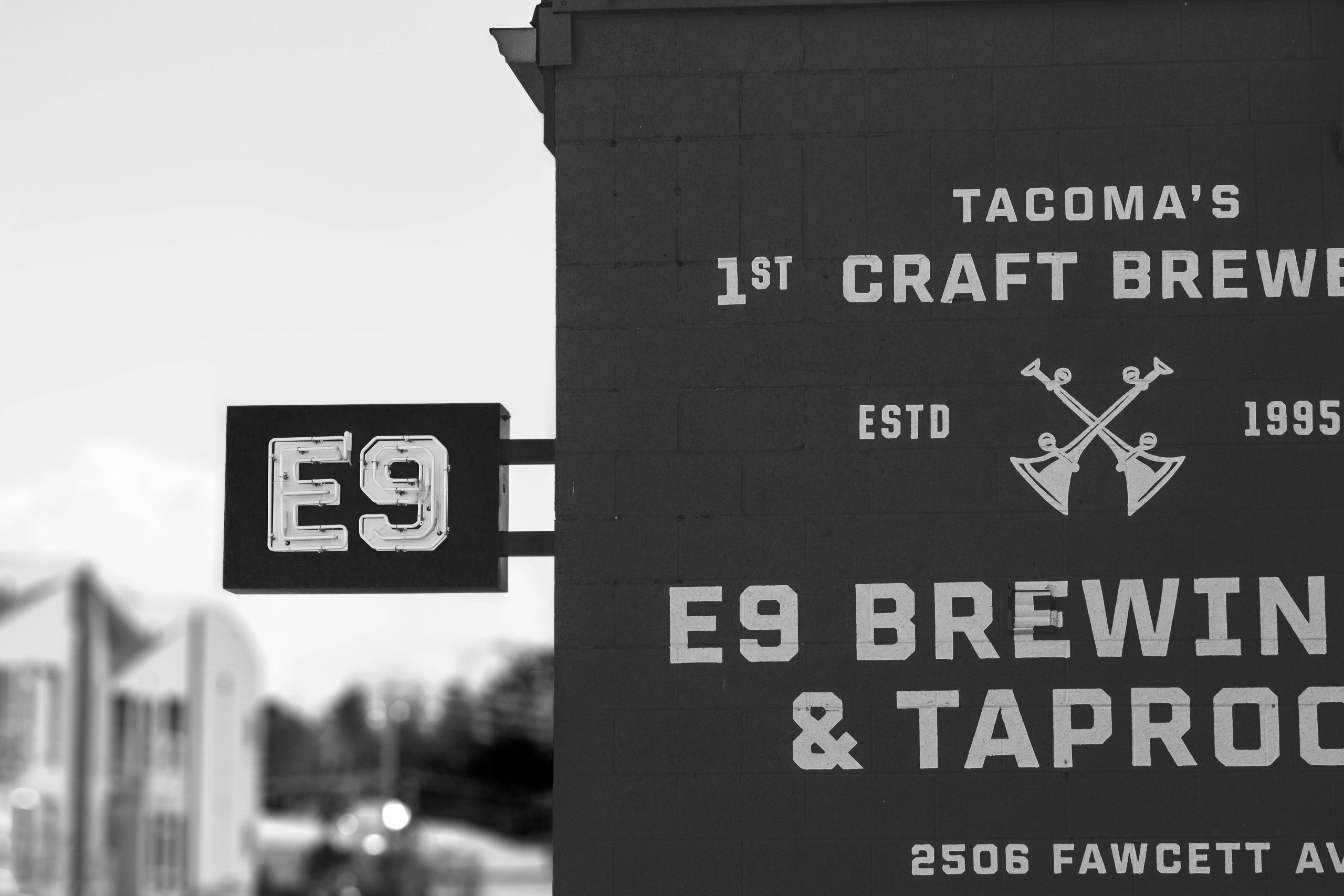
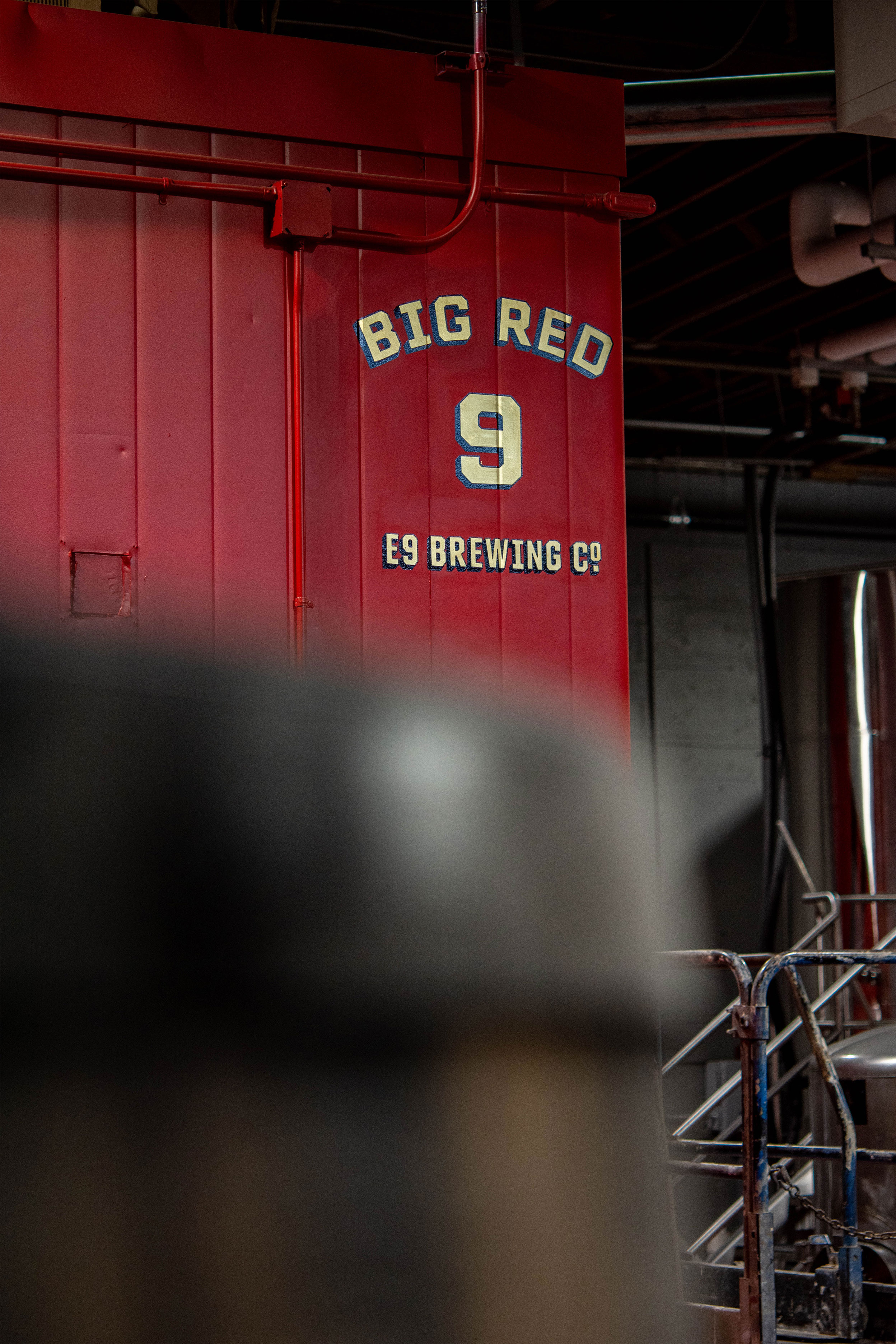
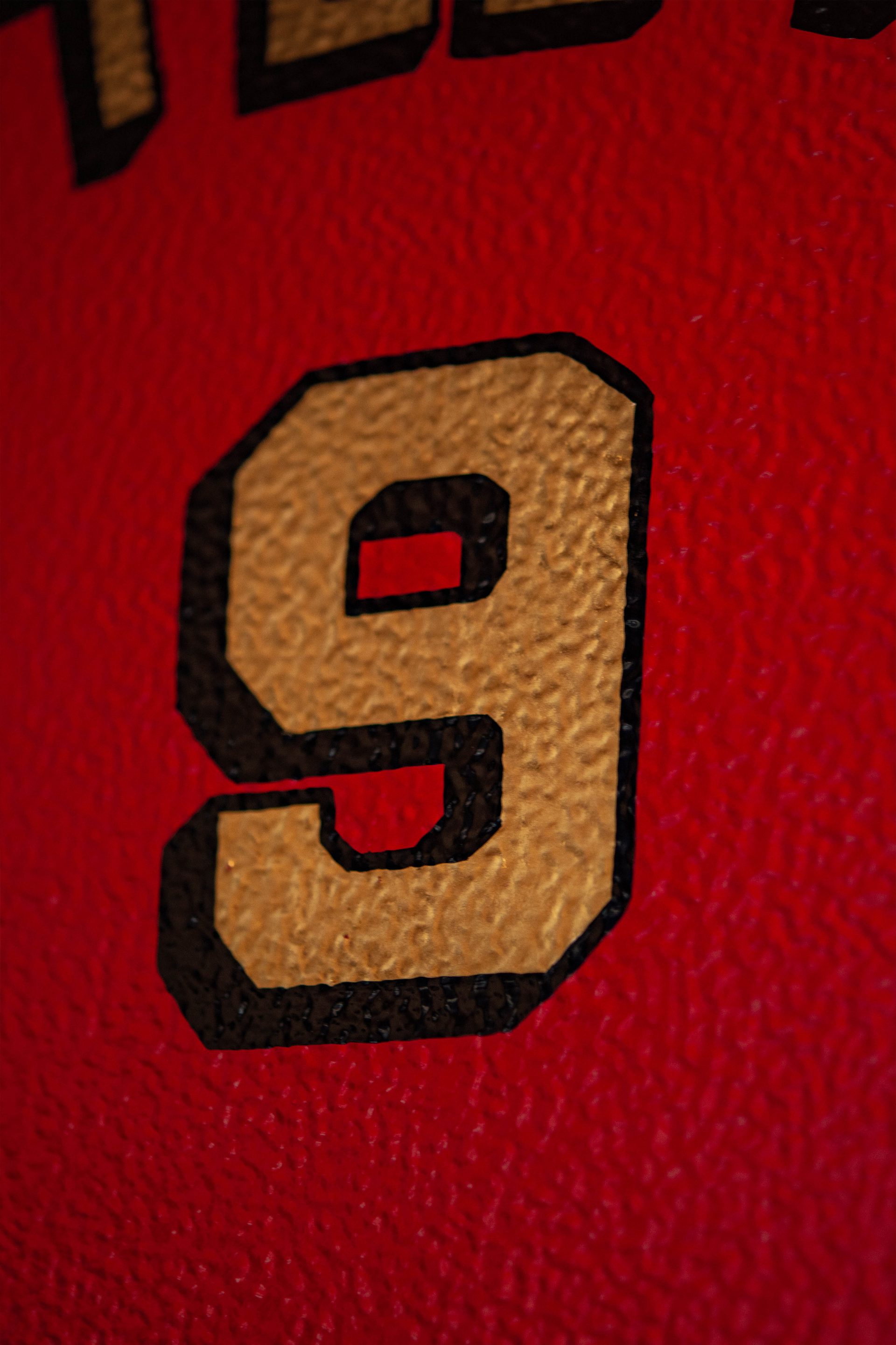
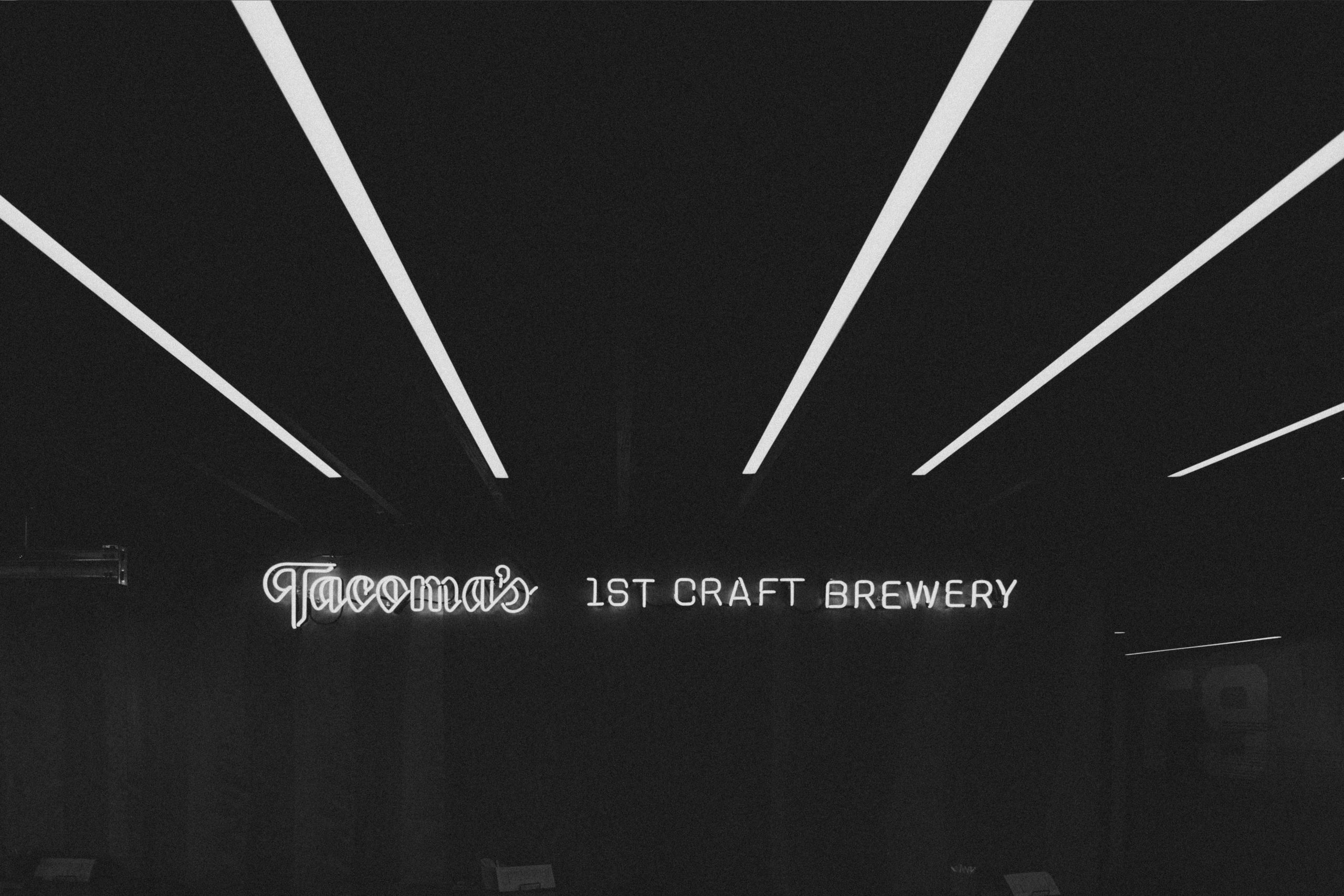
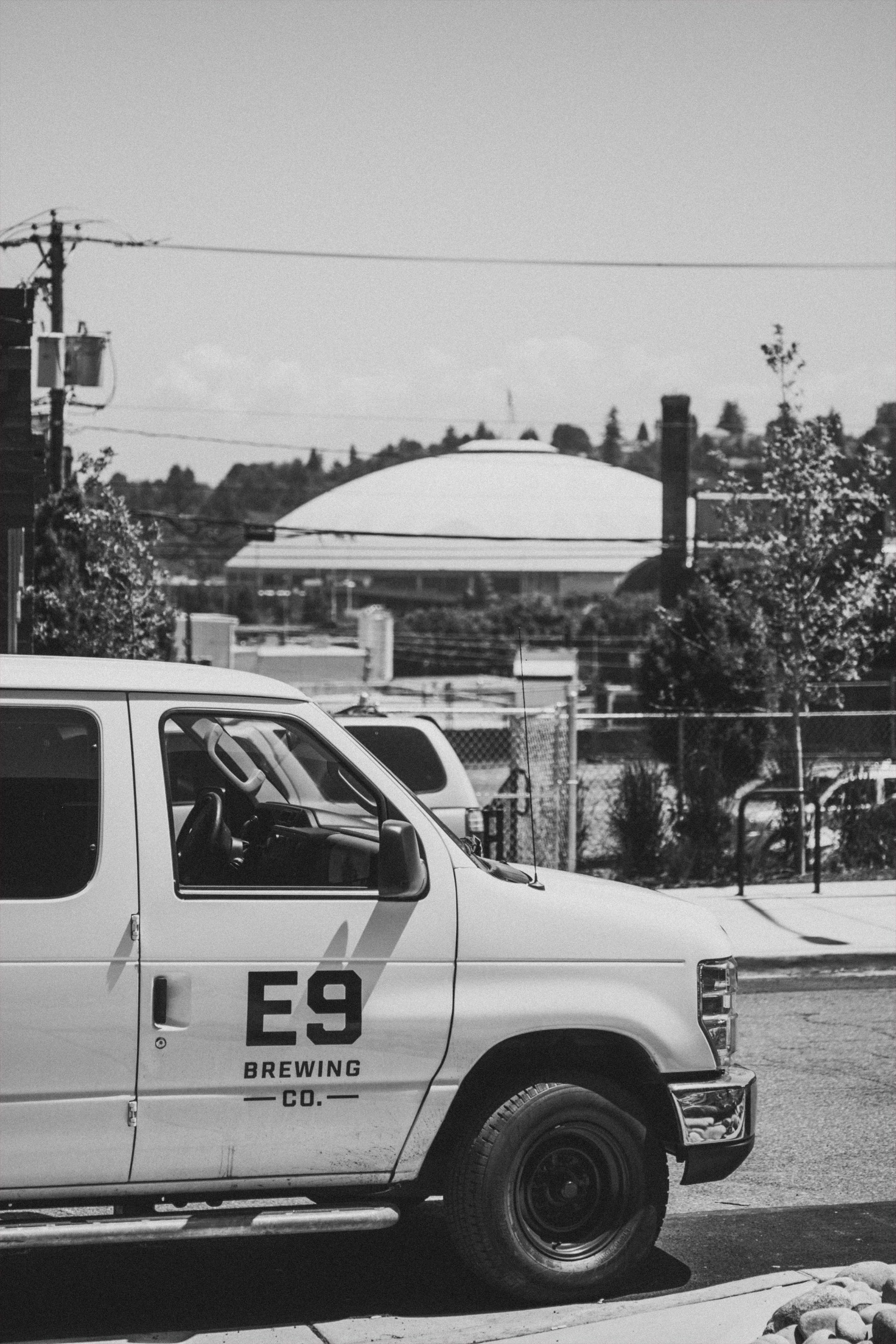
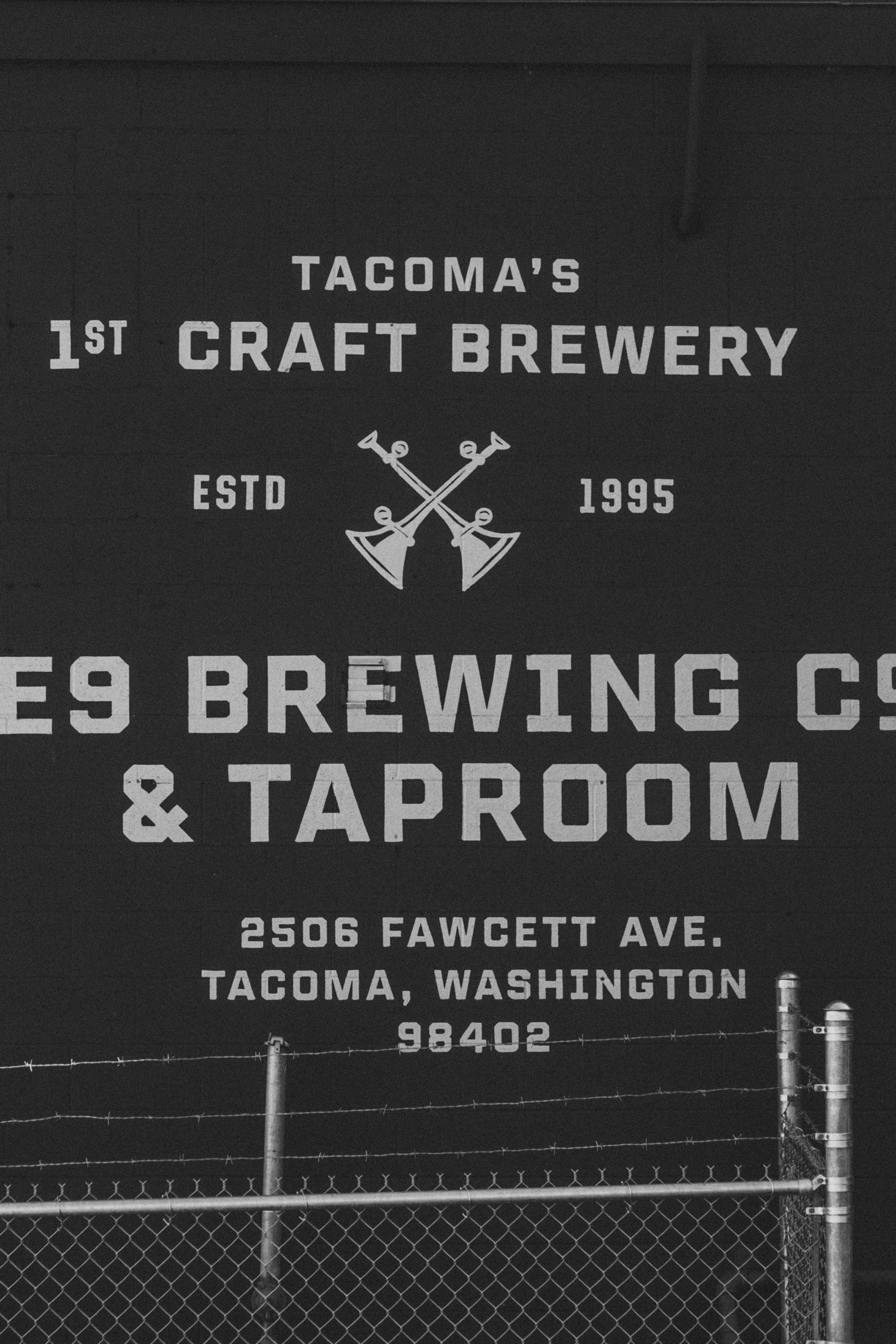
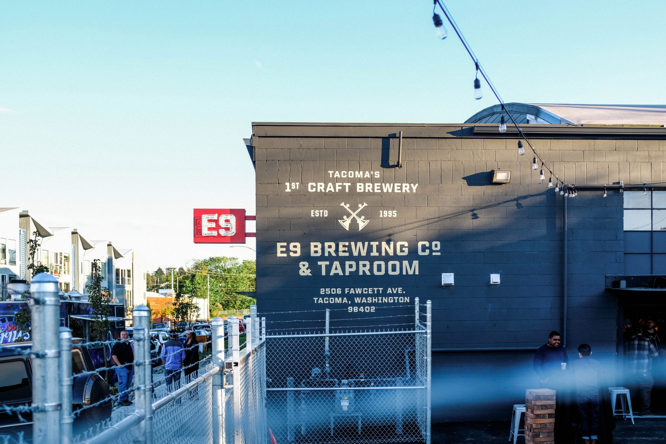
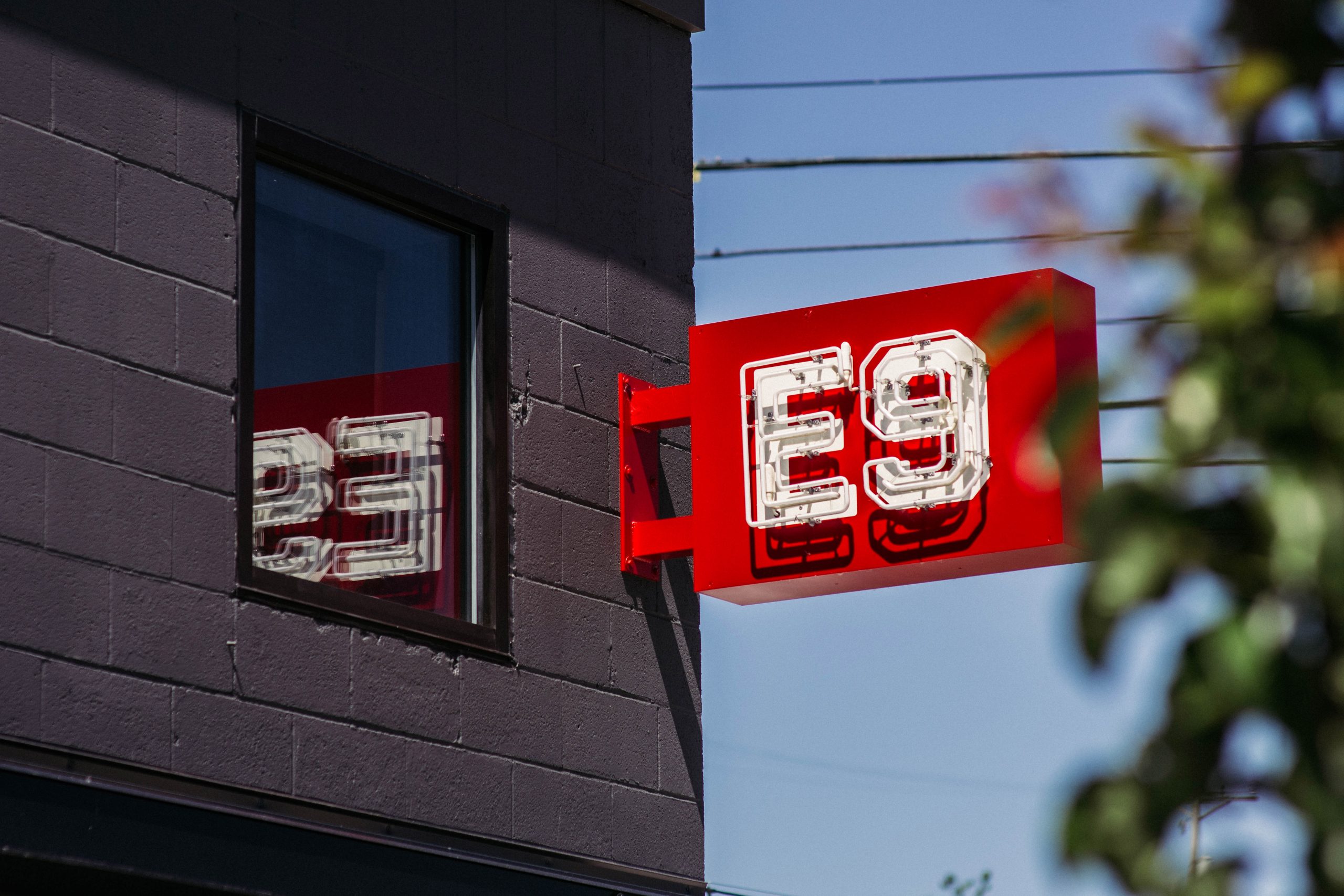
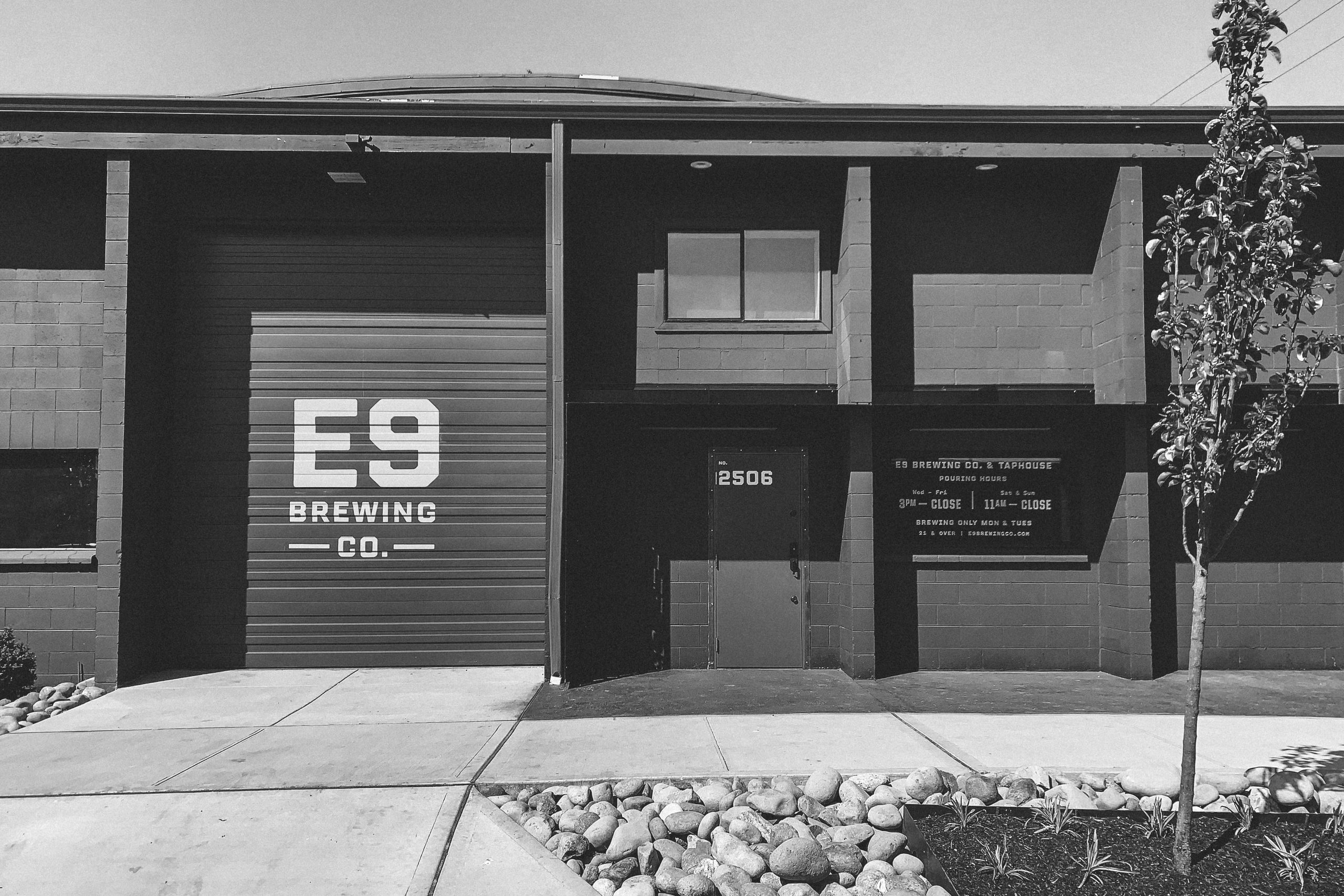
The signage package we created for E9 merges the old with the new. From the artistry of hand-painted lettering to their iconic red neon sign acting as a beacon in the heart of Tacoma’s emerging brewery district
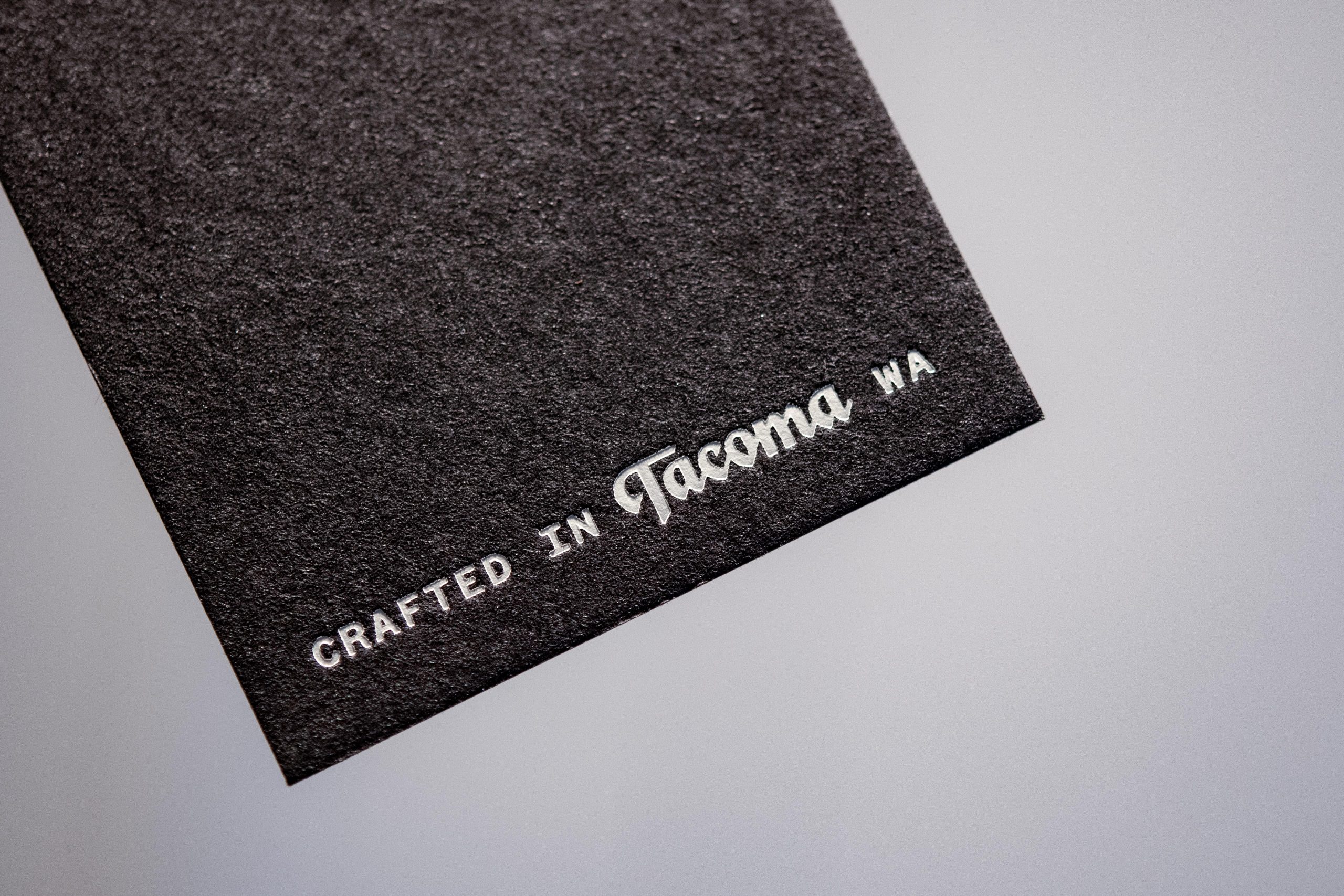
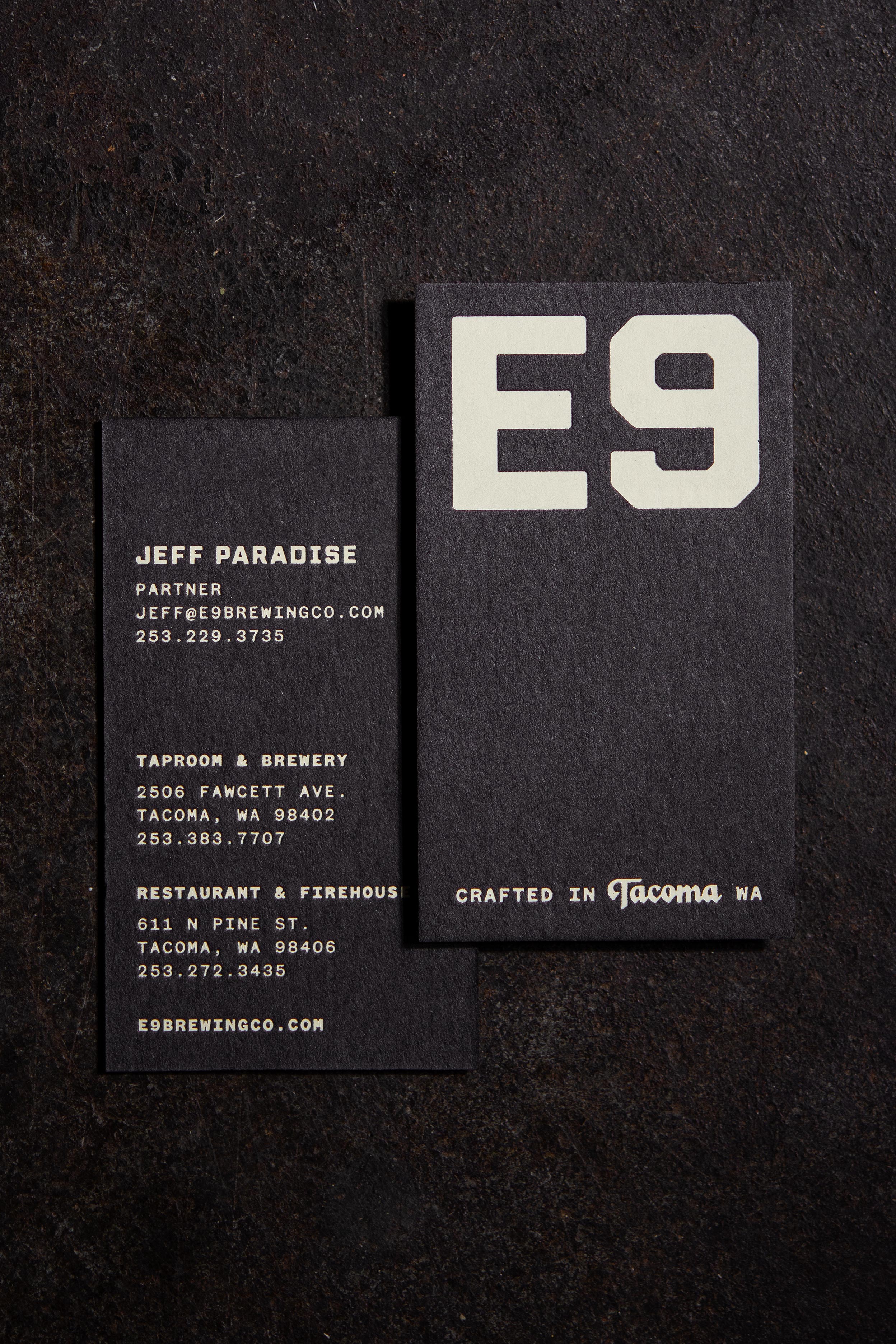
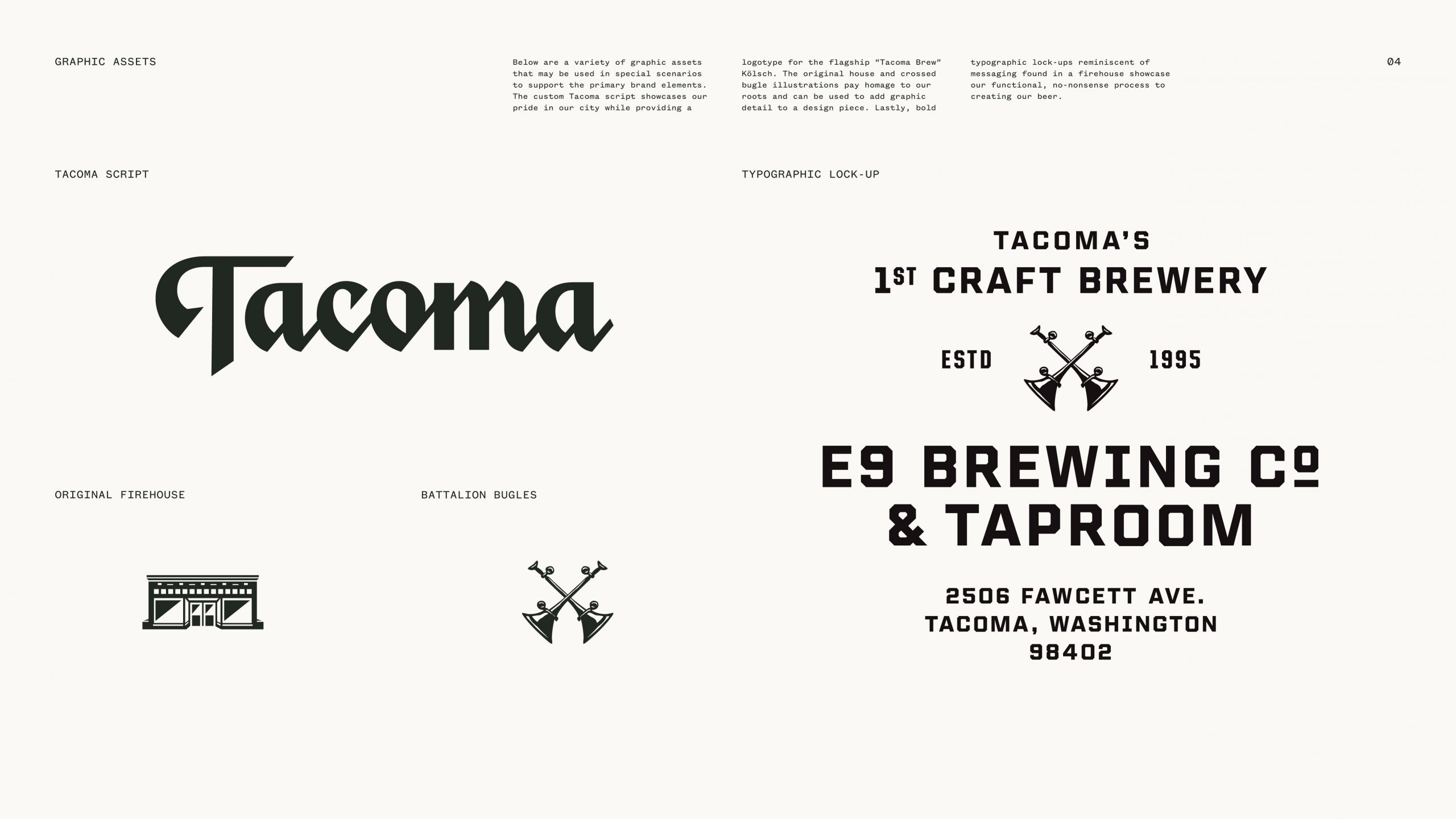
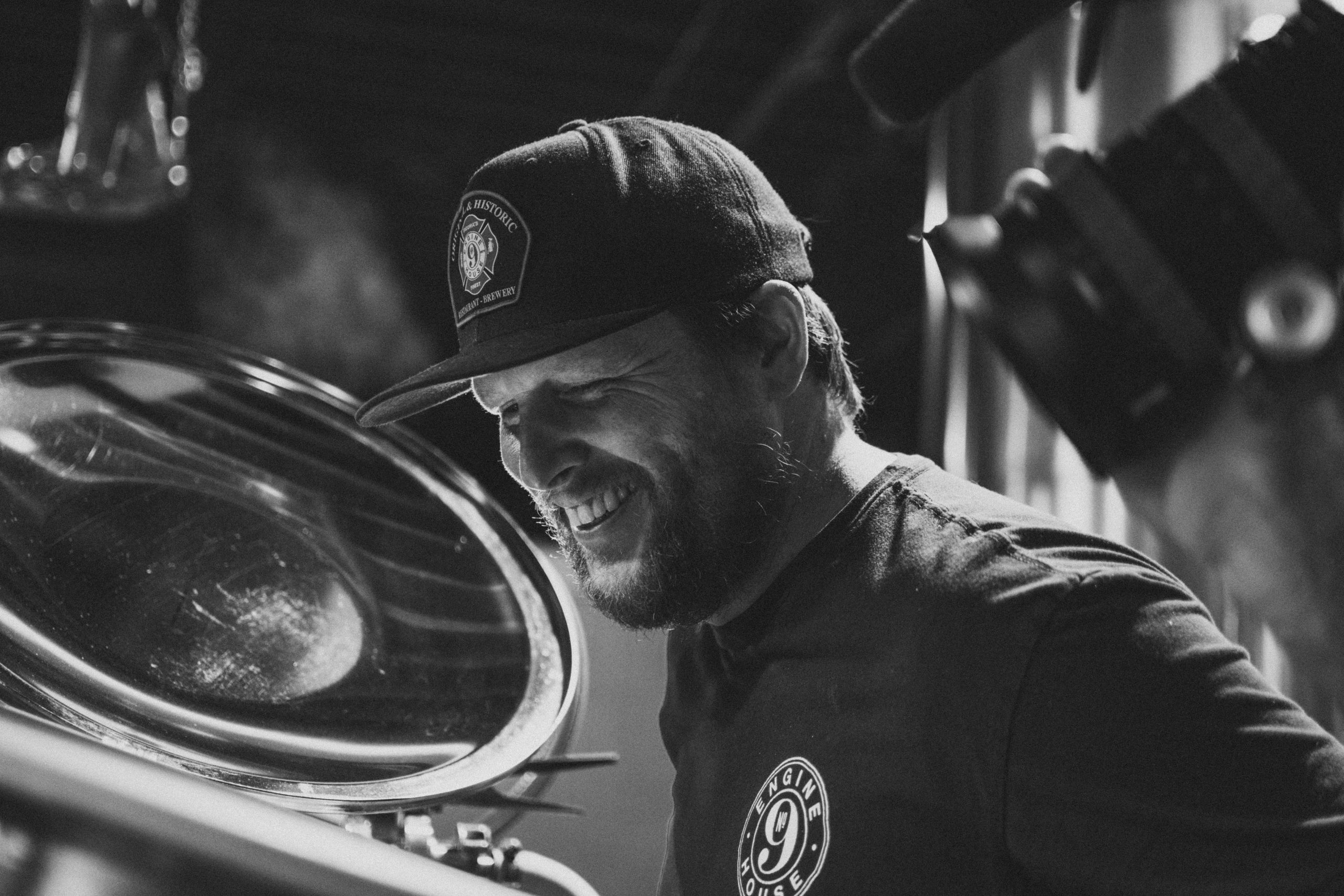
To keep the brand system simple and spare we limited the amount of graphic elements we used. However, the graphic elements we did create are meaningful, functional and reusable. Because the original Engine House No. 9 was the fire battalion headquarters we used the crossed bugles as they are a symbol of battalion chief. The illustration of the original engine house acts a reminder of E9s history. The custom Tacoma script exudes pride for the brewery’s grit city roots.
