Sullivan’s Steakhouse
Project InfoIn 1996 the first Sullivan’s Steakhouse opened its doors in Austin, Texas. Known for it’s speakeasy atmosphere, Texas-sized everything and nightly live jazz music they quickly began to garner a loyal following. Since then, they have opened twelve new locations that continue in this tradition while keeping the local flare intact of the cities they call home. To support with their expansion, Column developed a brand system that evokes the charm of the original Sullivan’s but allows for small touches at the local level to help generate a familiar neighborly atmosphere.
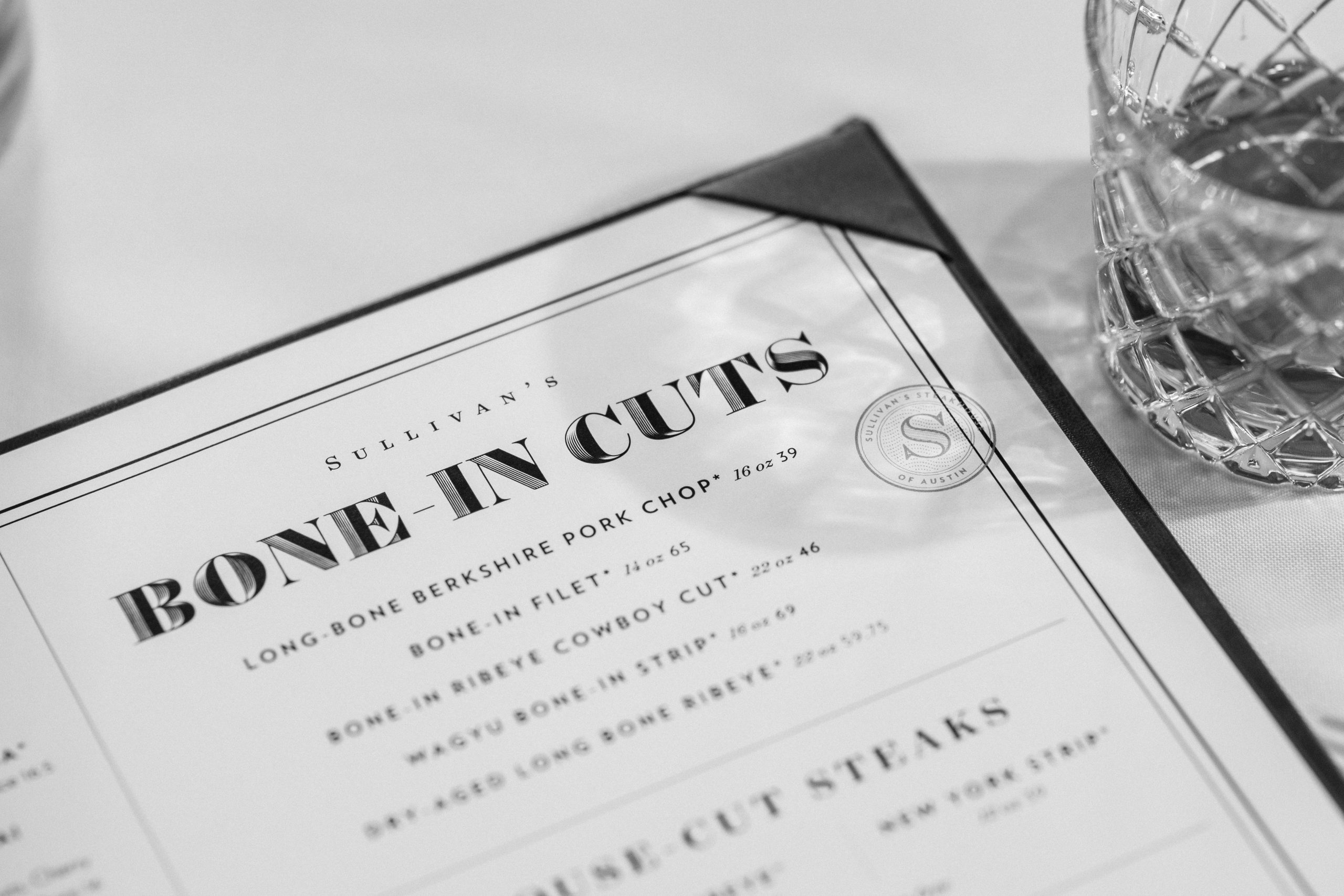
In addition to refreshing Sullivan’s main logo, we developed a set of localized seals for each location that is stamped onto menus, bags and even location specific microsites.
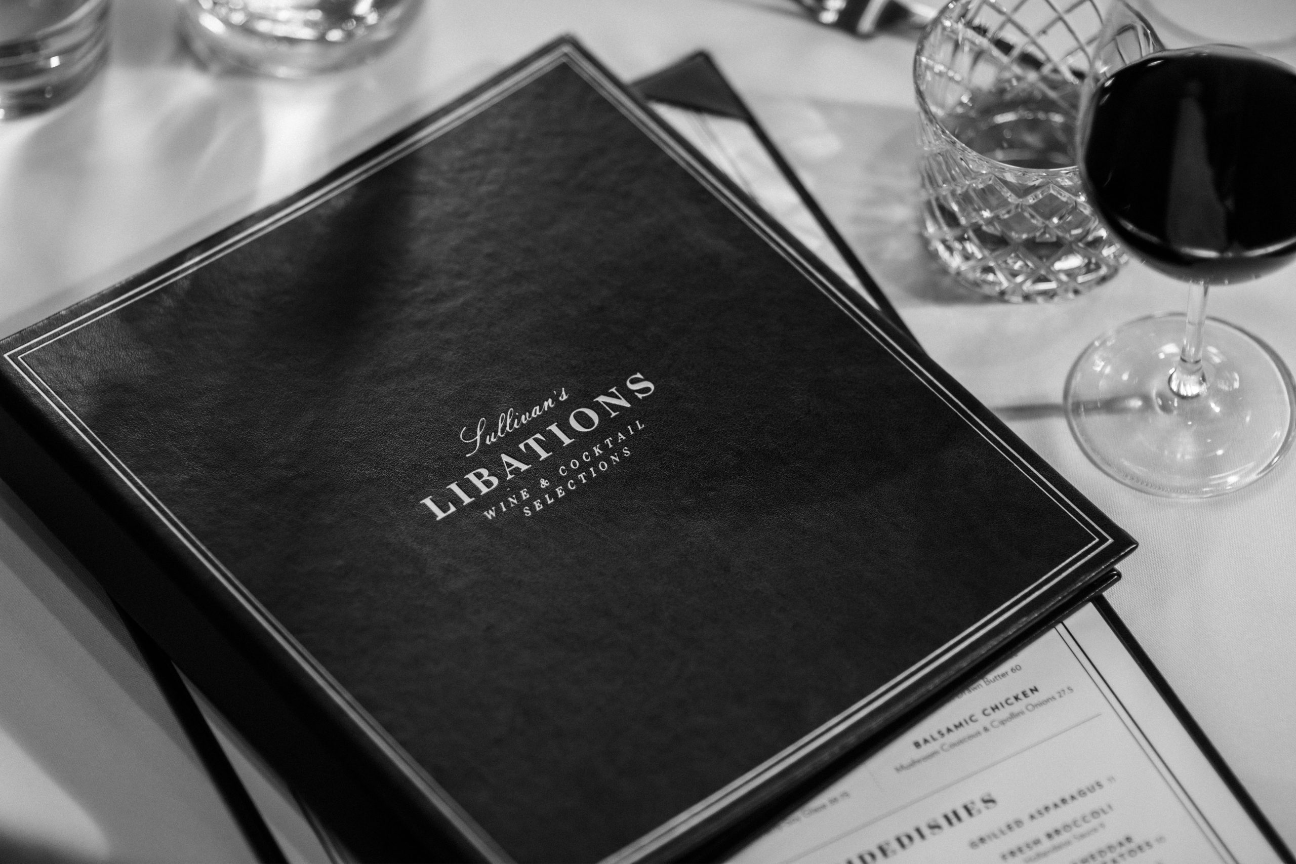
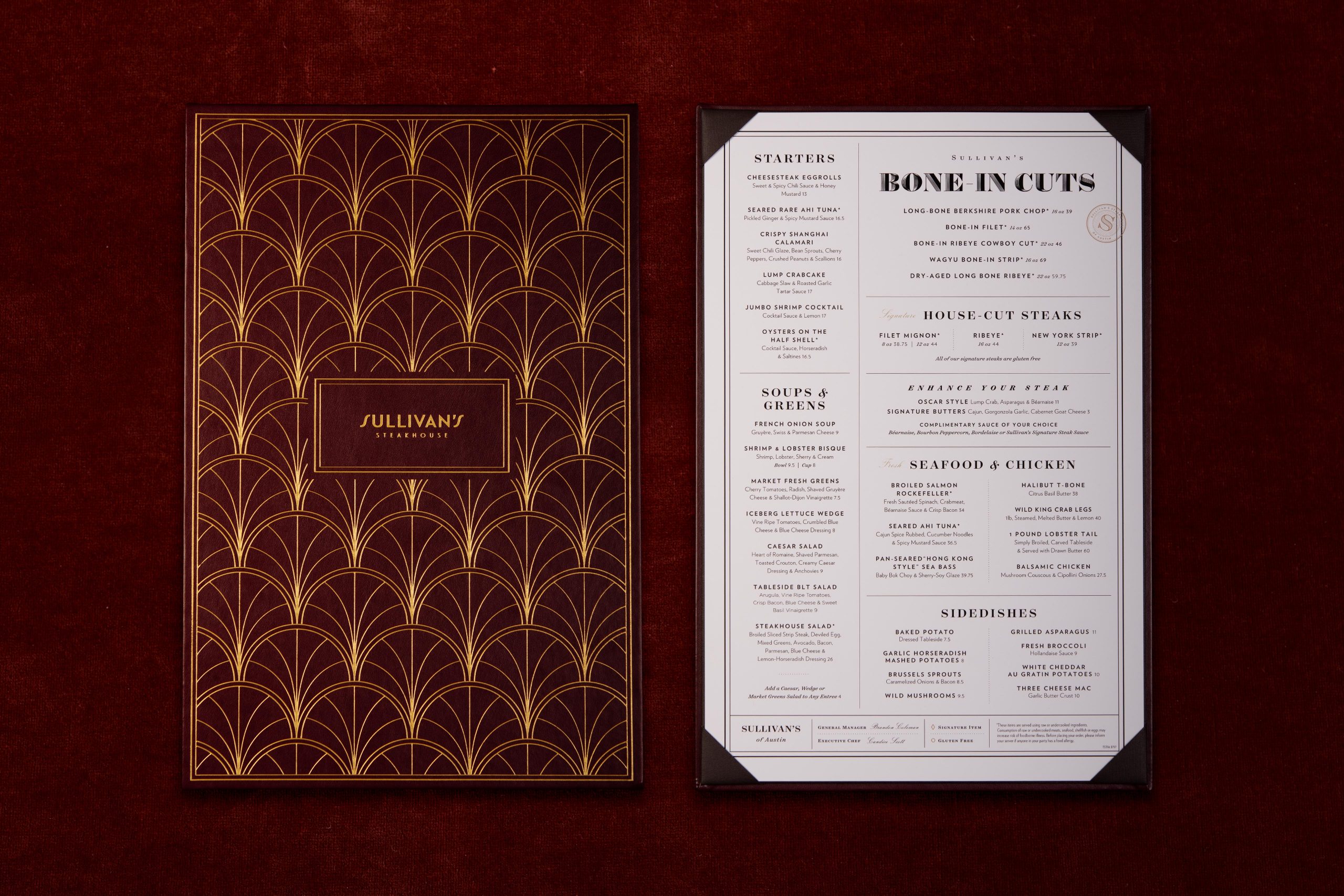
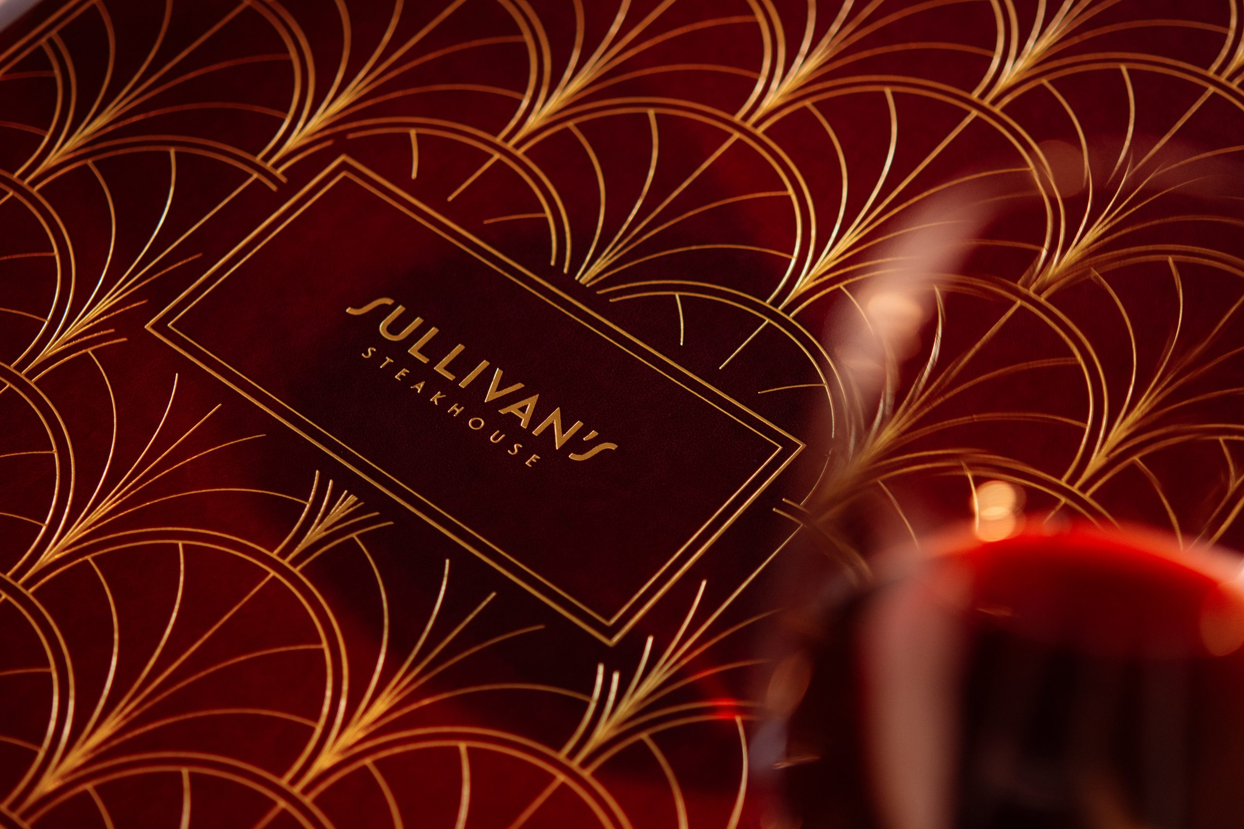
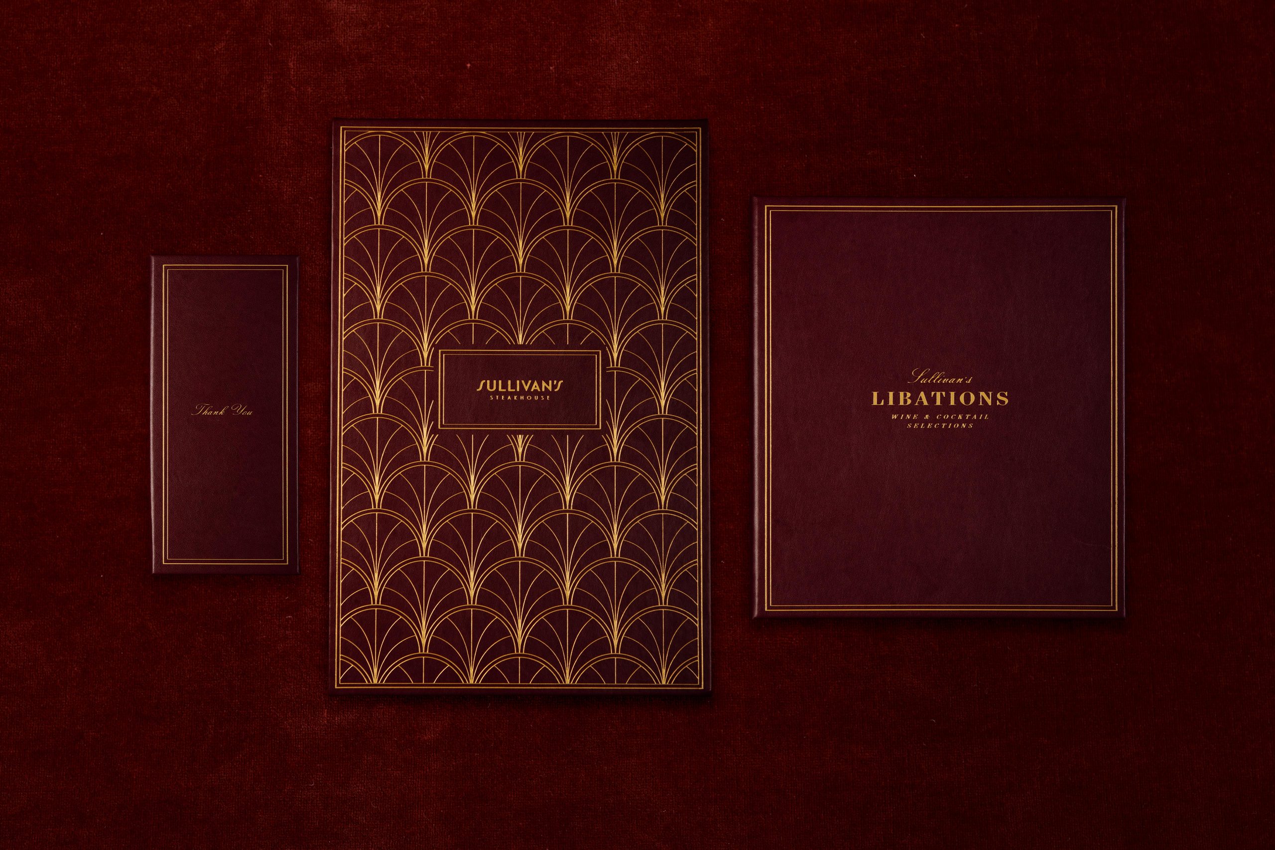
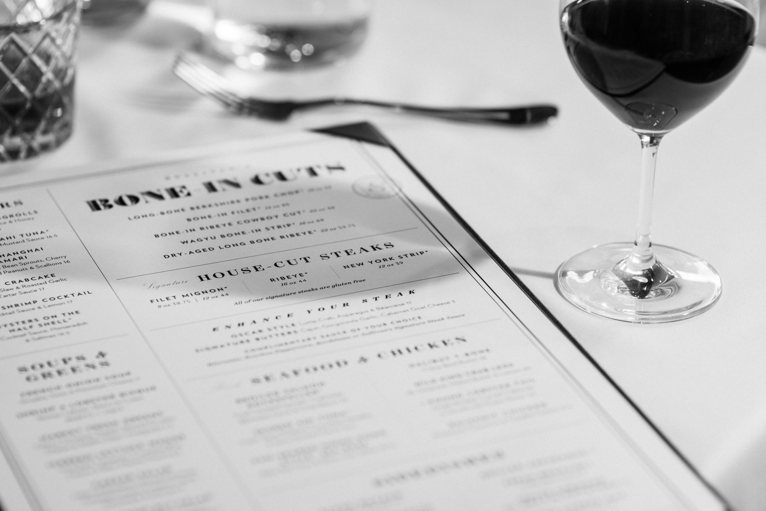
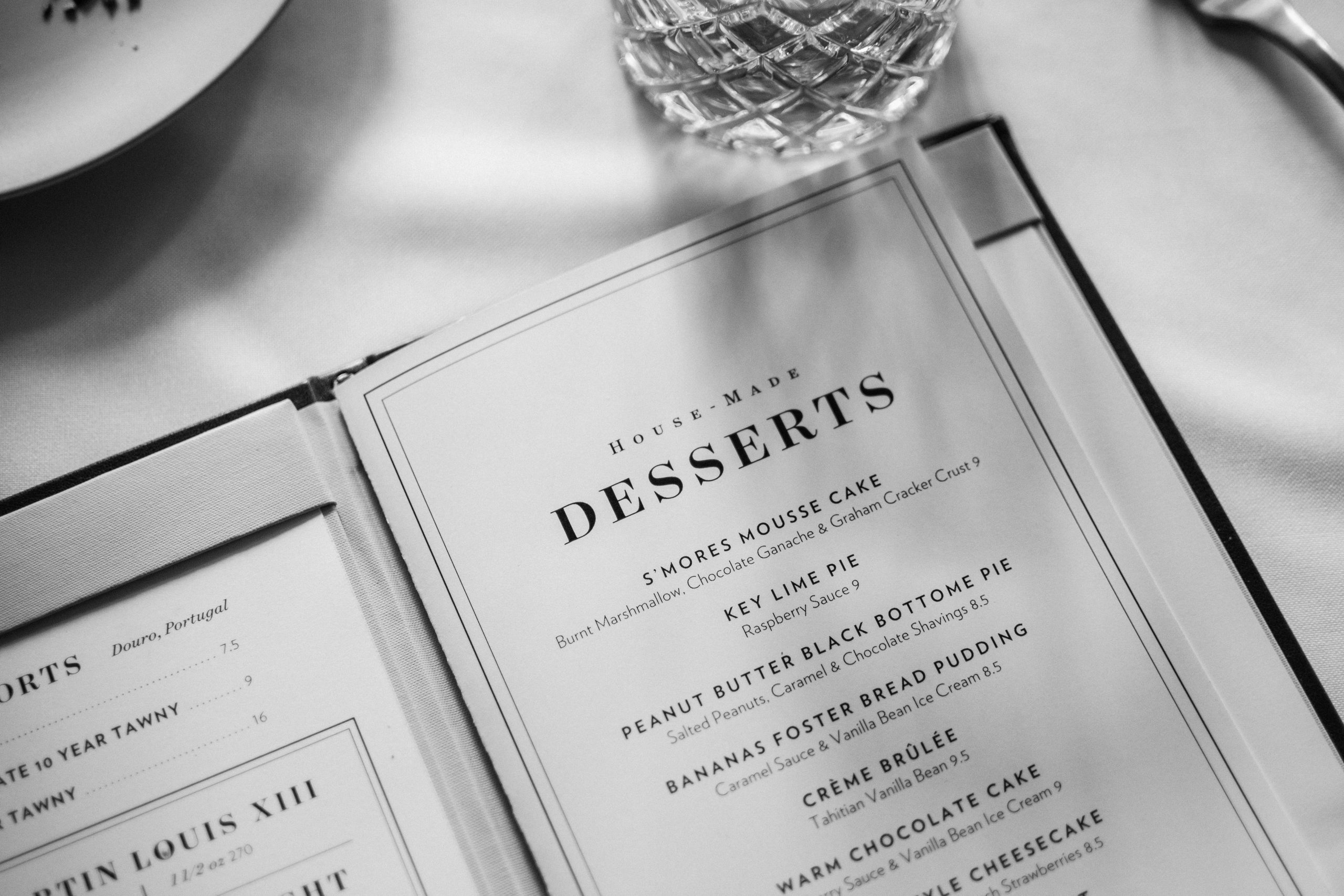
We developed a menu set inspired by the prohibition era of the 20’s to harken back to the atmosphere of the original Sullivan’s location. We made use of classic and decorative typefaces along side a bold art deco pattern to bring this idea to life.


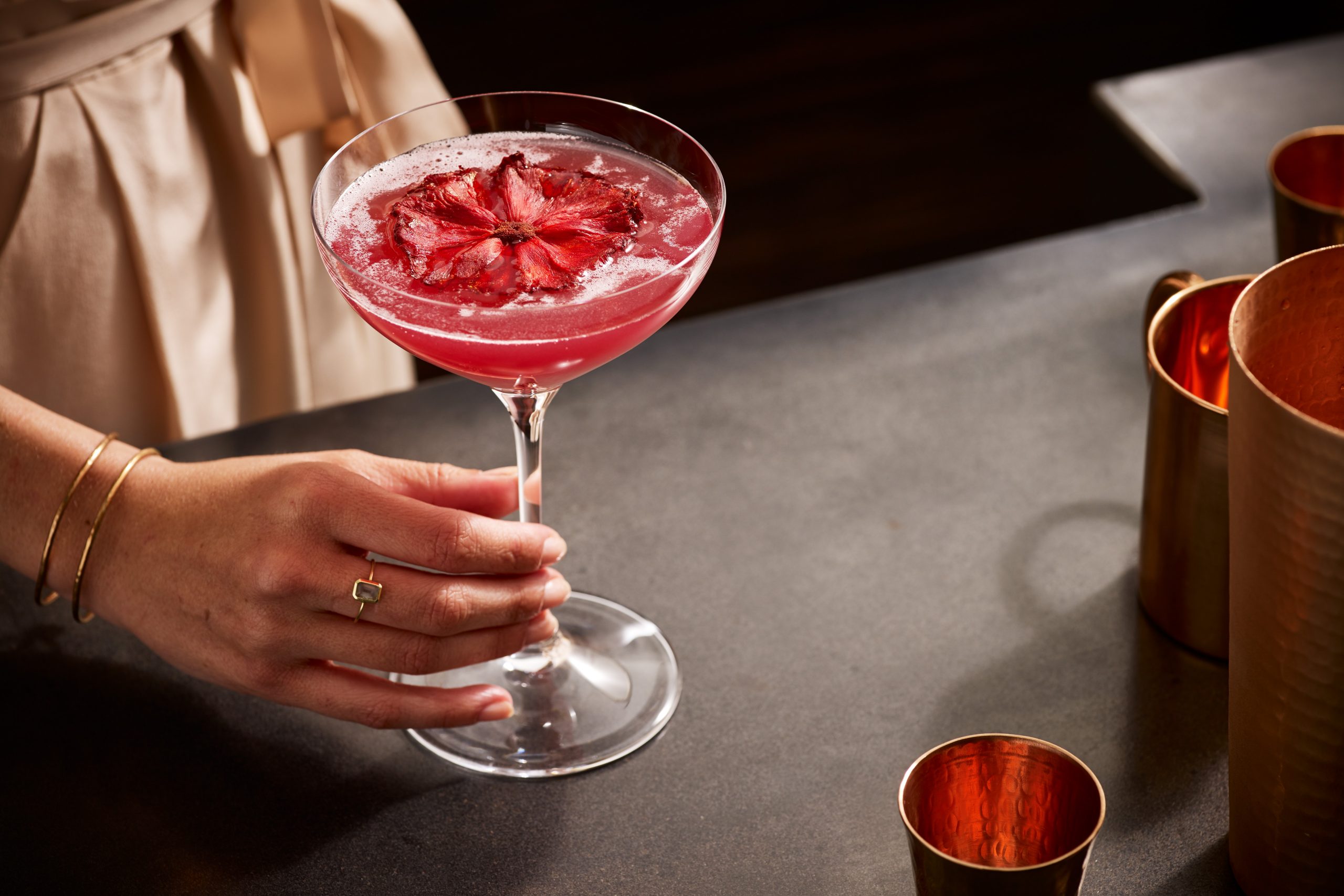
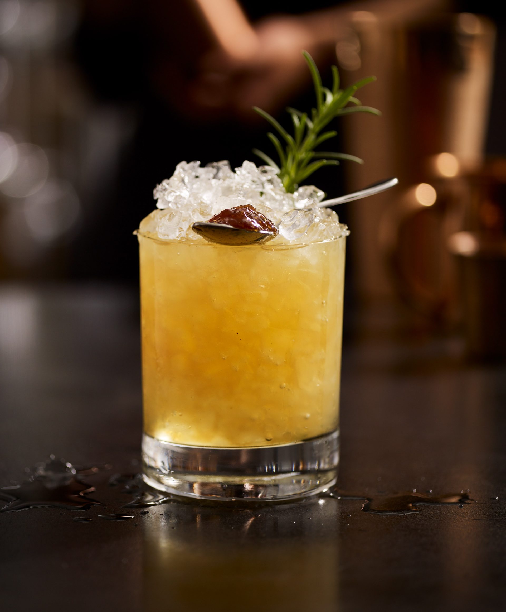
We worked with Scott Pitts to develop a warm and inviting photo style to showcase the craftsmanship of Sullivan’s cocktails and plates.
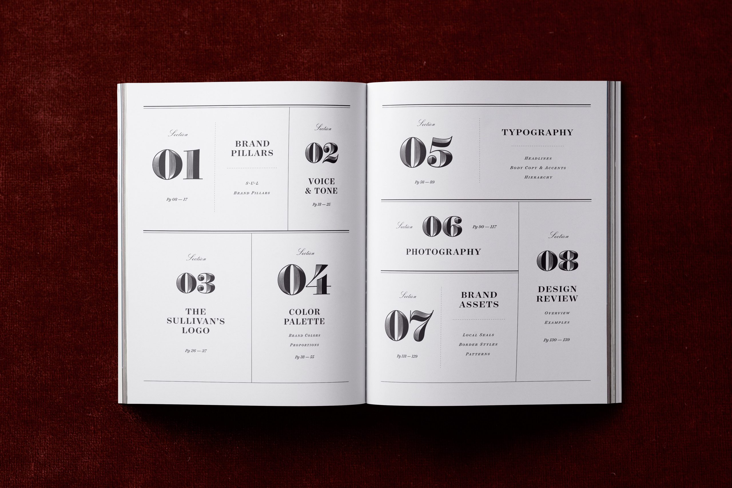
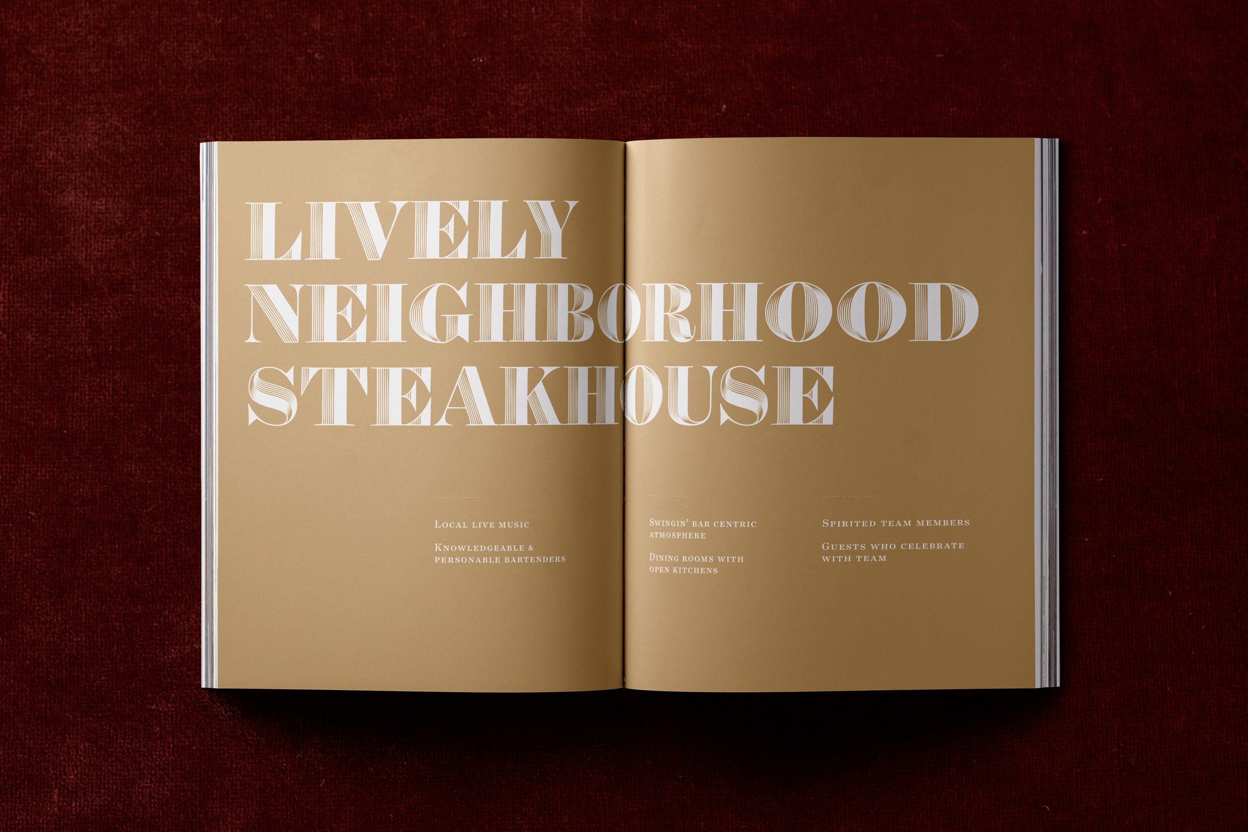
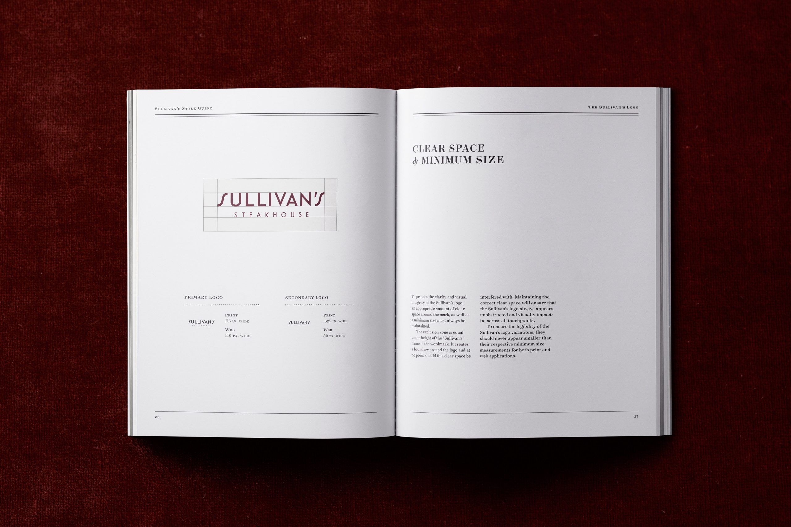
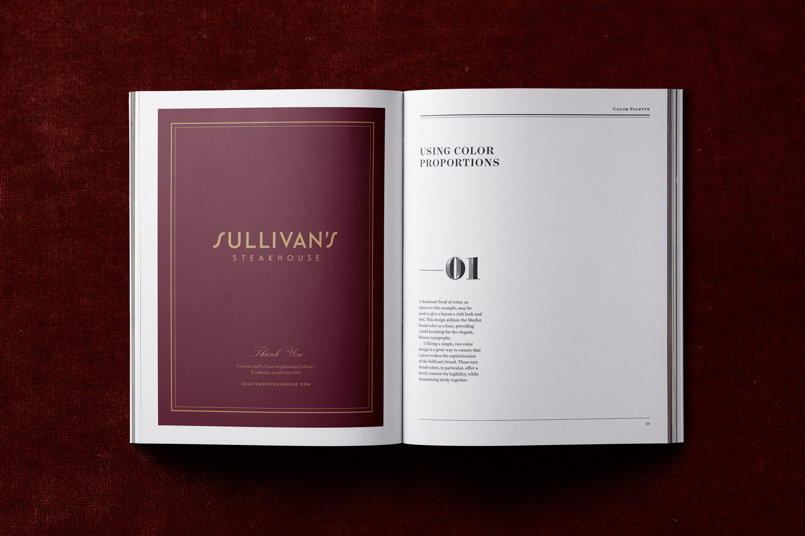
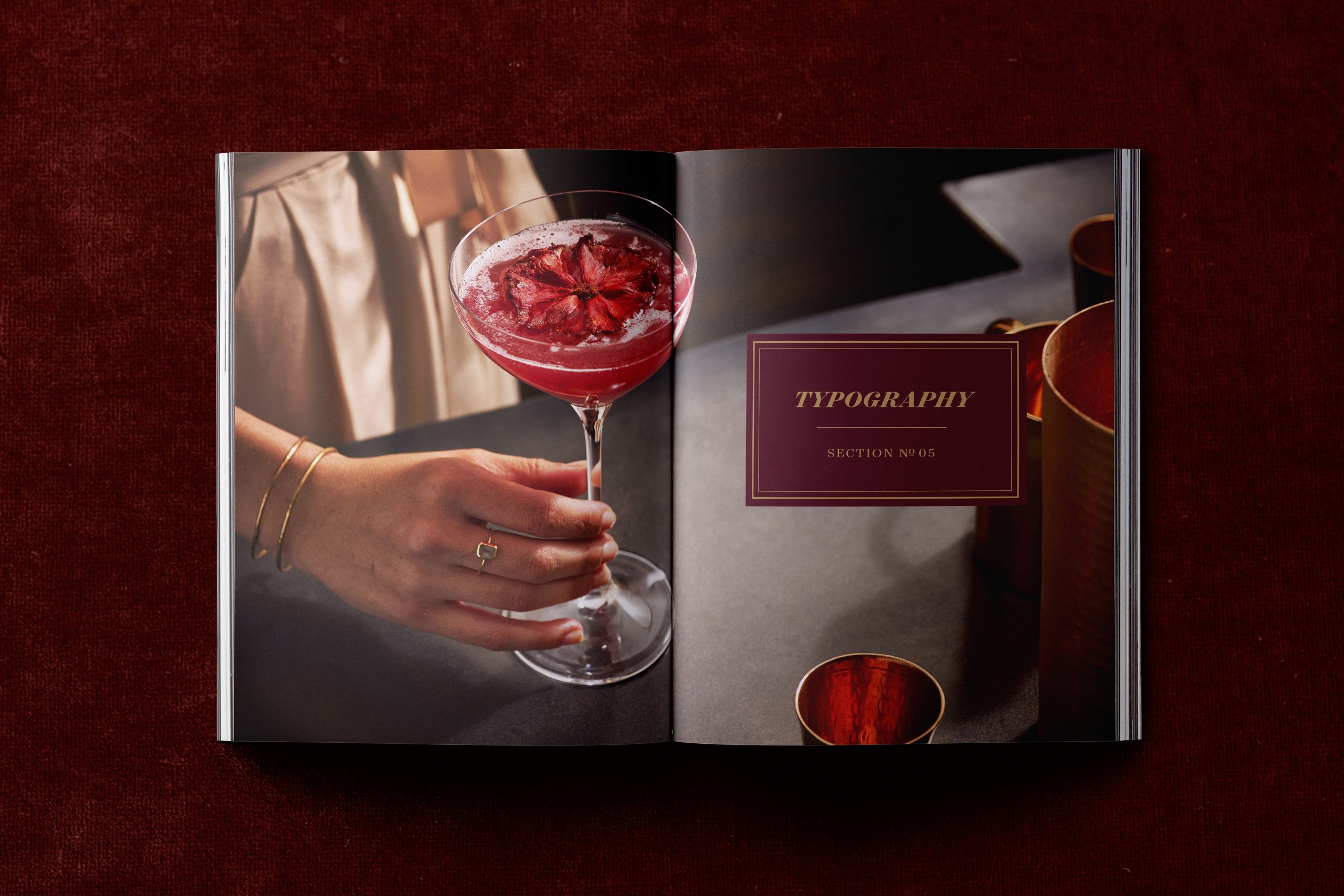
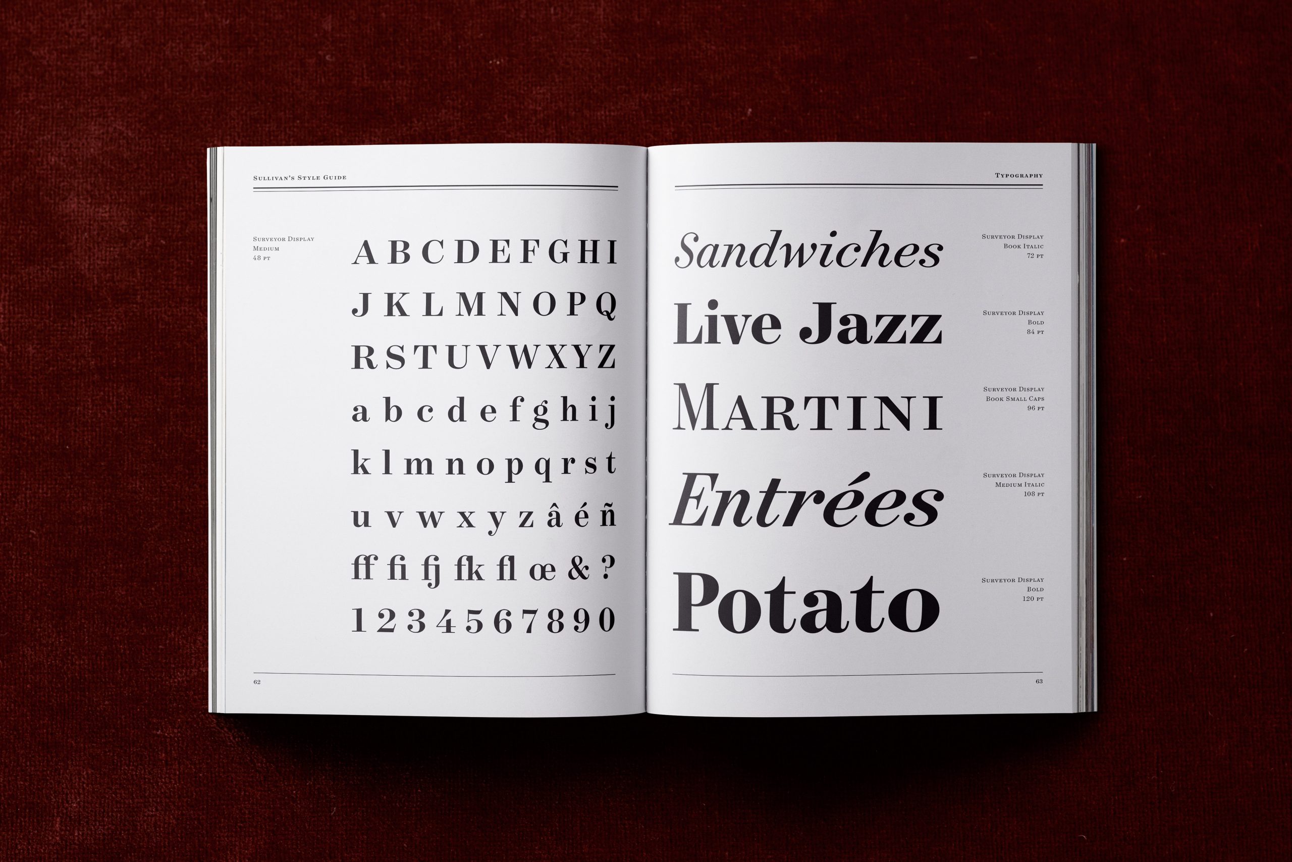
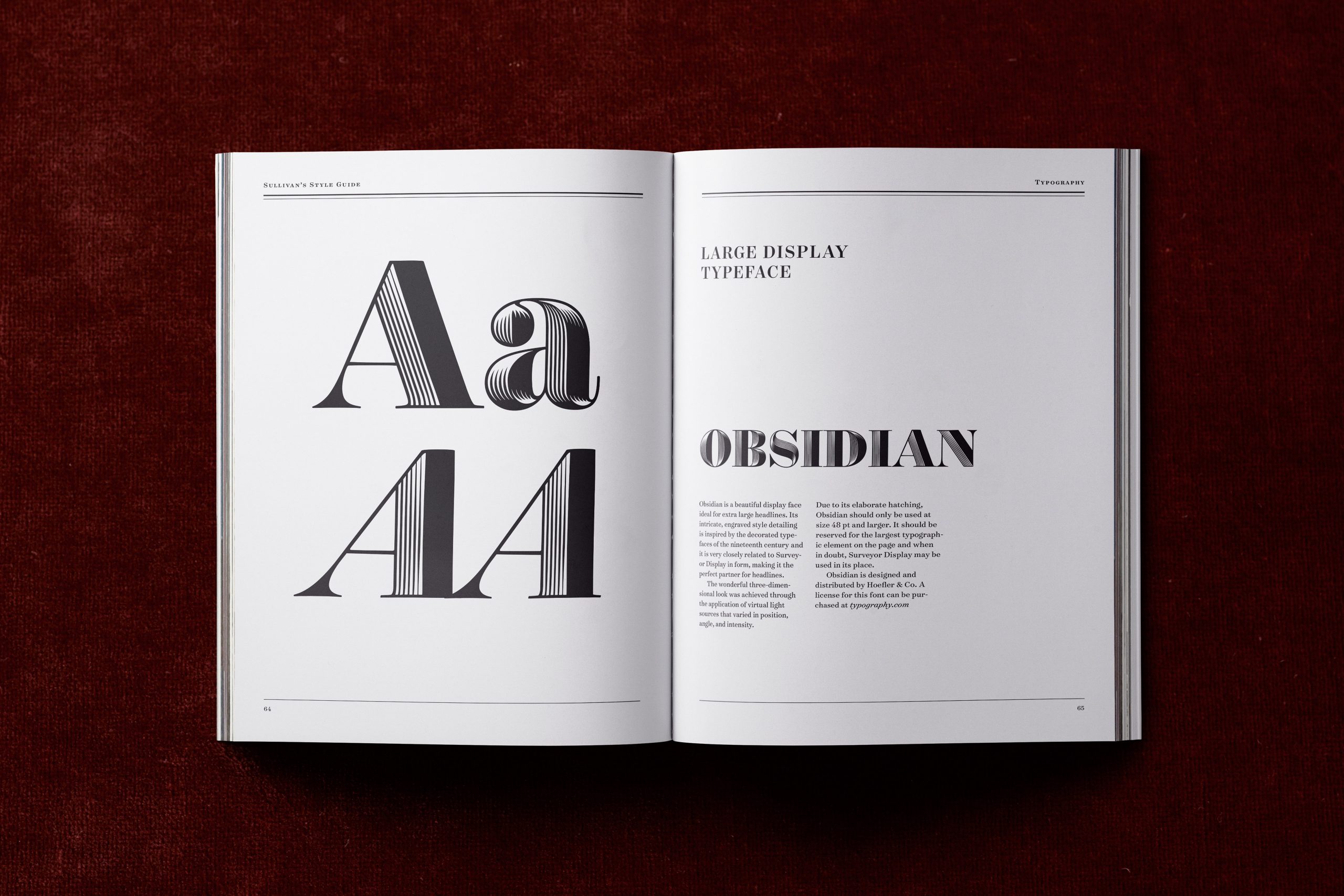
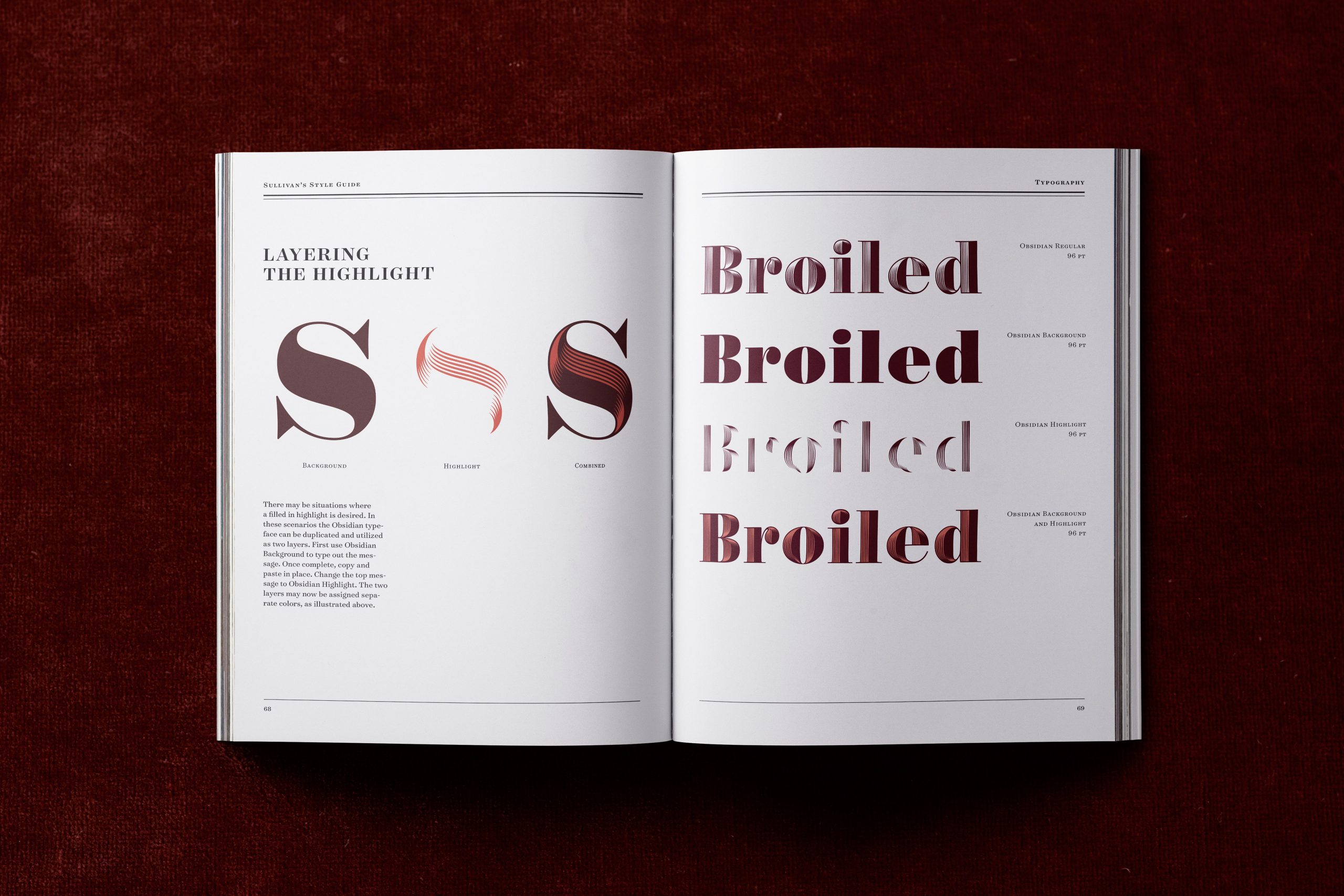
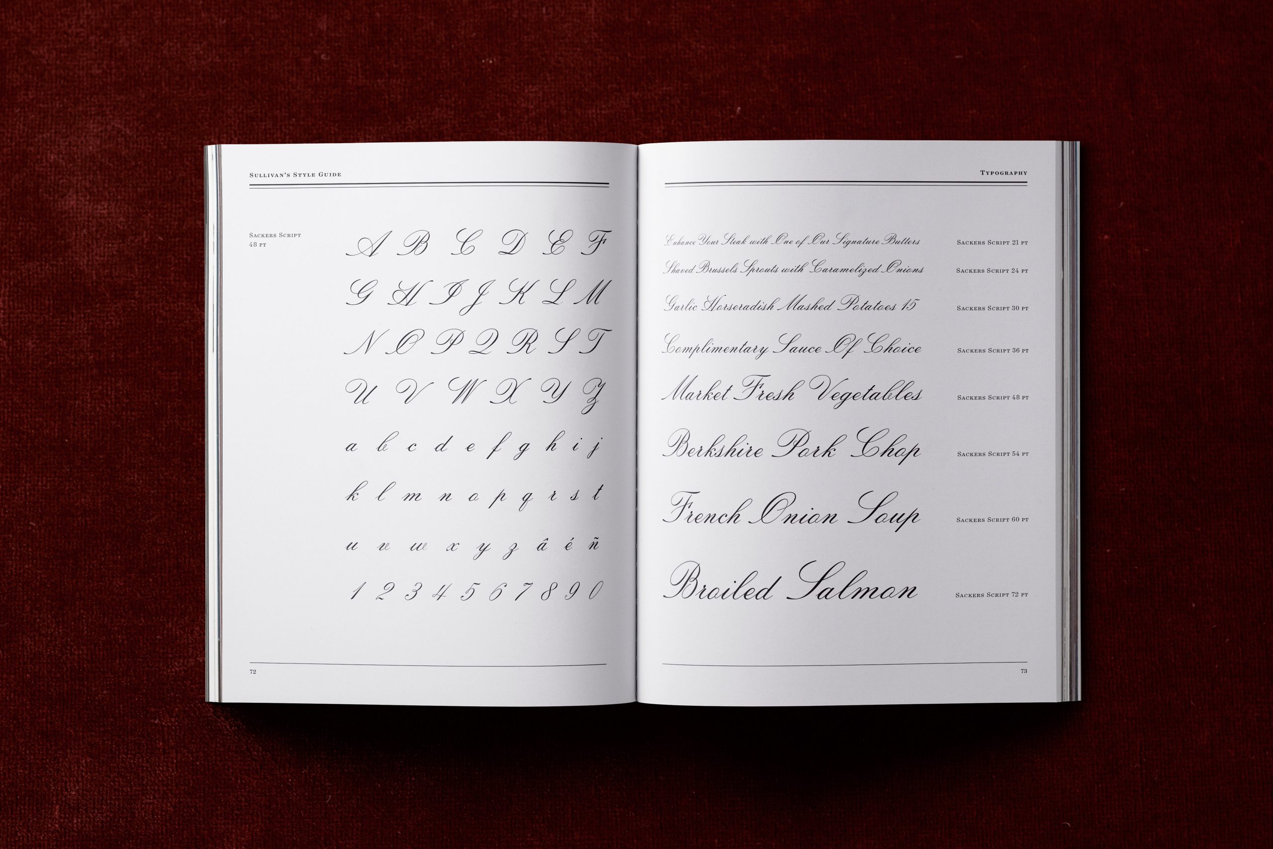
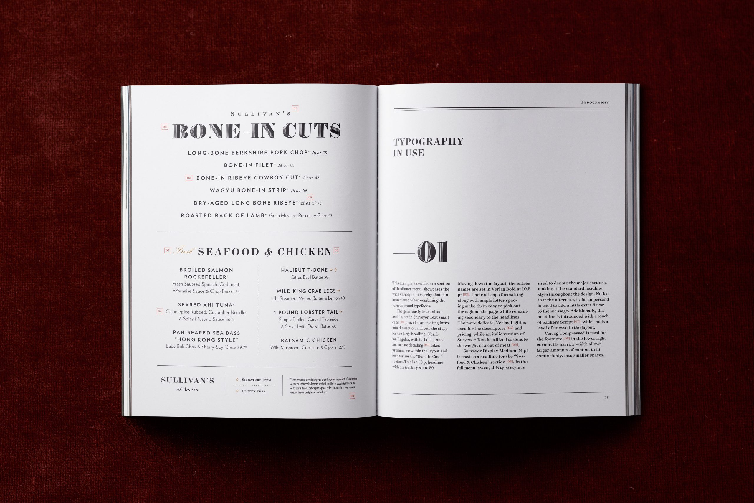
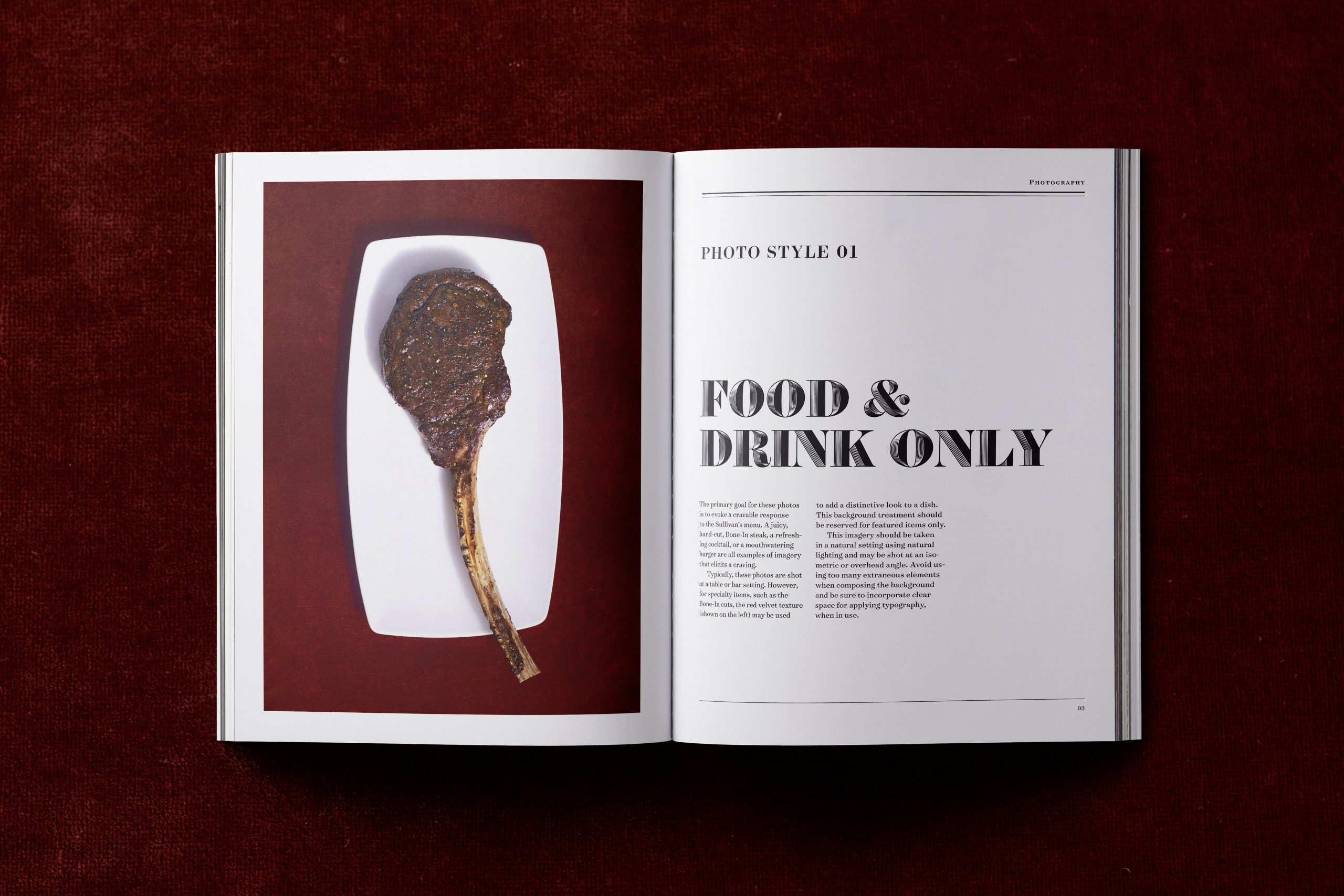
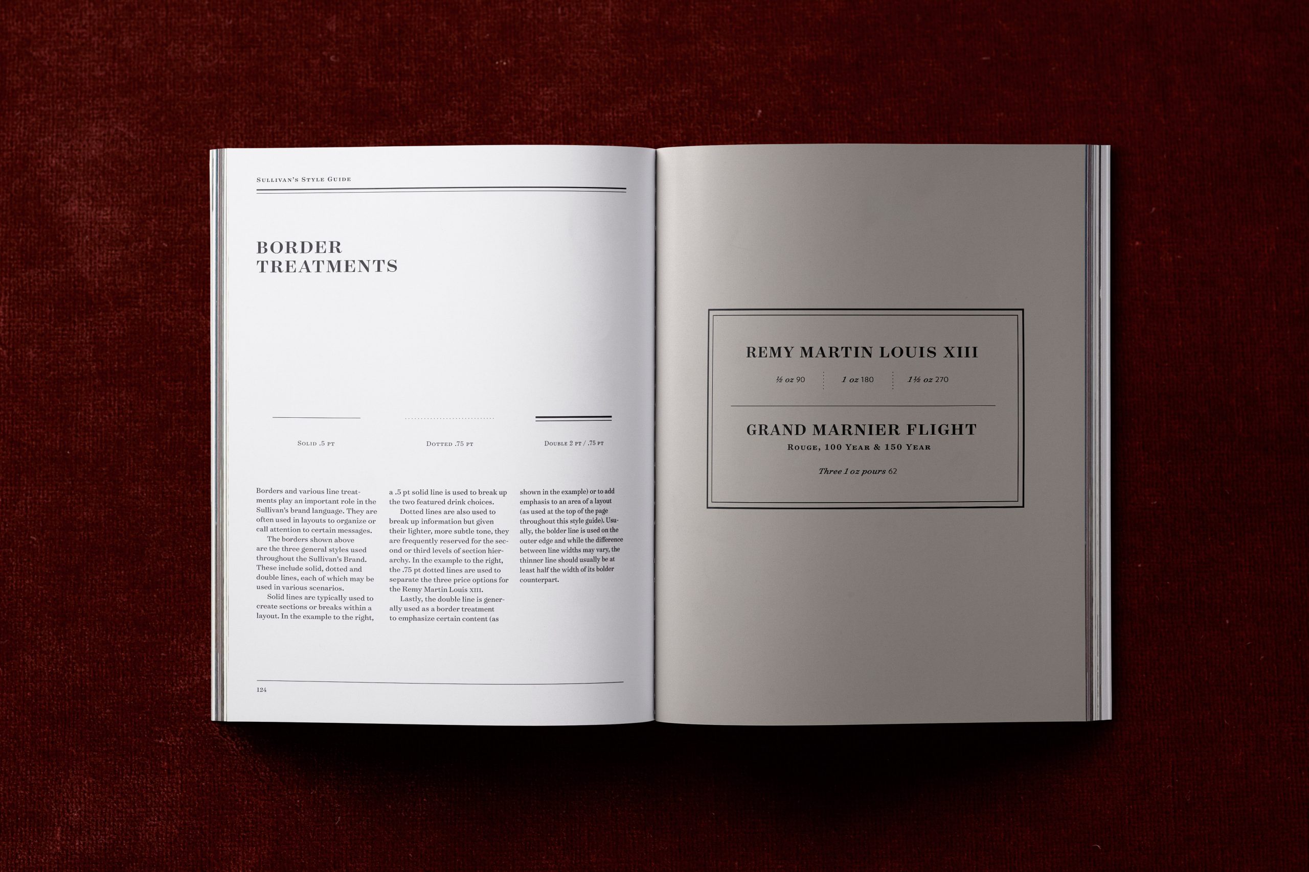
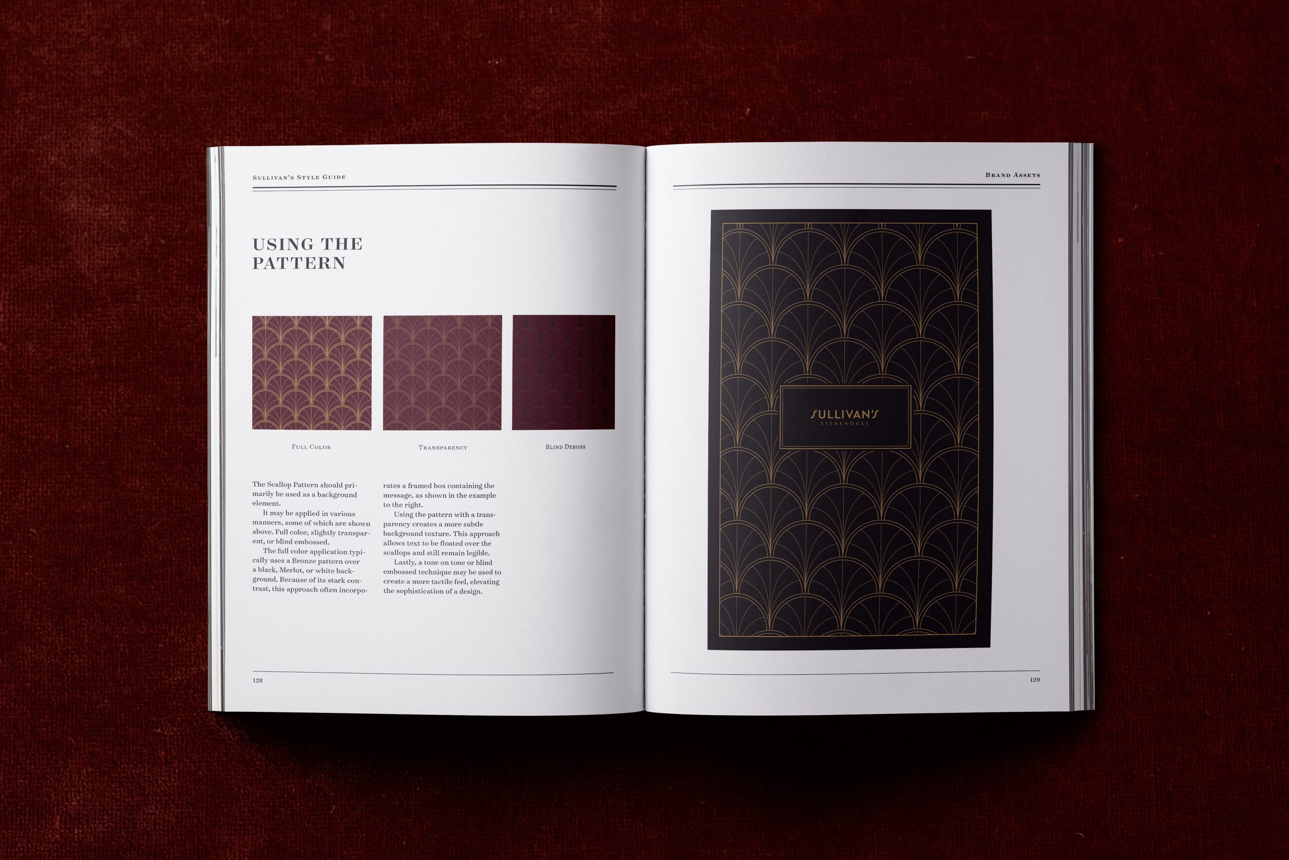
We developed a comprehensive style guide instructing how to use all of the brand elements we created in harmony in order to create uniquely Sullivan’s design pieces.
