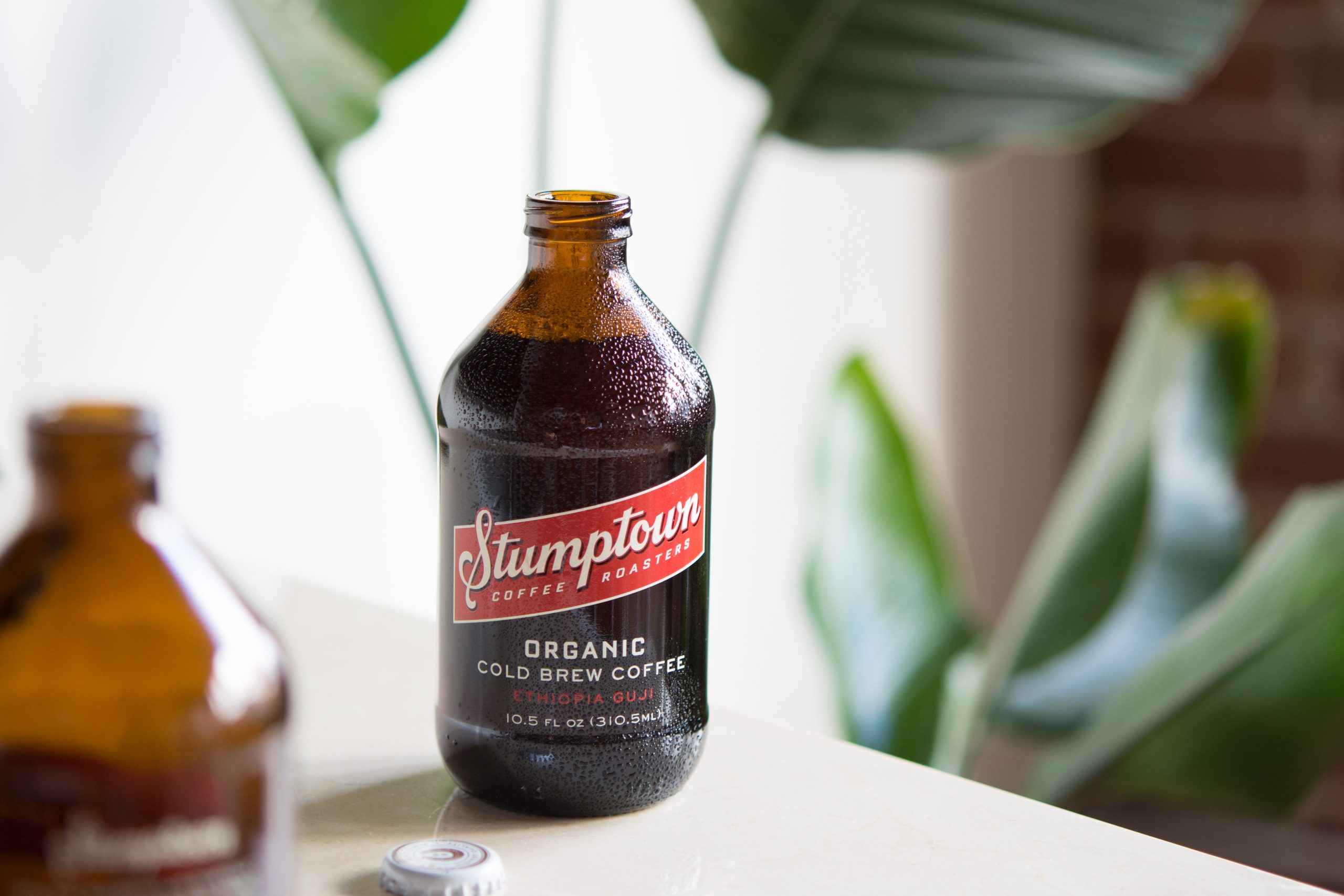
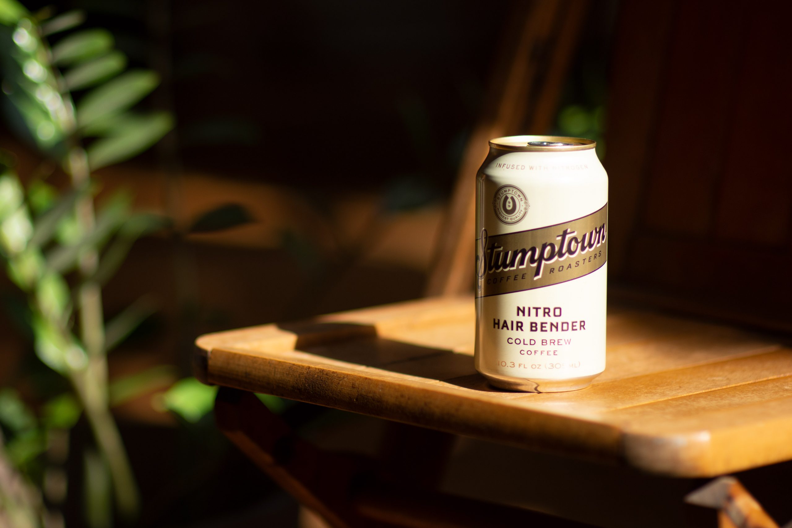
Stumptown Cold Brew
Project InfoStumptown is known as one of the Northwest region’s most beloved coffee companies. Gaining more and more popularity, it became time to offer their trendsetting Cold Brew products on the national stage.
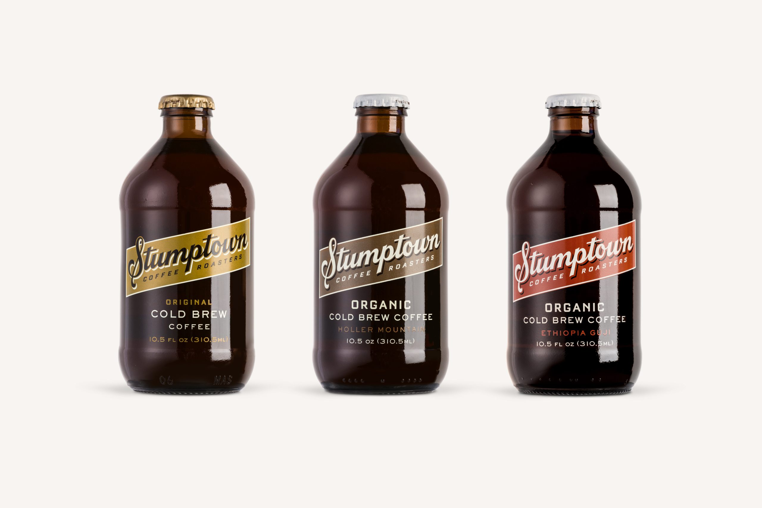
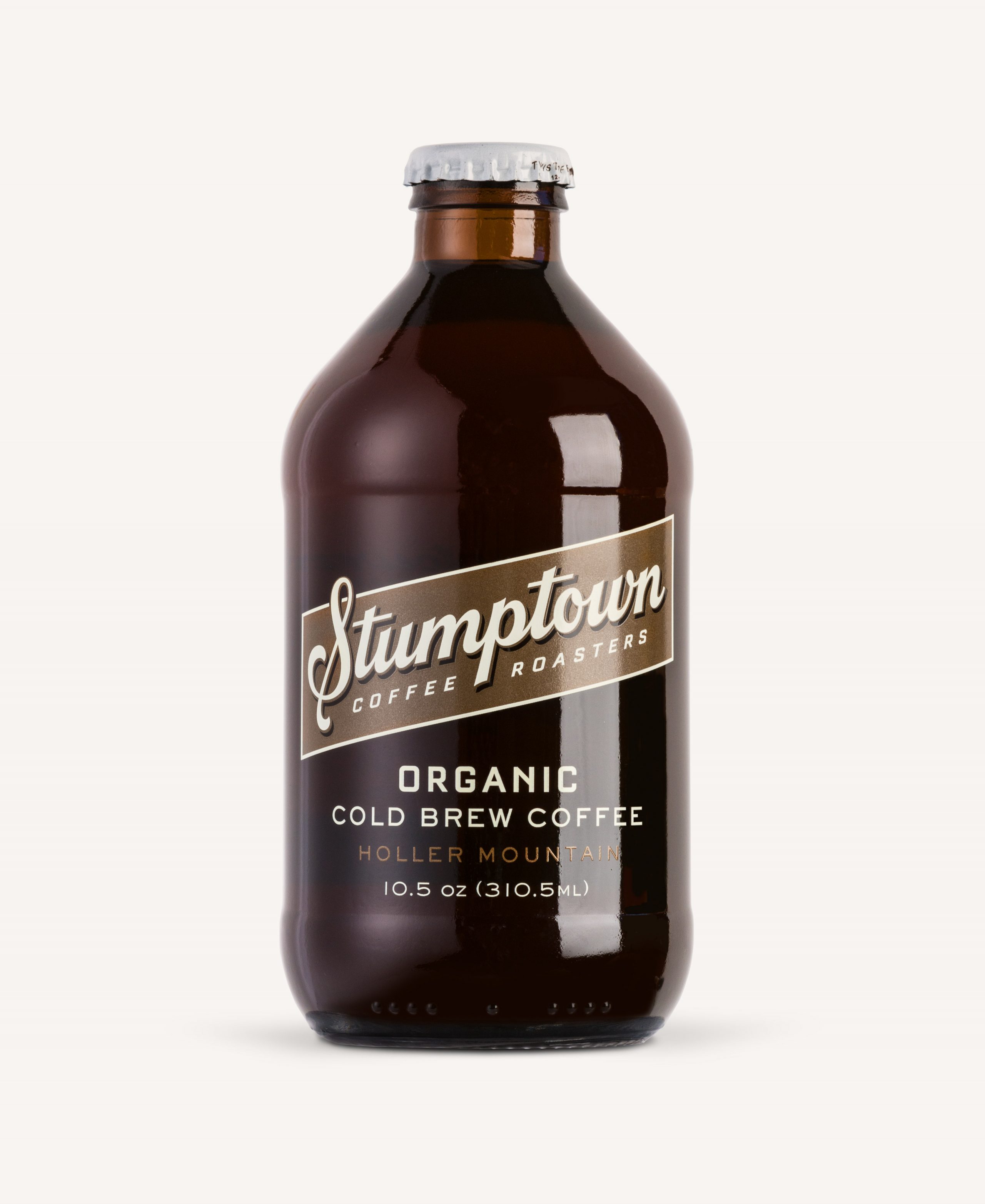
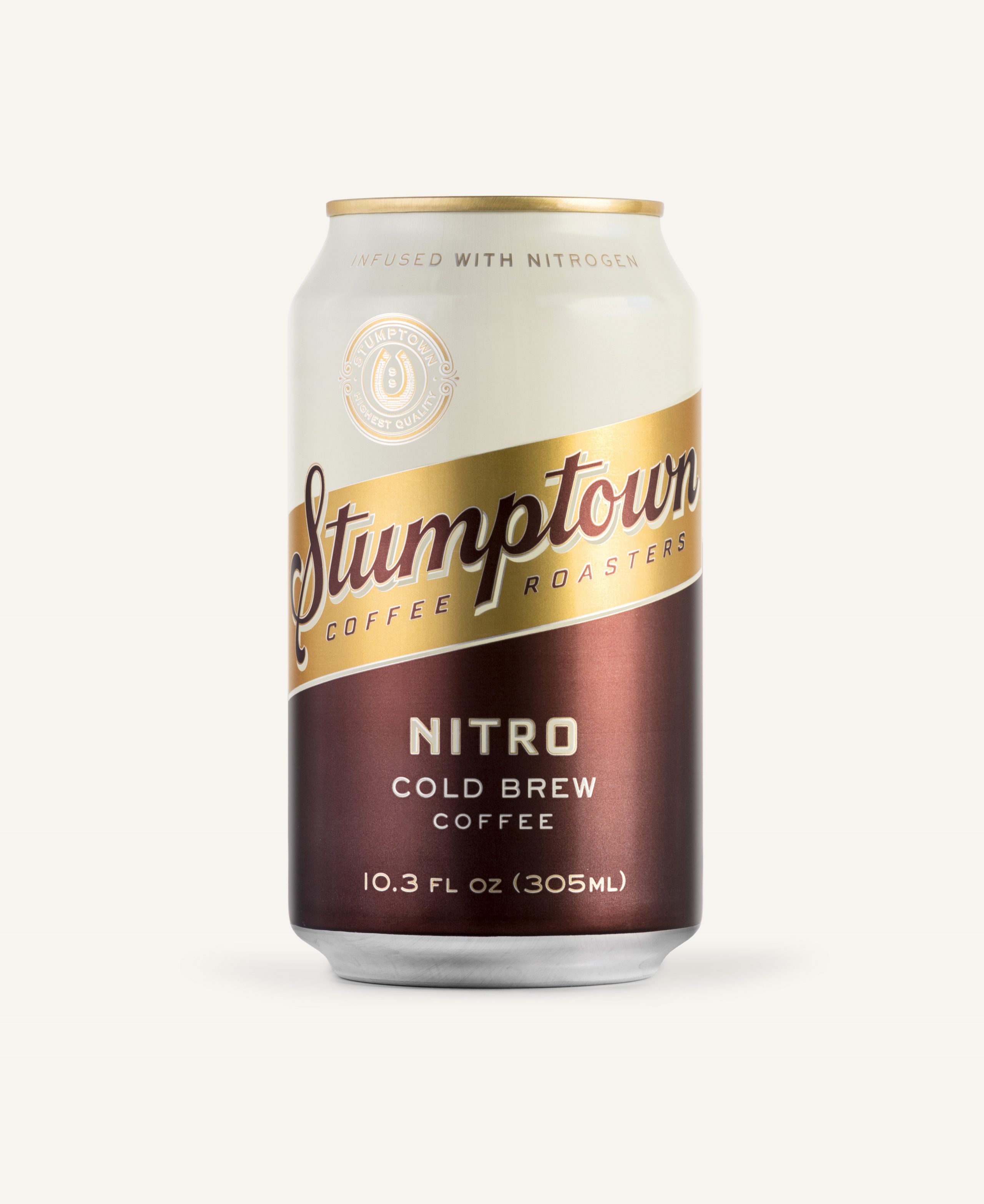
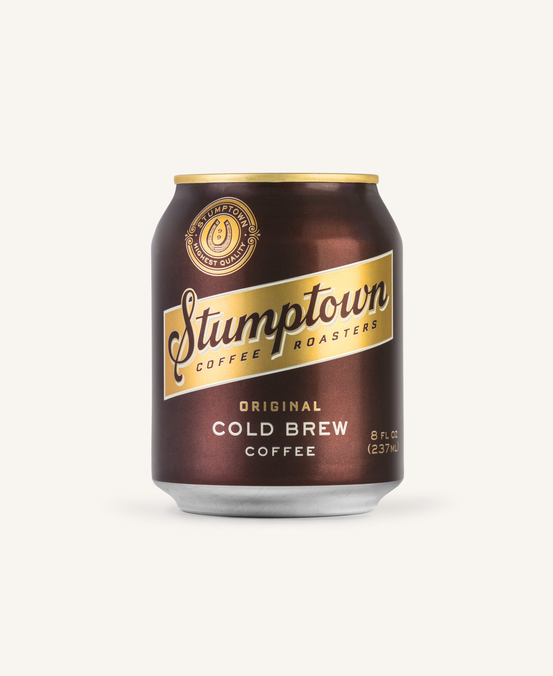
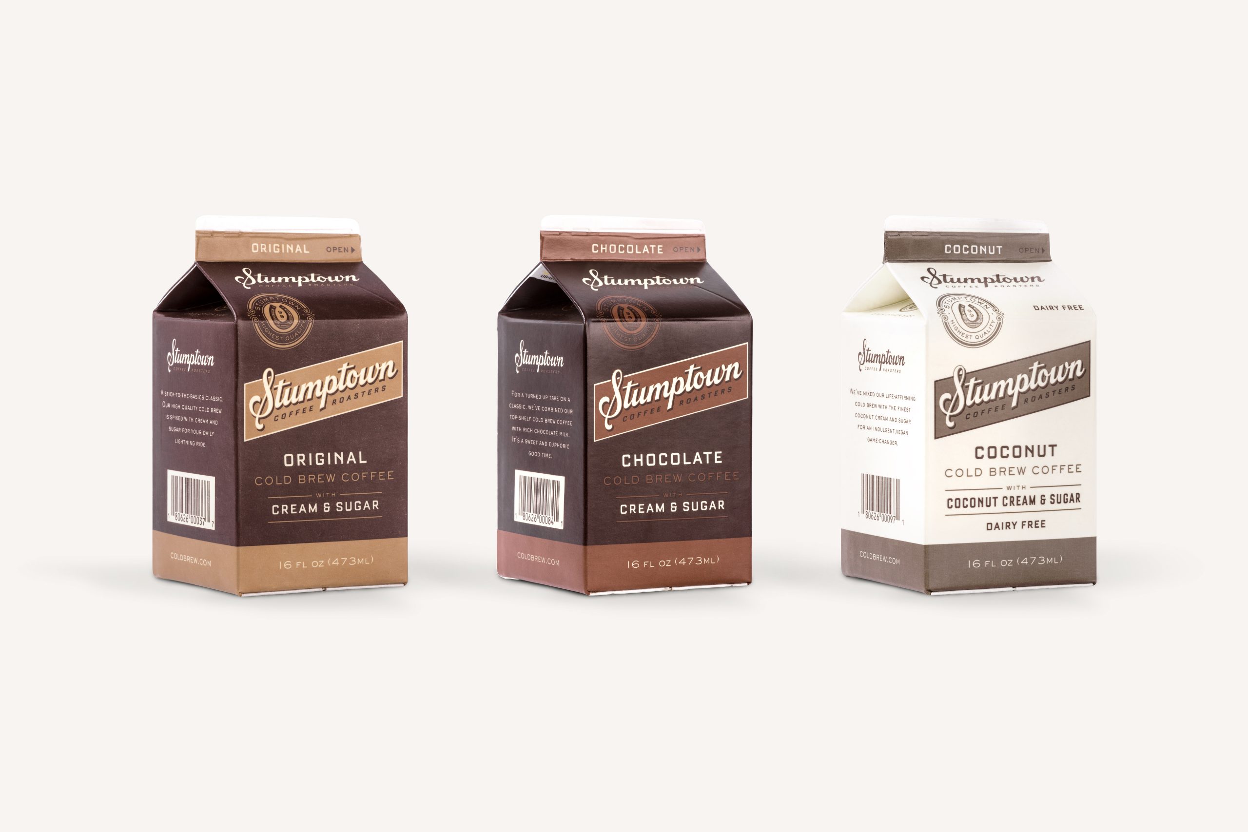
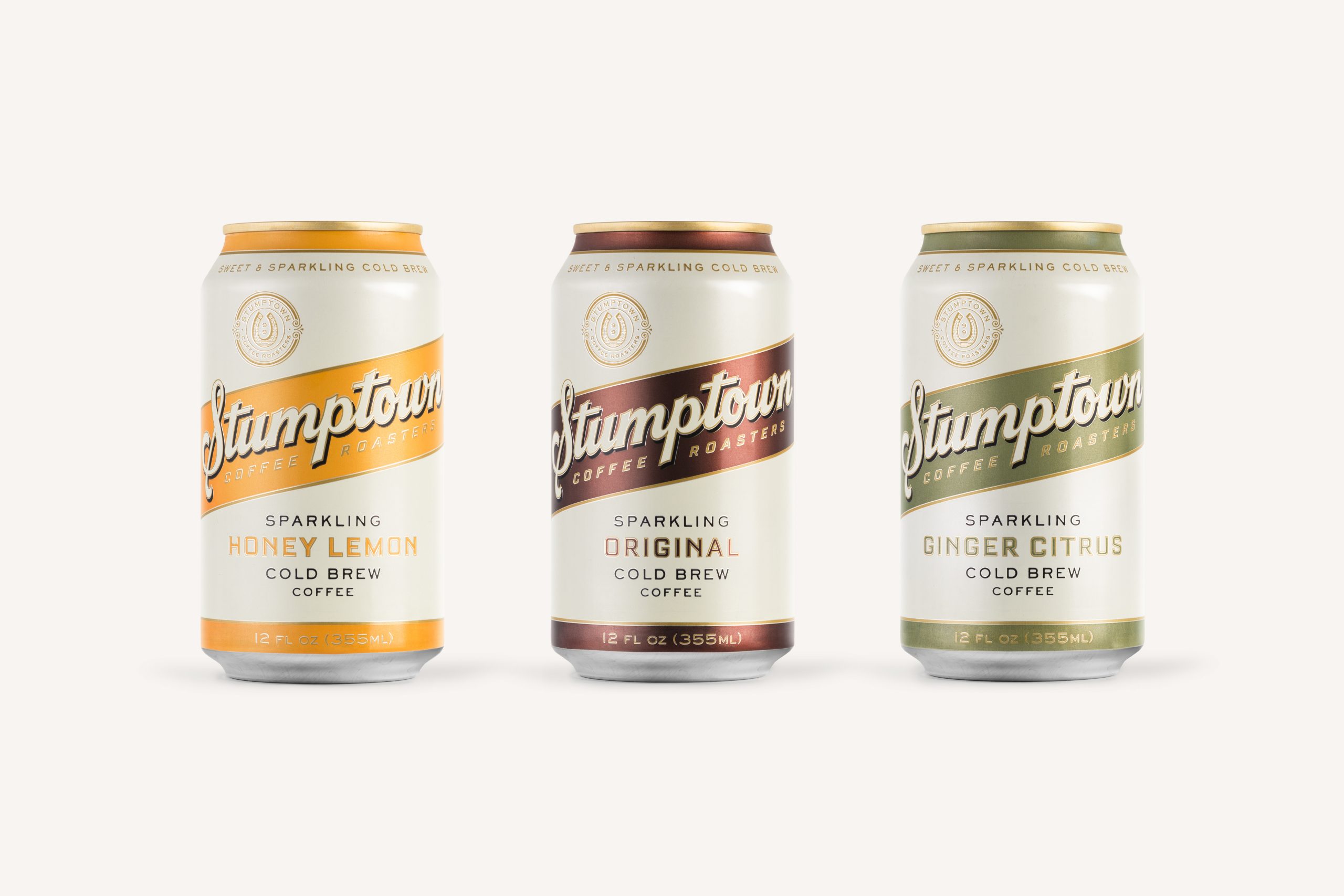
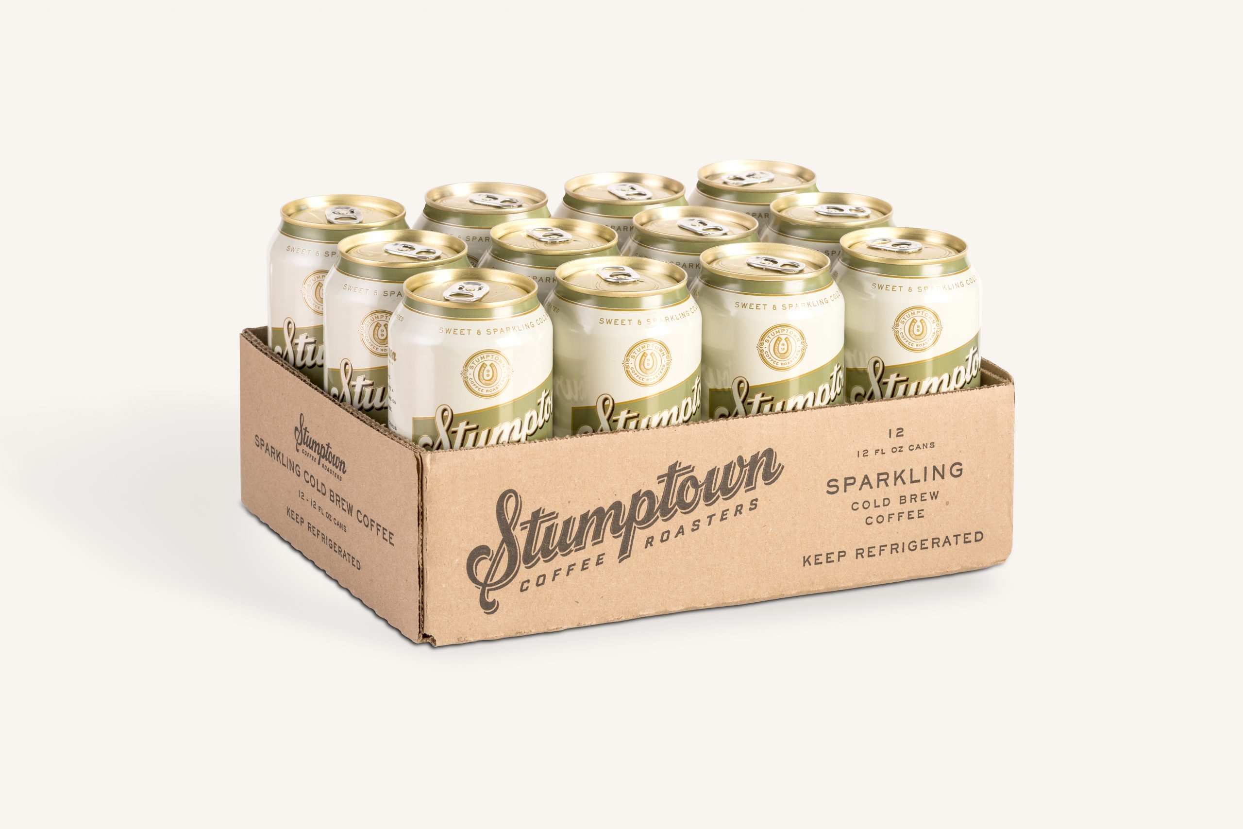
In order to stand-out in the sea of competitors within the category that they themselves created, they needed a package redesign structured to leverage the Stumptown name—making it the focal point of their ready-to-drink products. Being careful not to disrupt their loyal consumers, we developed an updated look and visual system.
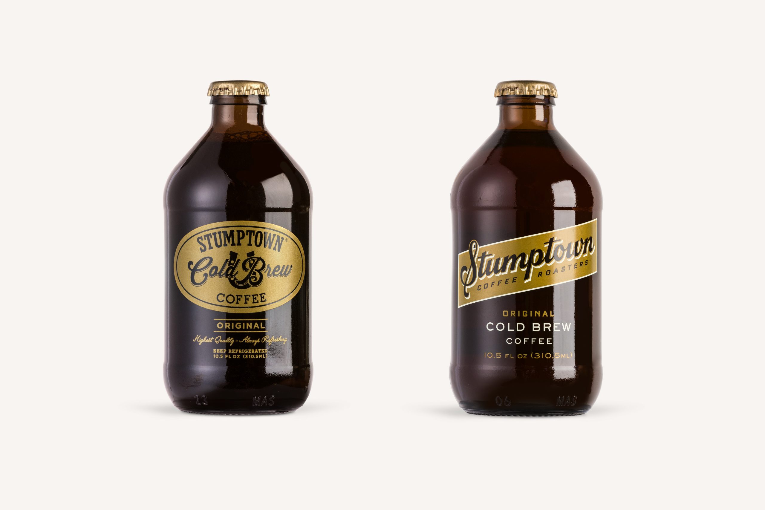
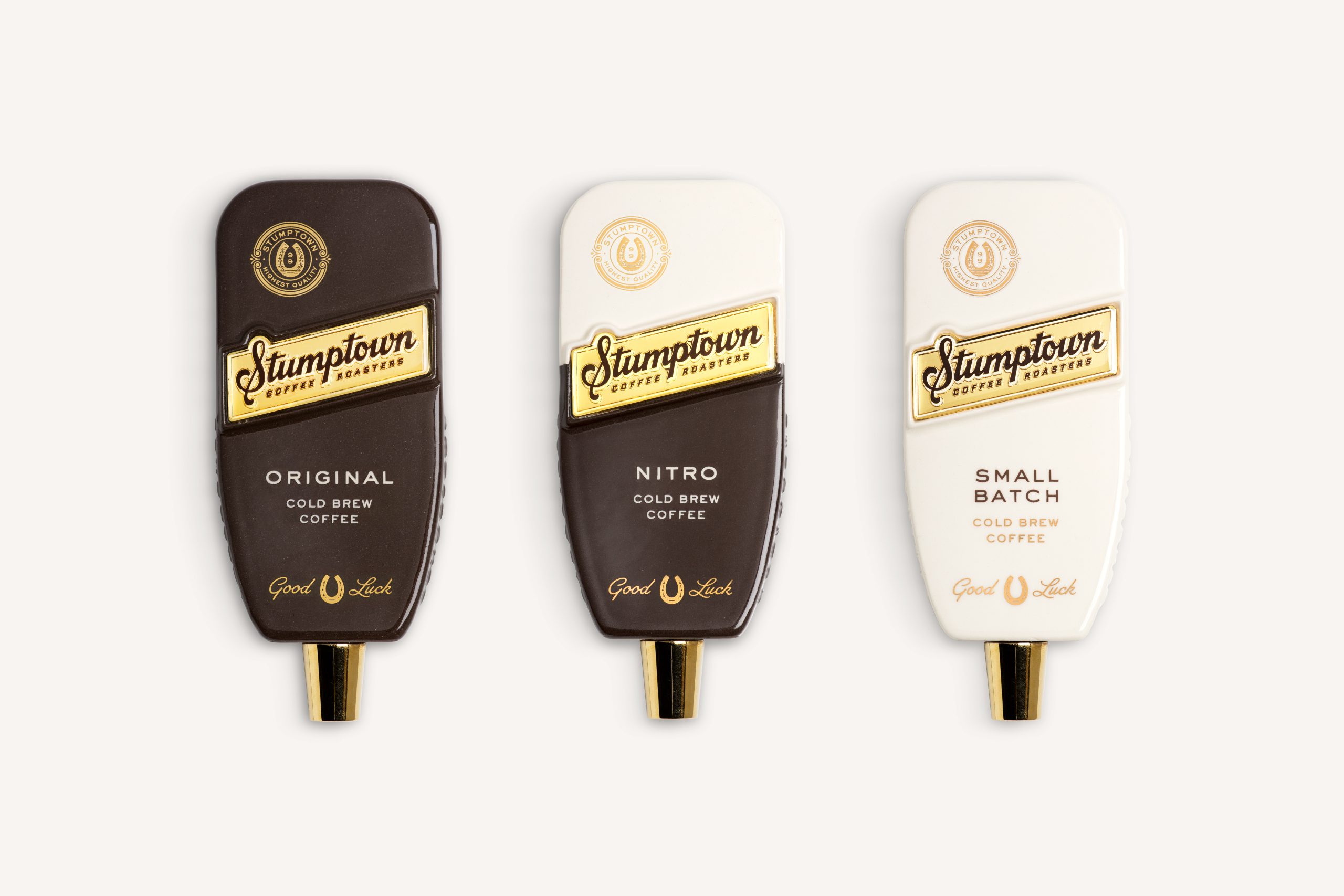
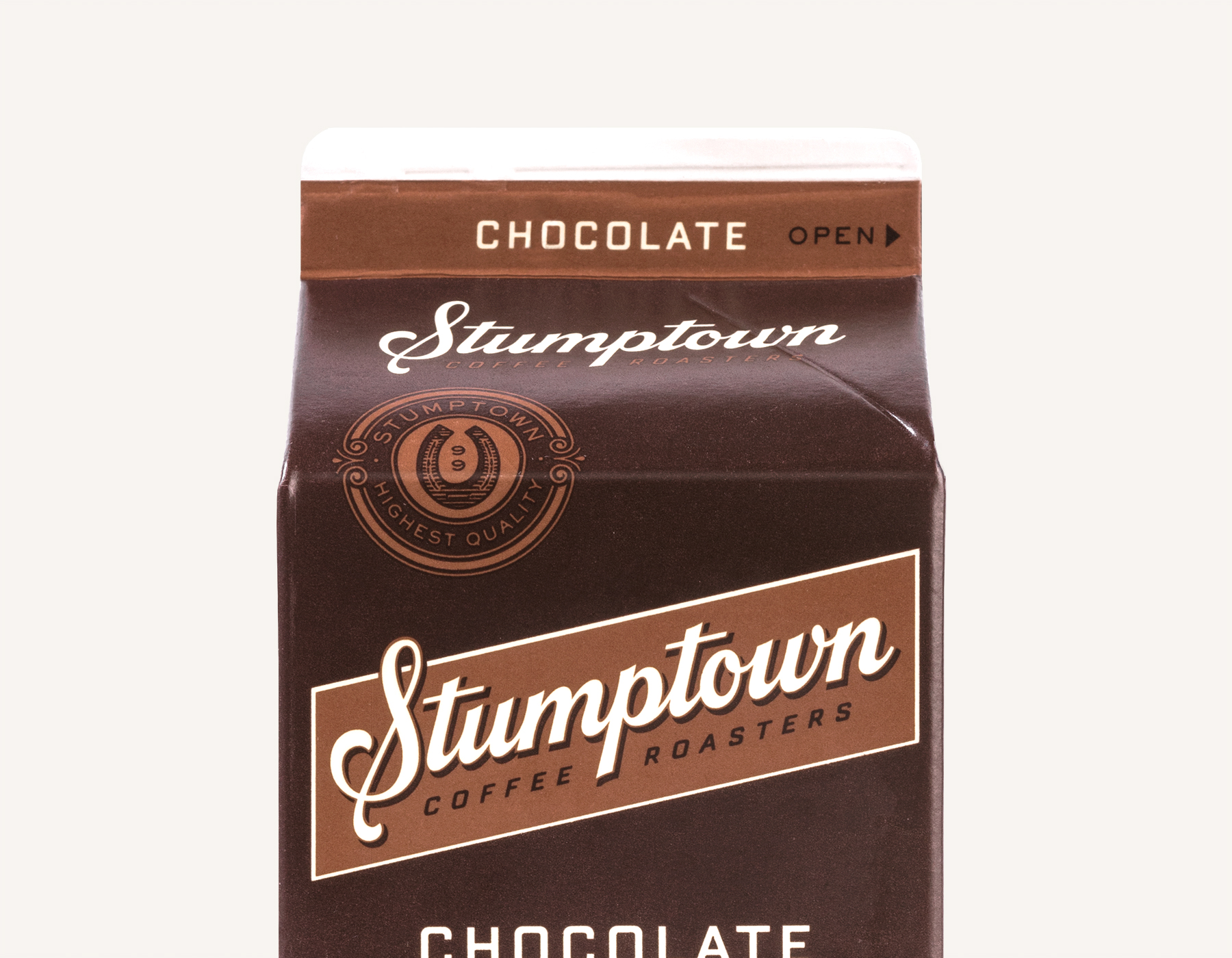
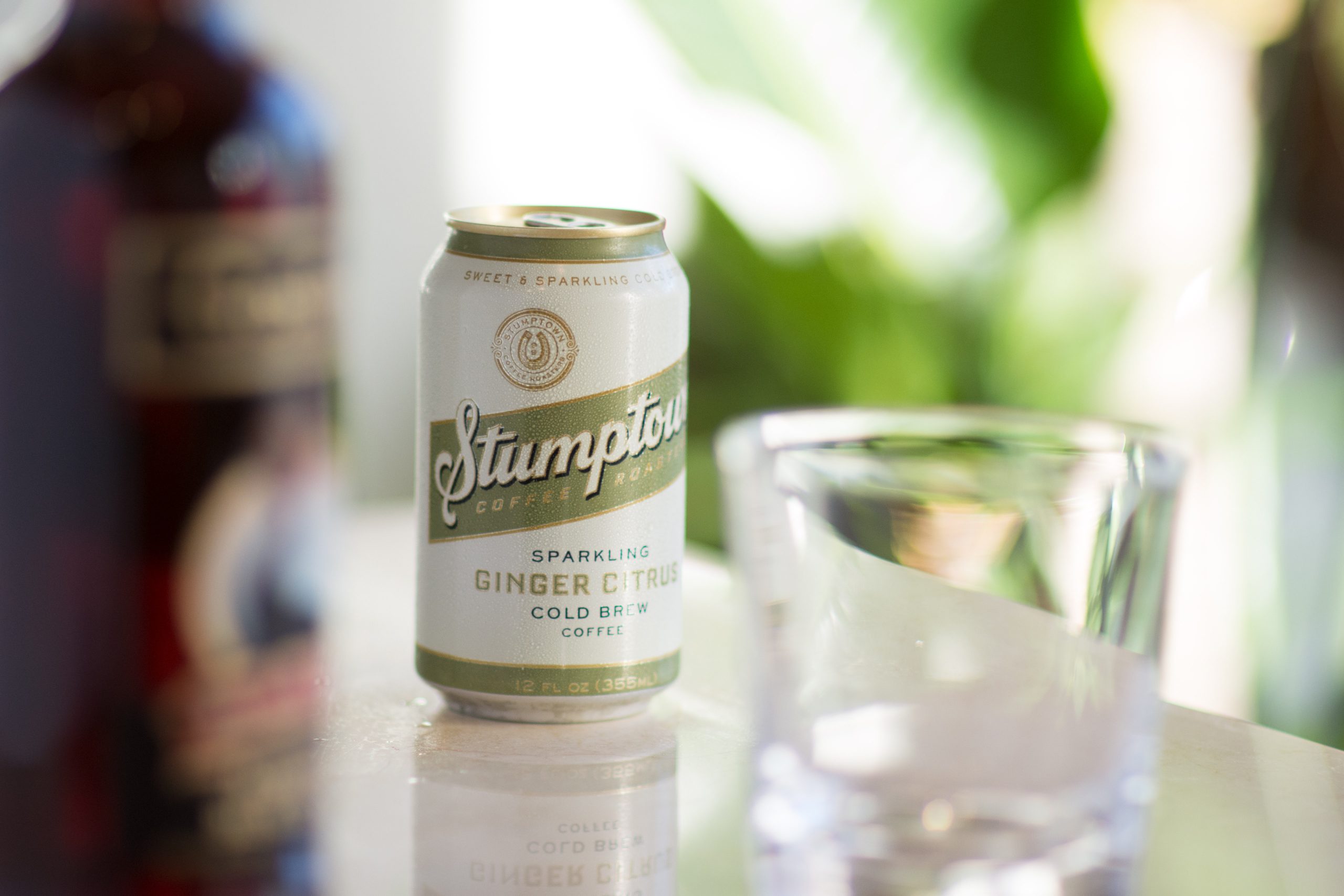
The primary goal for the redesign was to amplify the Stumptown brand name, while retaining the general spirit of the original package.


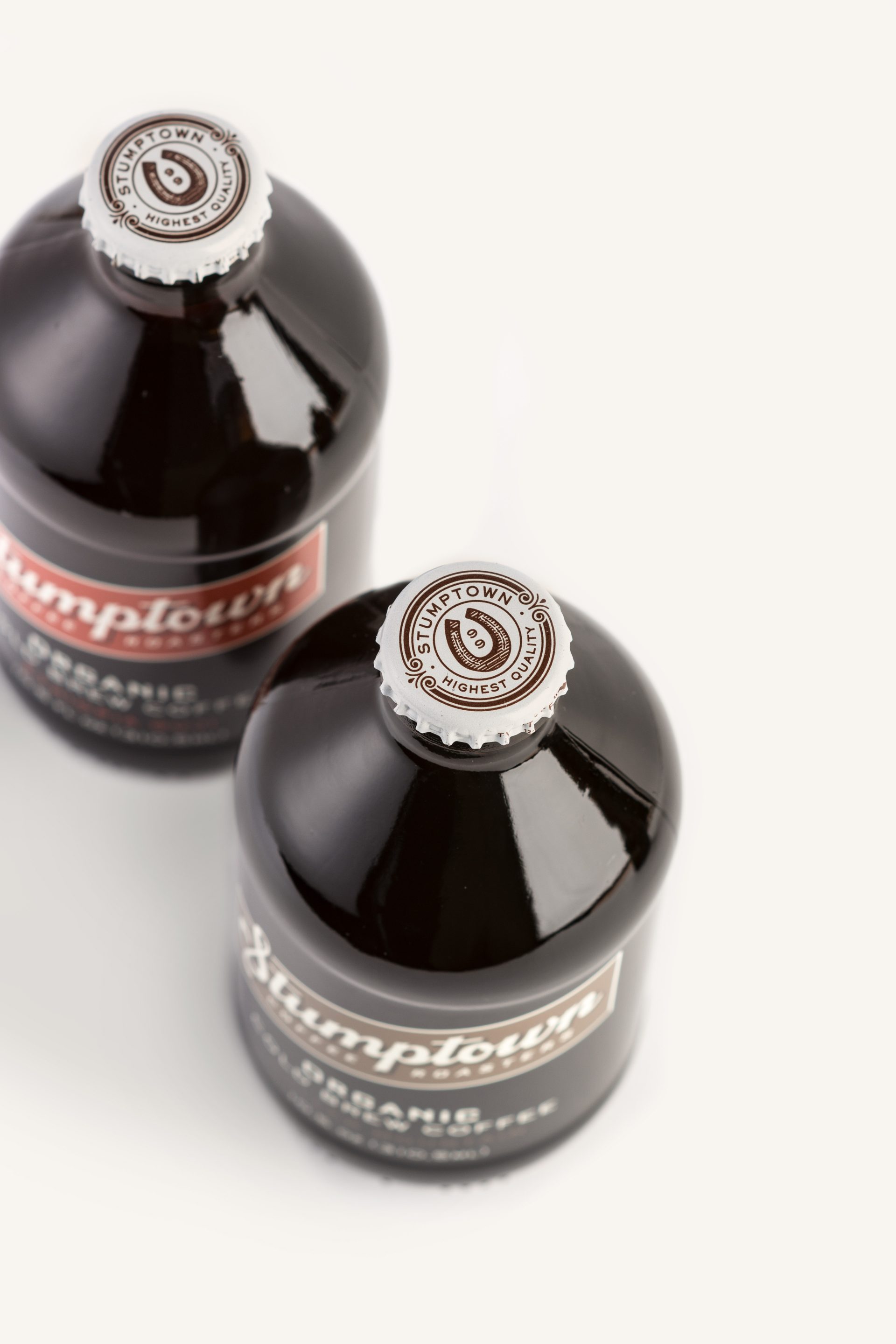
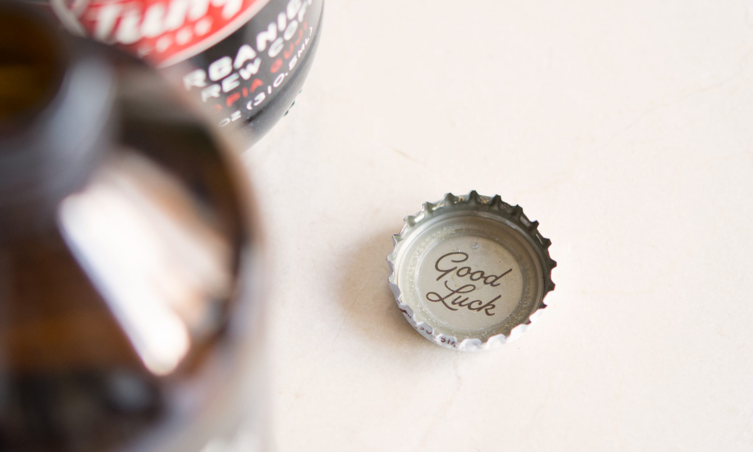
The logotype is inspired by hand-painted signage found at Stumptown’s various cafés blended with elements of the original packaging. In addition to the primary mark, we created a custom illustrated seal to express the quality and heritage of the Stumptown brand. The horseshoe has been a symbol for the brand since inception —representing their famous motto of Good Luck.