Seattle Sounders Identity
Project InfoBorn in 74. Reimagined for 2024. We are incredibly honored and grateful that the Seattle Sounders tapped Column to reimagine this next chapter in their history. We have been trusted partners for many years and being a good steward of the club is something we have taken very seriously. It was our mission to deliver the fans everything needed out of this refresh with love, care and precision.
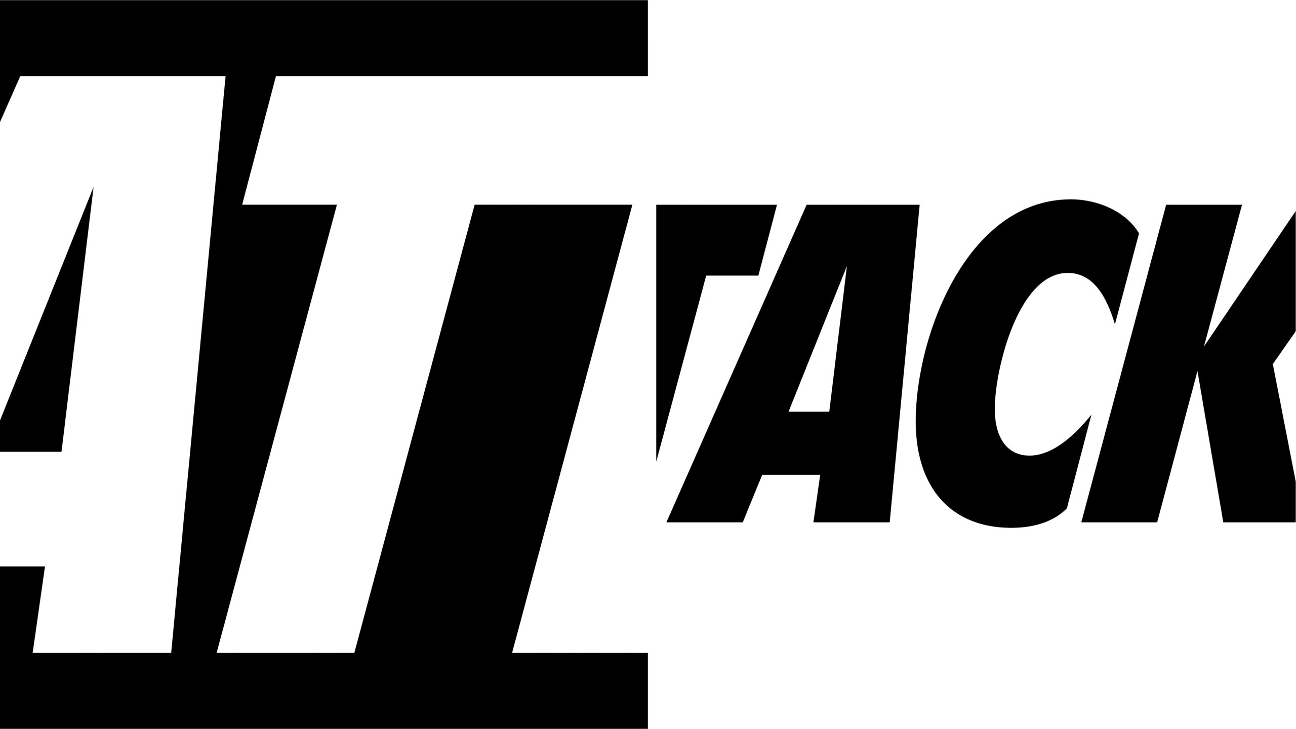
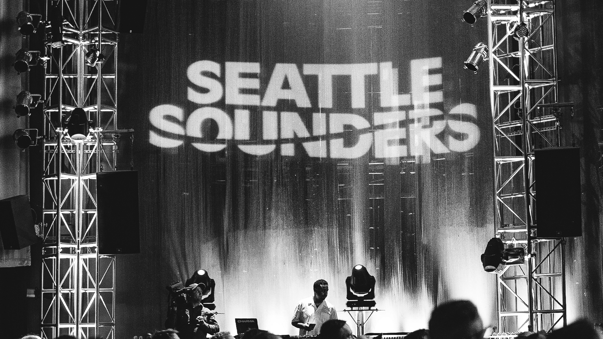
We updated the beloved crest, reimagined the original word mark, refreshed the color palette, and created a family of tertiary marks that accurately pay homage to the whole of the club. Additionally, we developed a comprehensive, custom typeface born from the letterforms drawn for the refreshed wordmark. The system blends styles of the past and future, archival with CGI, serious with playful, restraint with excitement. We partnered with specialists across the globe to infuse their expertise and truly take advantage of this special moment.

Creative Direction: Column
Design & Direction: Panoply
Audio: Human Robot Soul
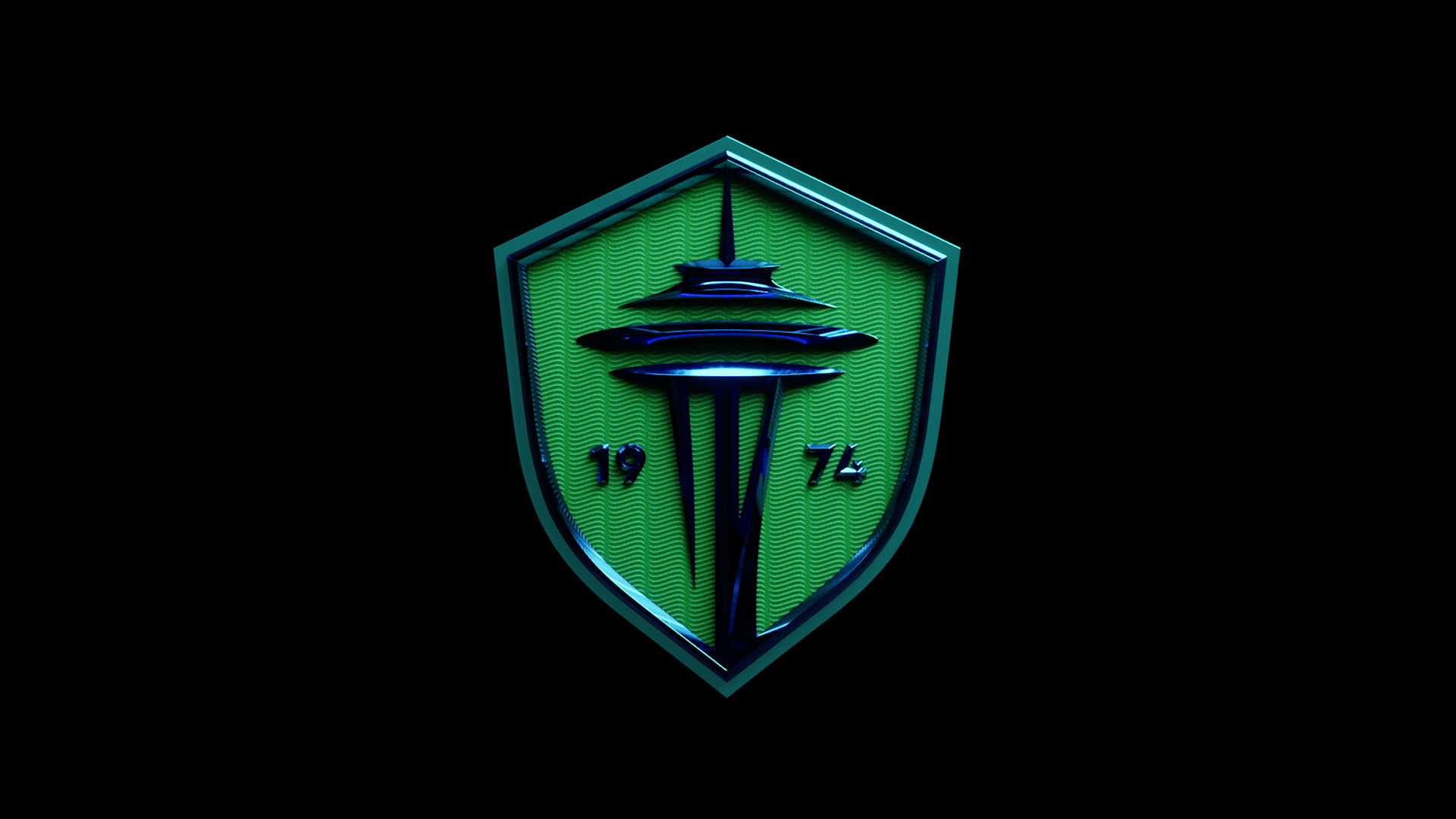
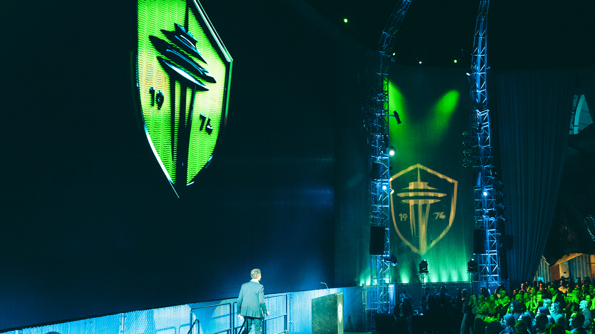
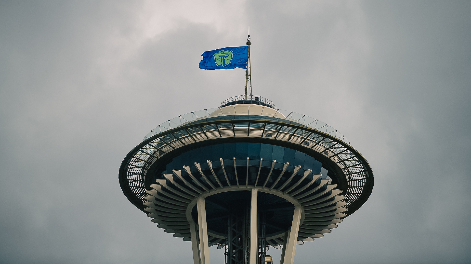
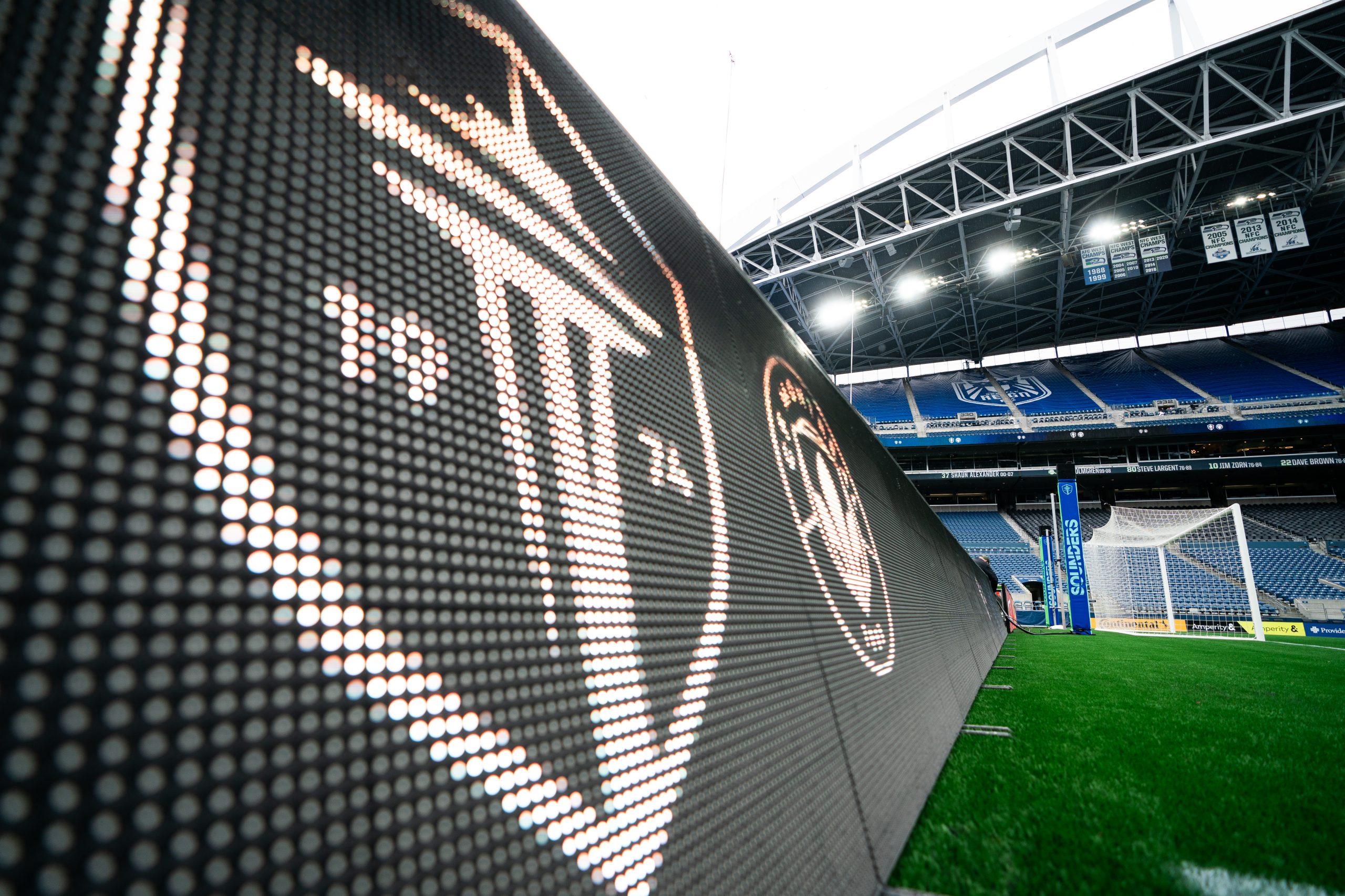
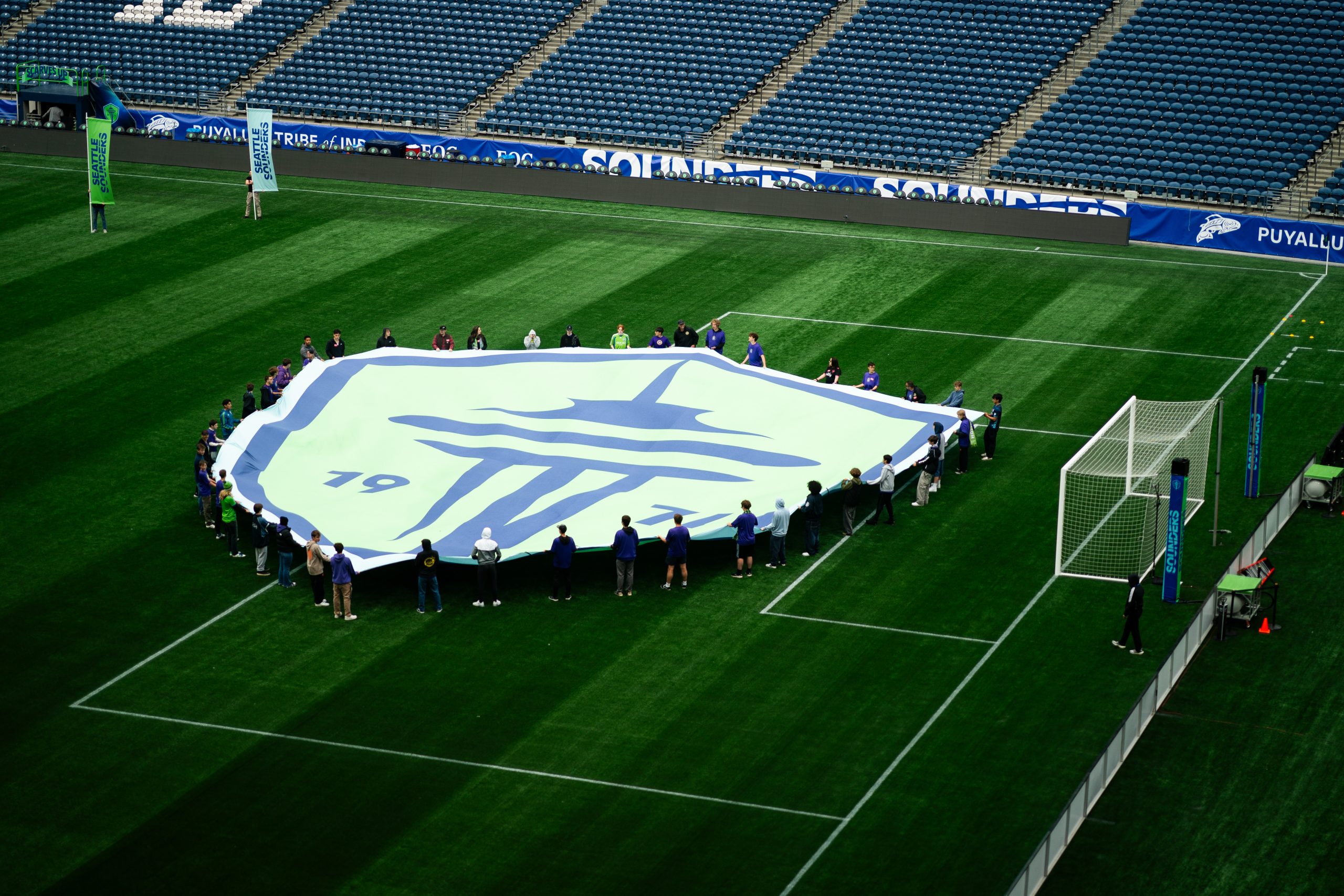
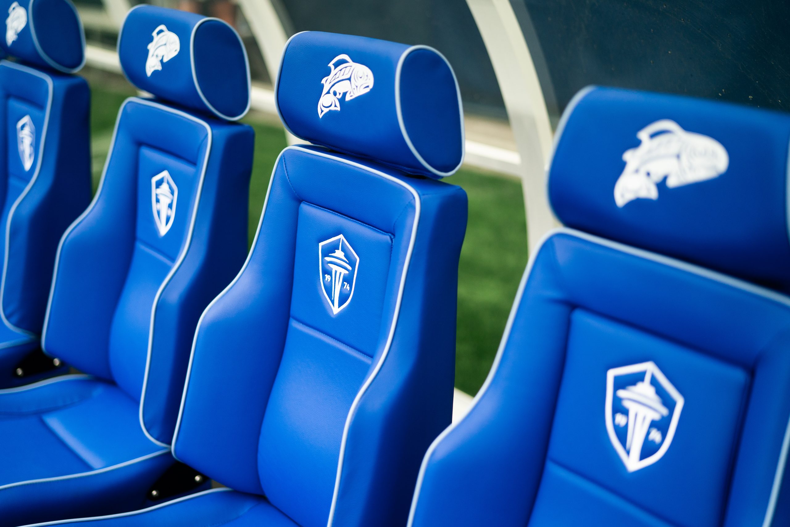
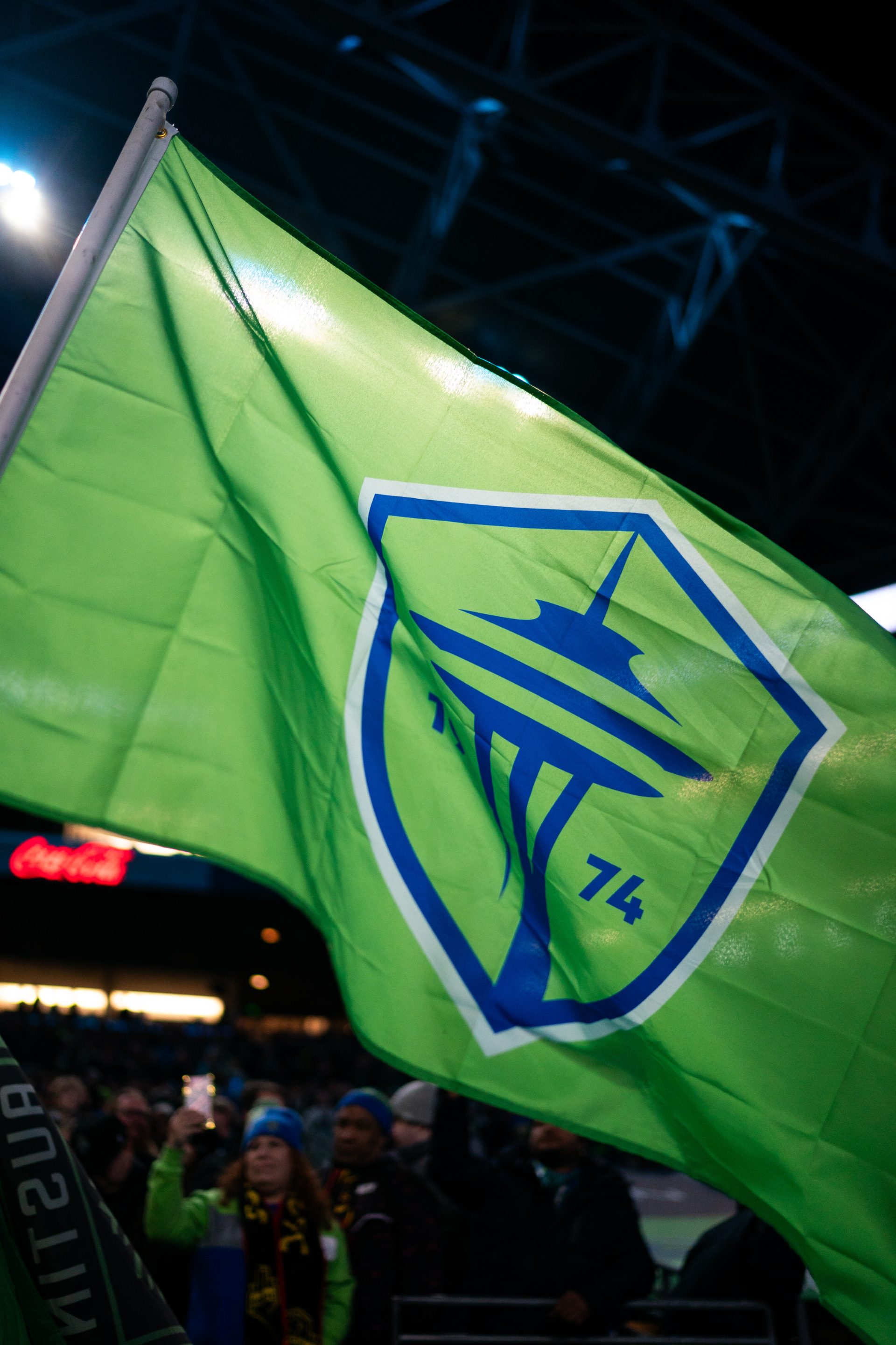
A thoughtful and streamlined evolution of the previous mark. At its core, the crest is decorated with a contemporary depiction of the city’s iconic Space Needle, flanked on each side by the club’s birth year. With the intention of standing triumphantly for the next 50 years, this mark’s posture is striking and powerful as it reflects the Sounders commitment to the city, its fans, the game, and to the world it inhabits.
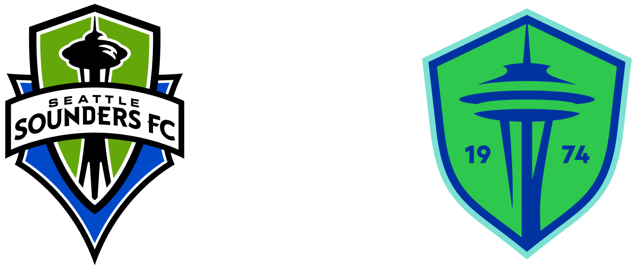
Creative Direction & Design: Column
Motion Design & Animation: Aren Williams
Animation: Margaret Bialis
Audio: Human Robot Soul


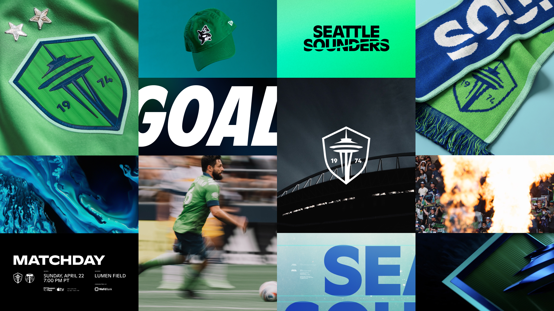
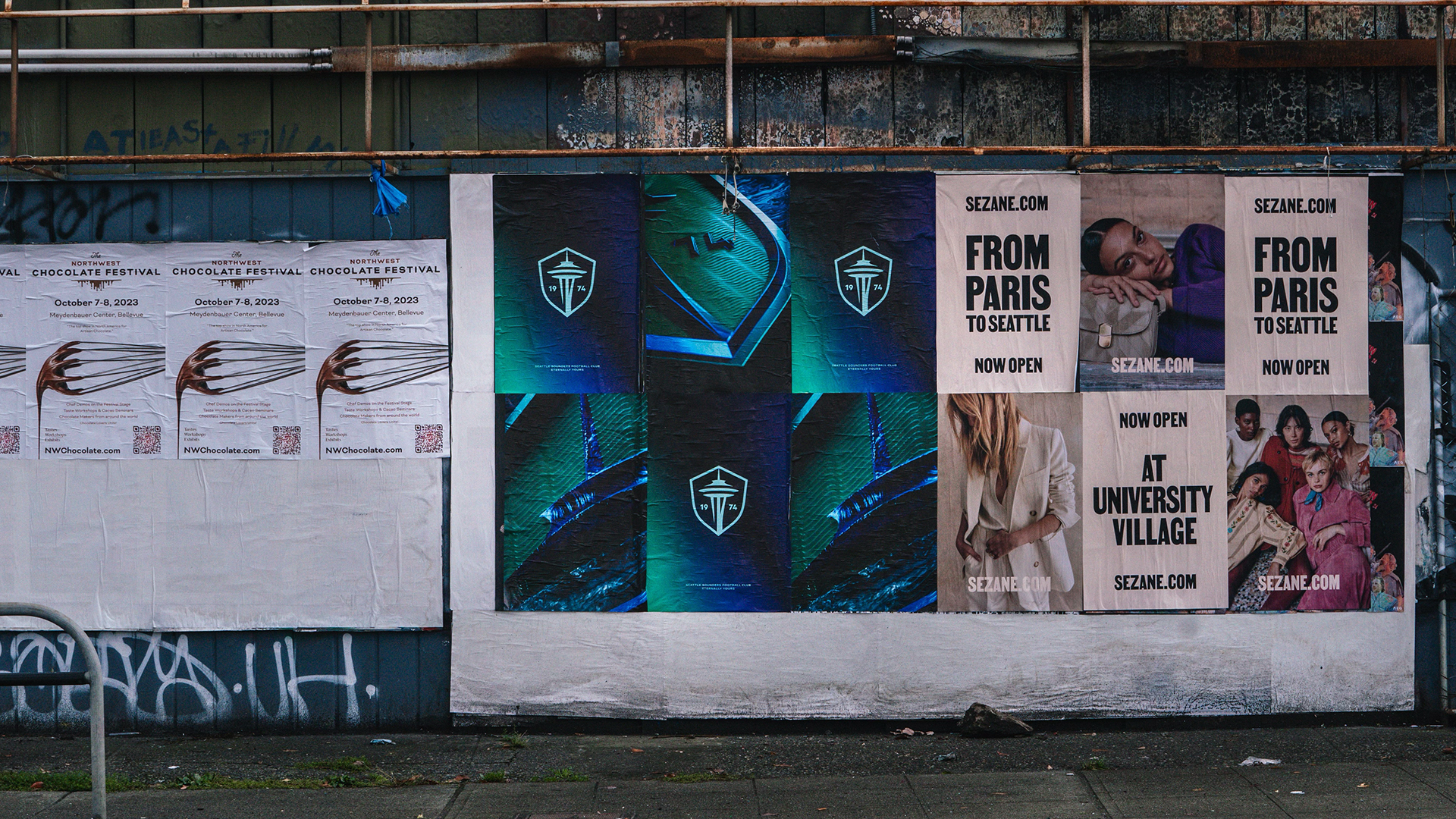


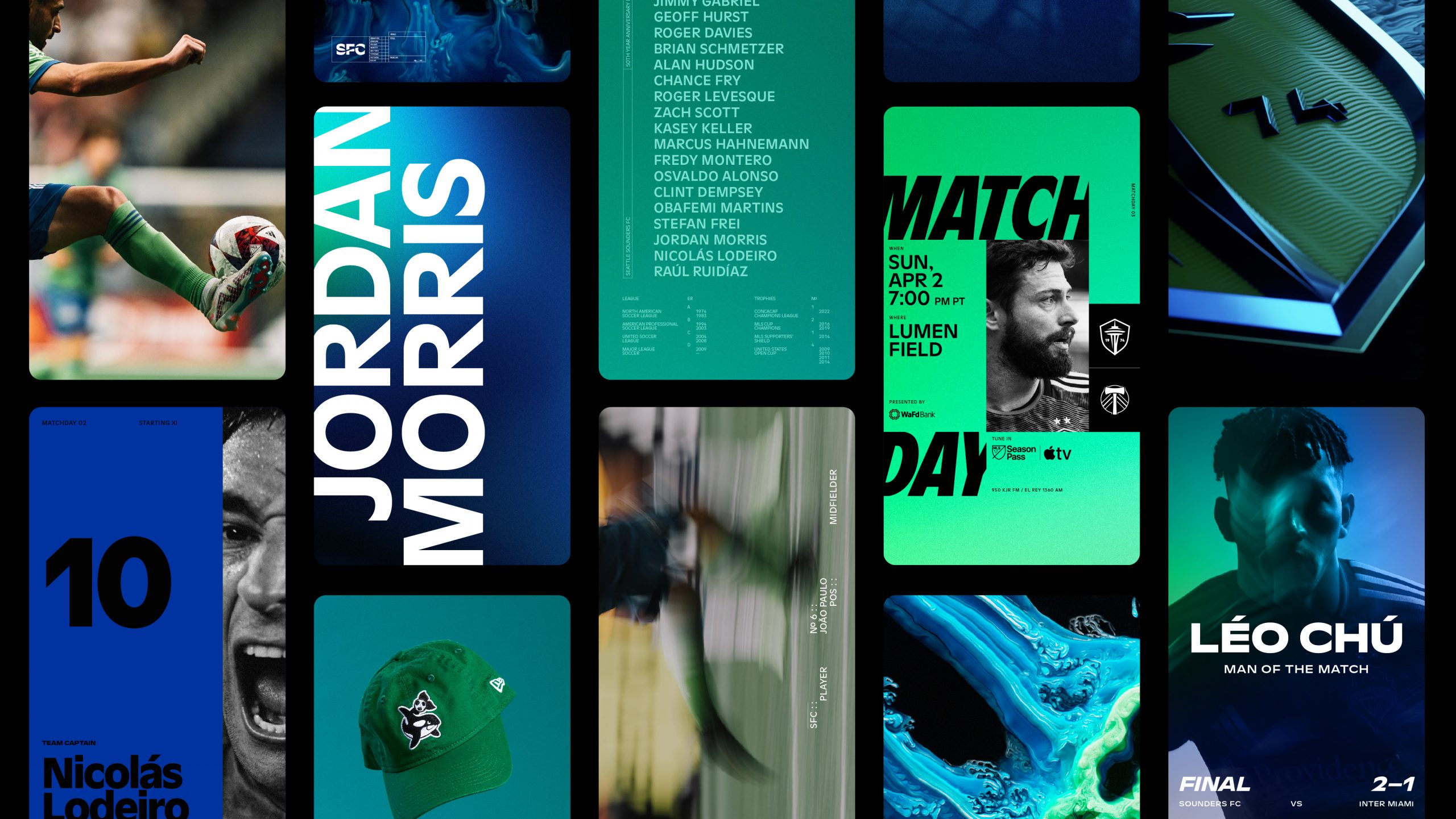
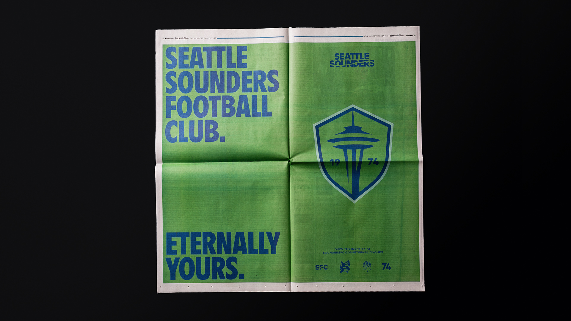
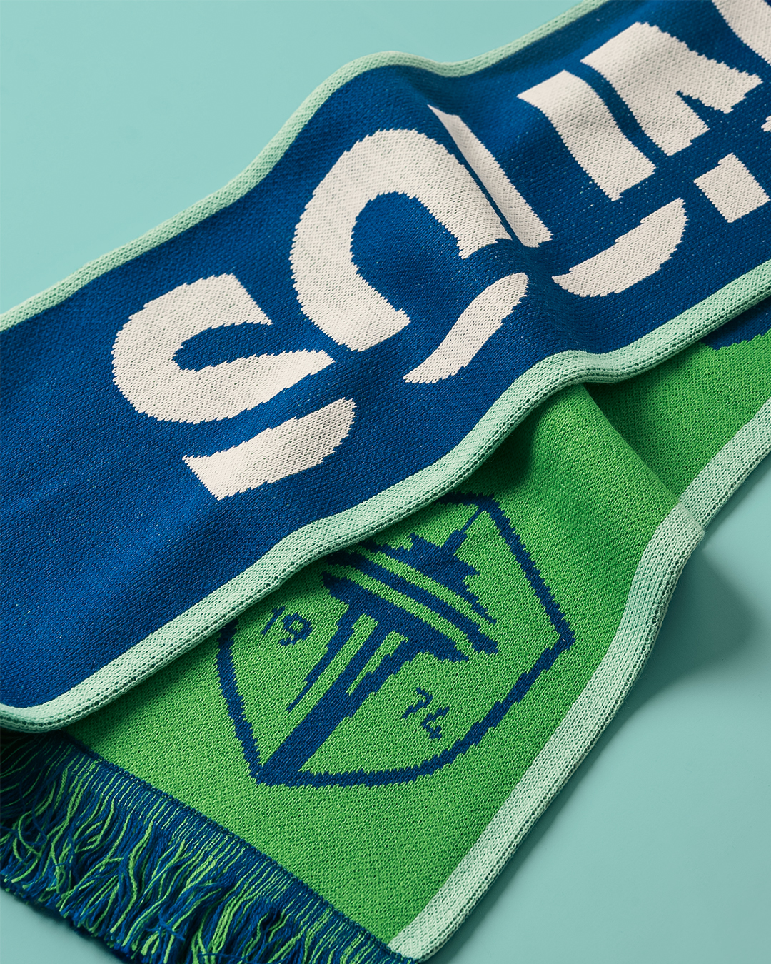
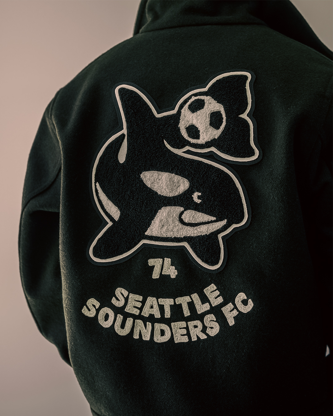
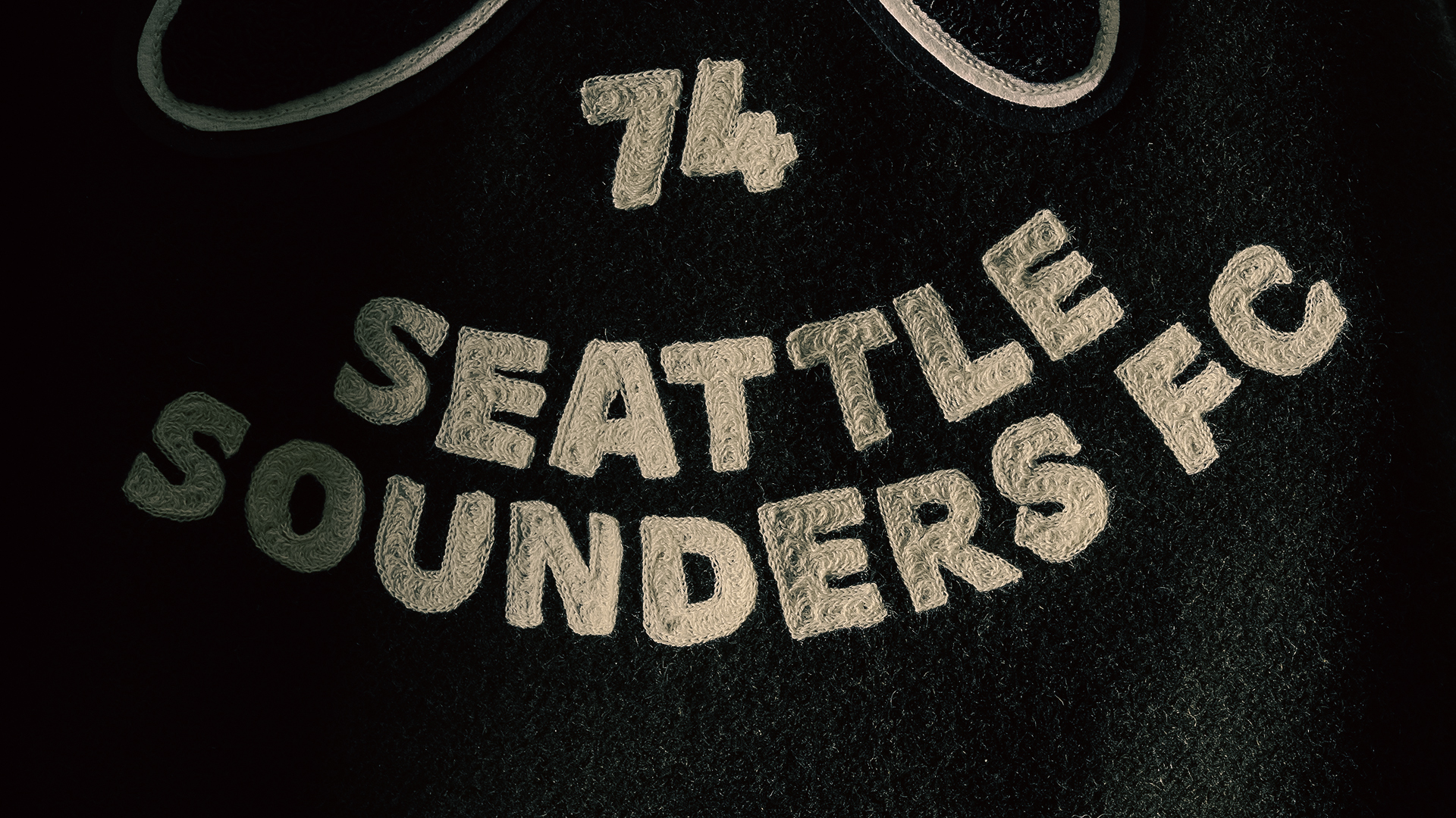

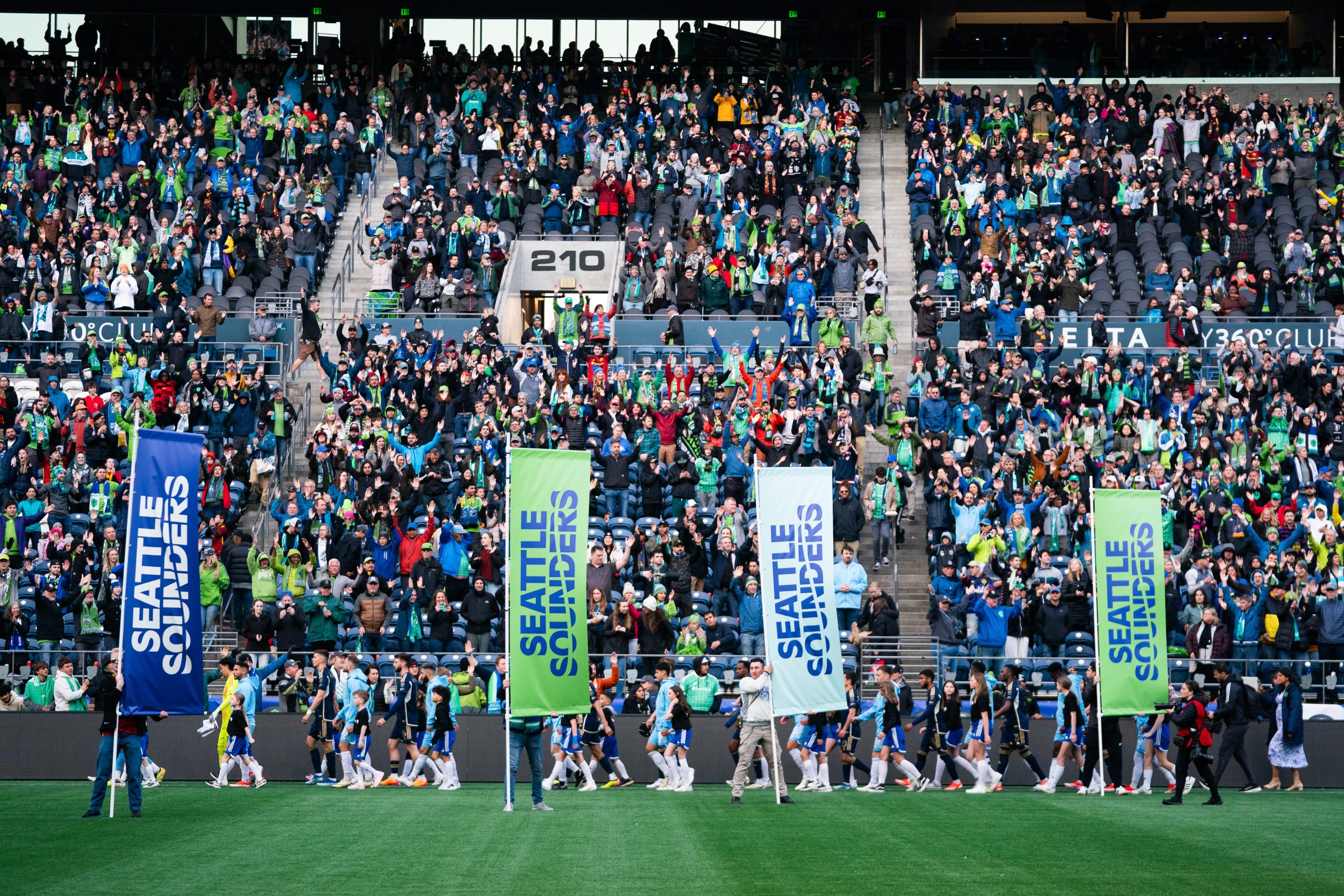
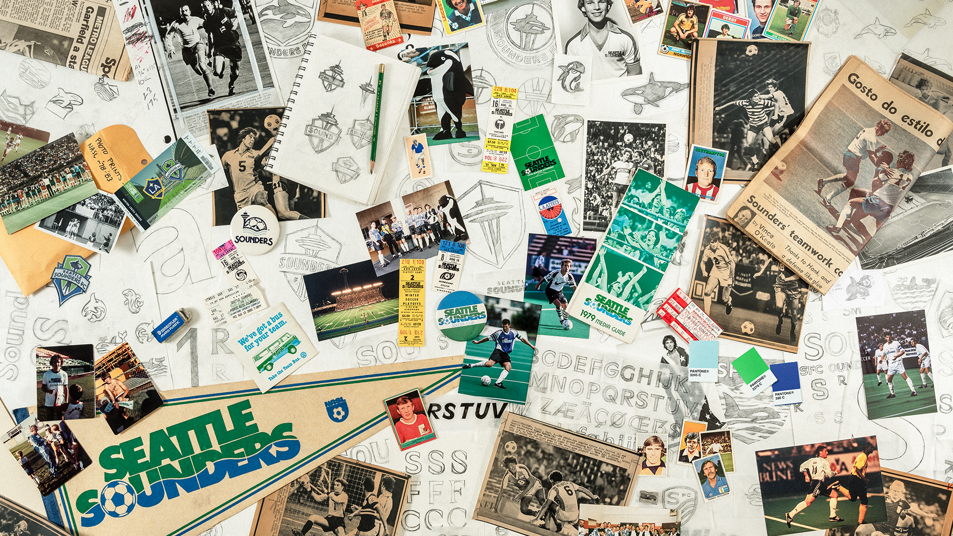
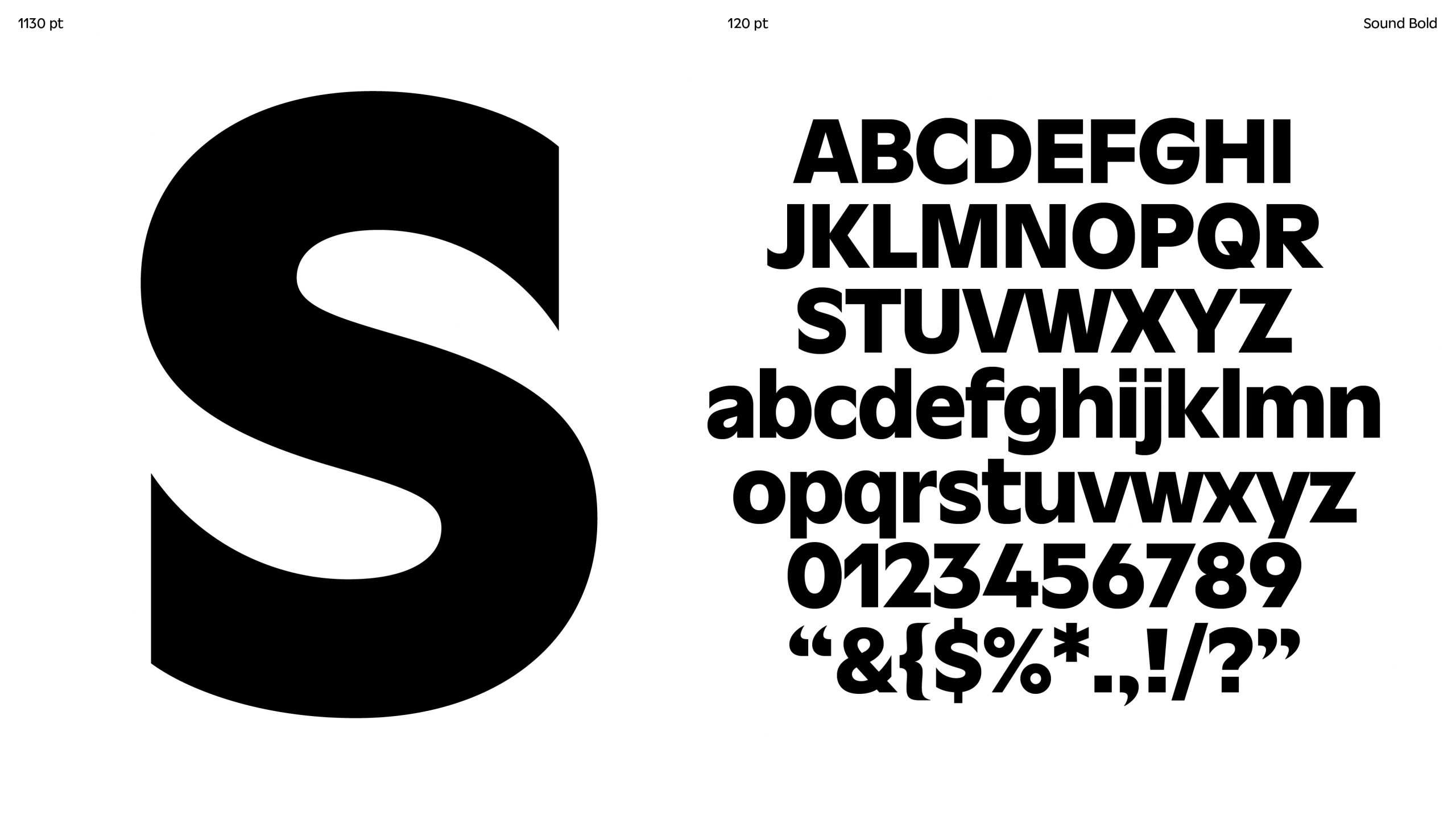
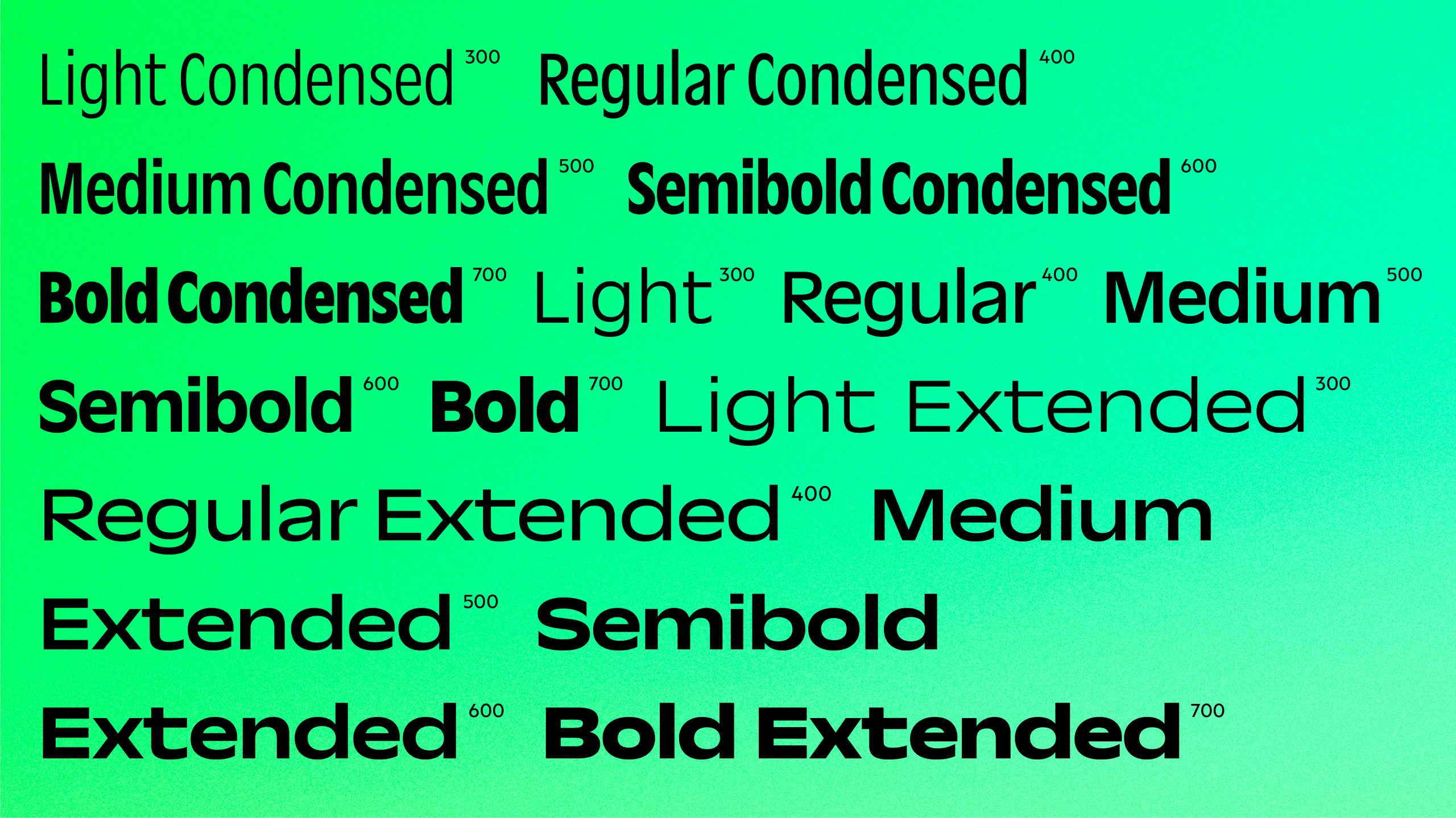
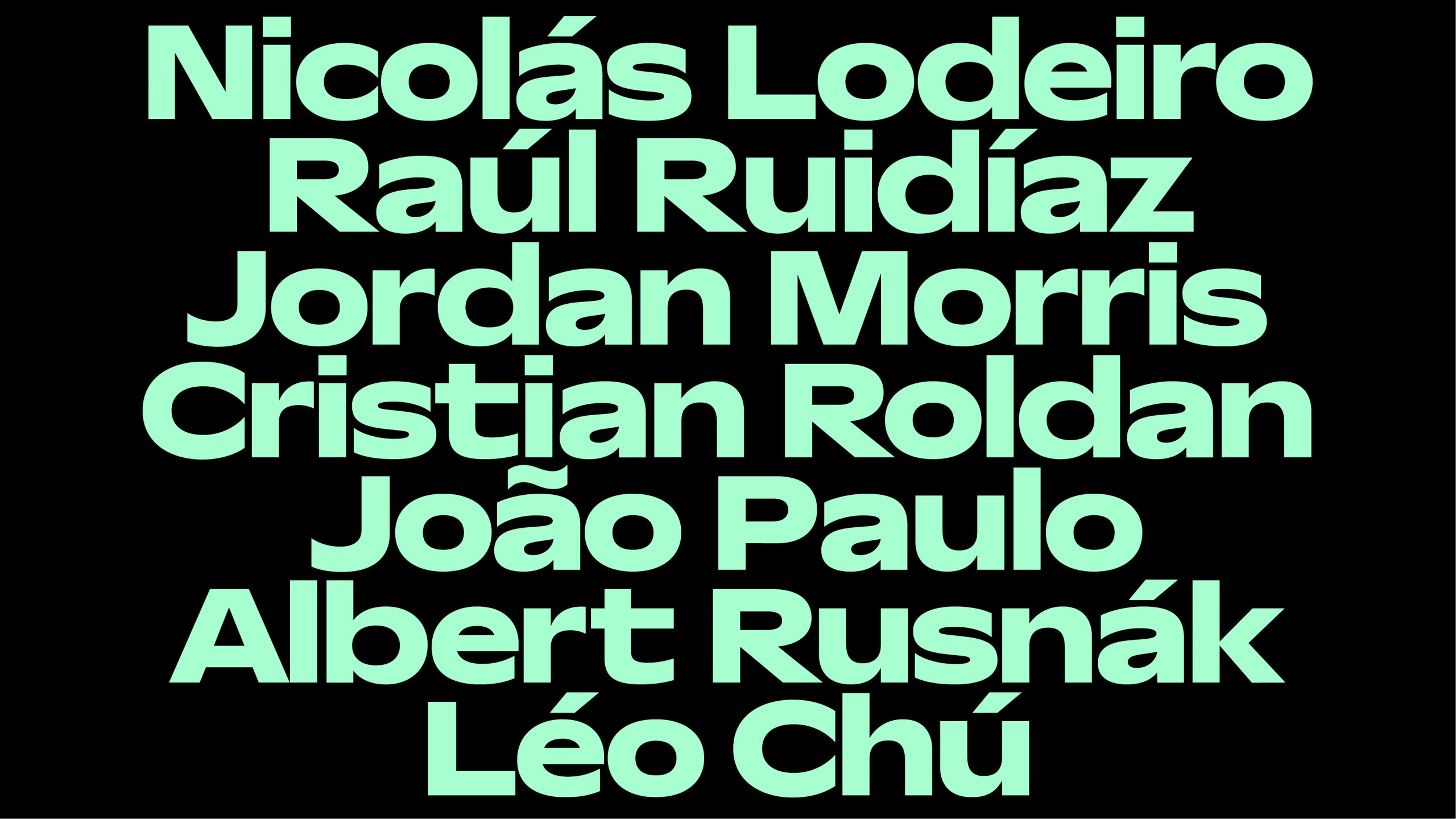
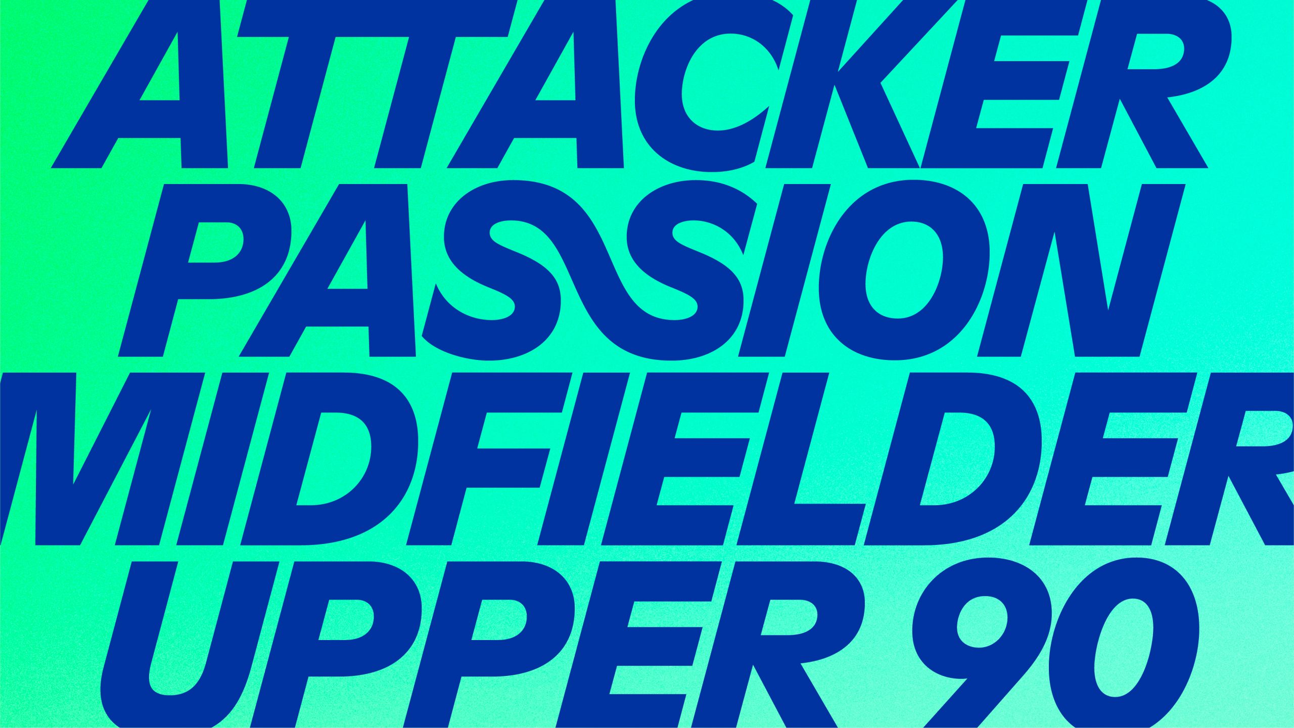
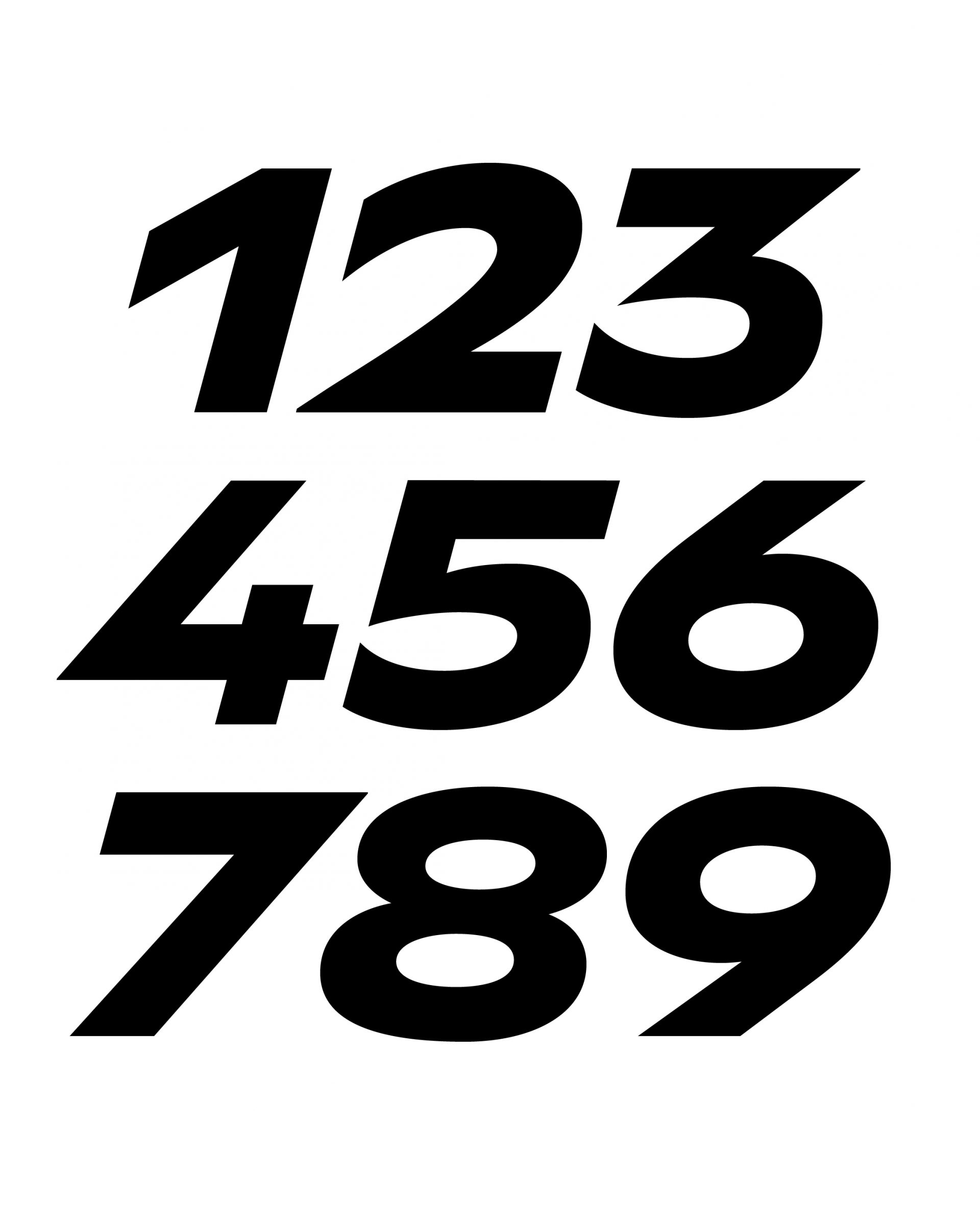
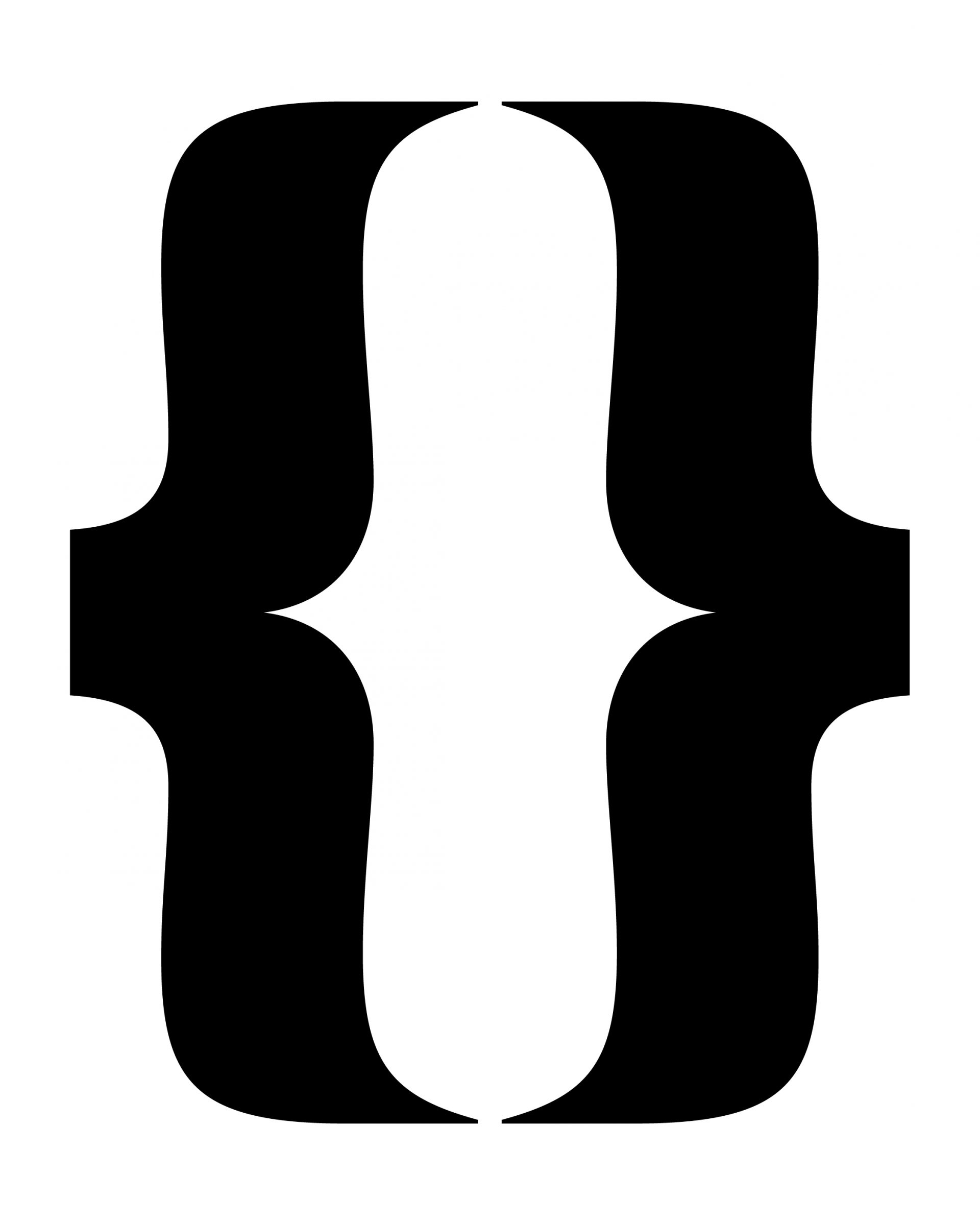
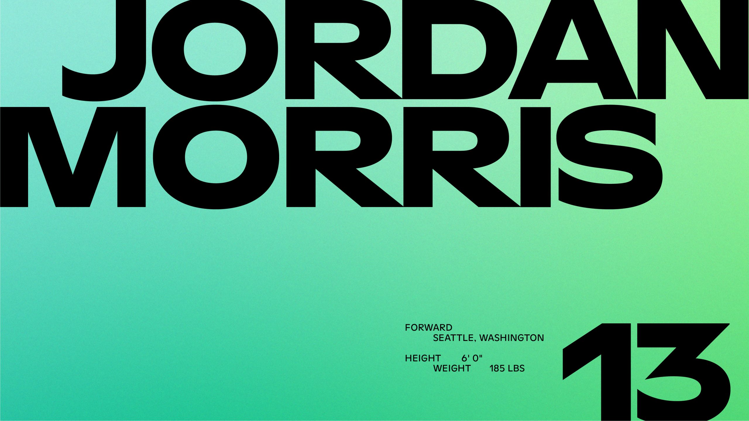
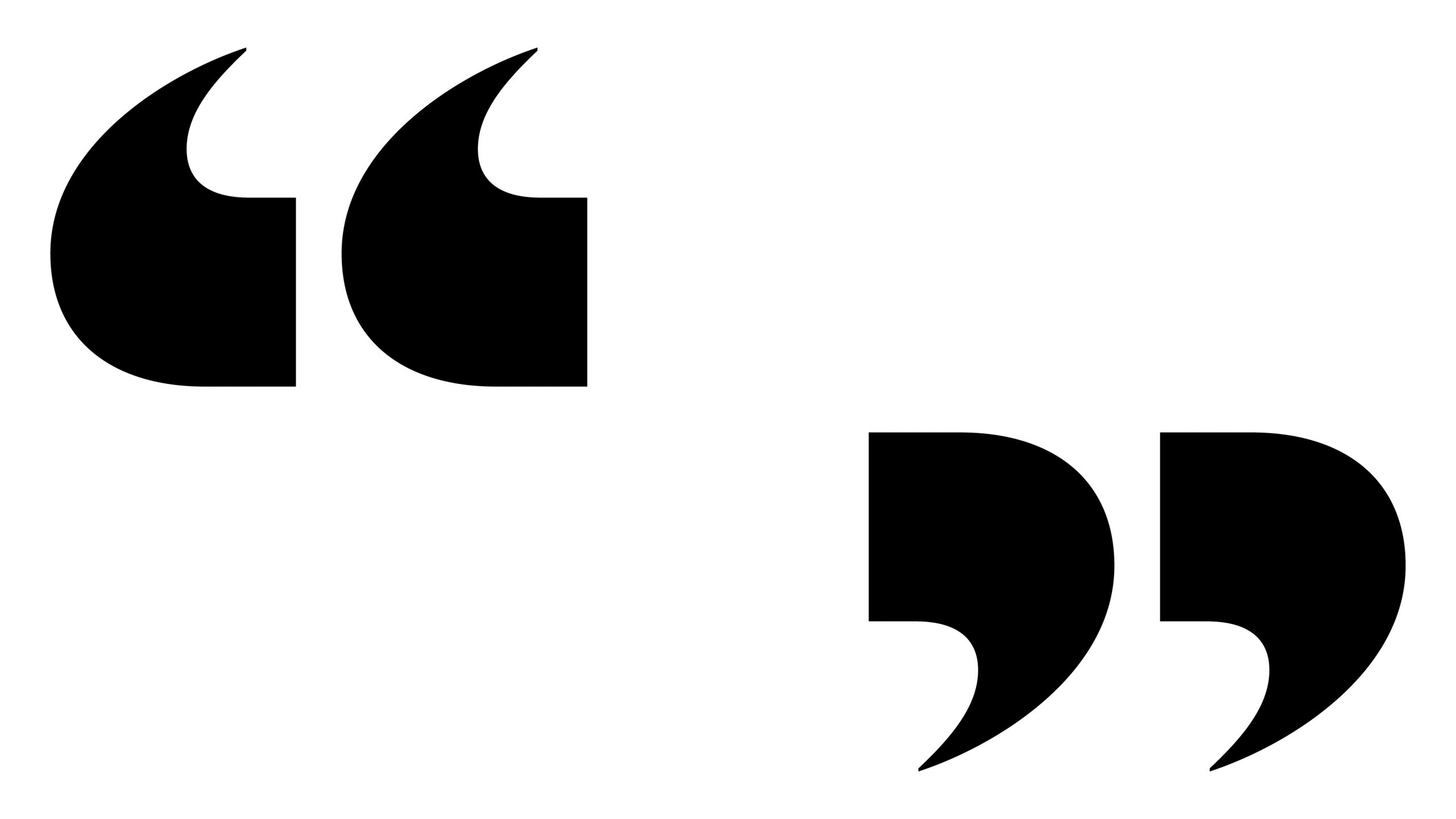
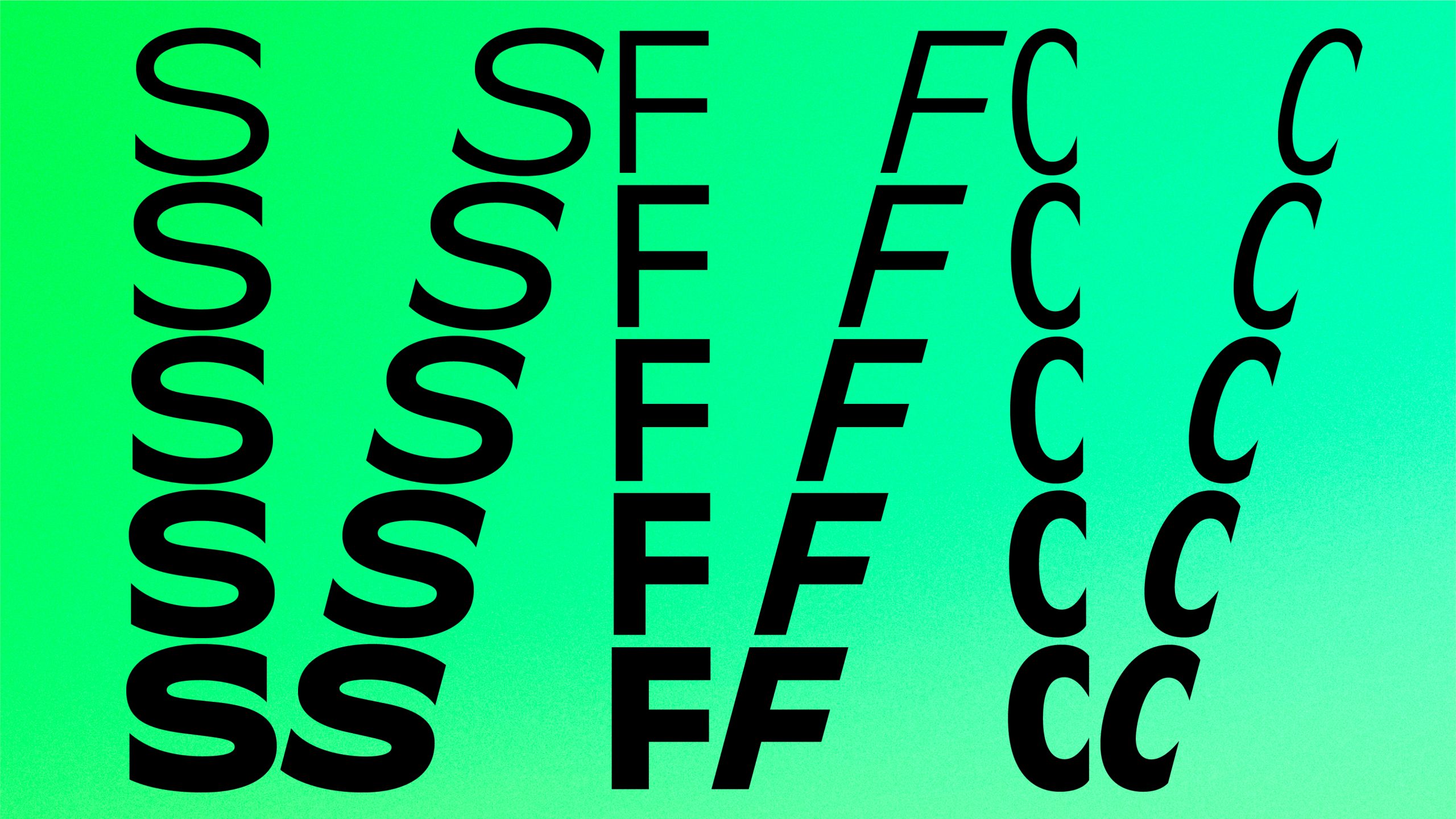
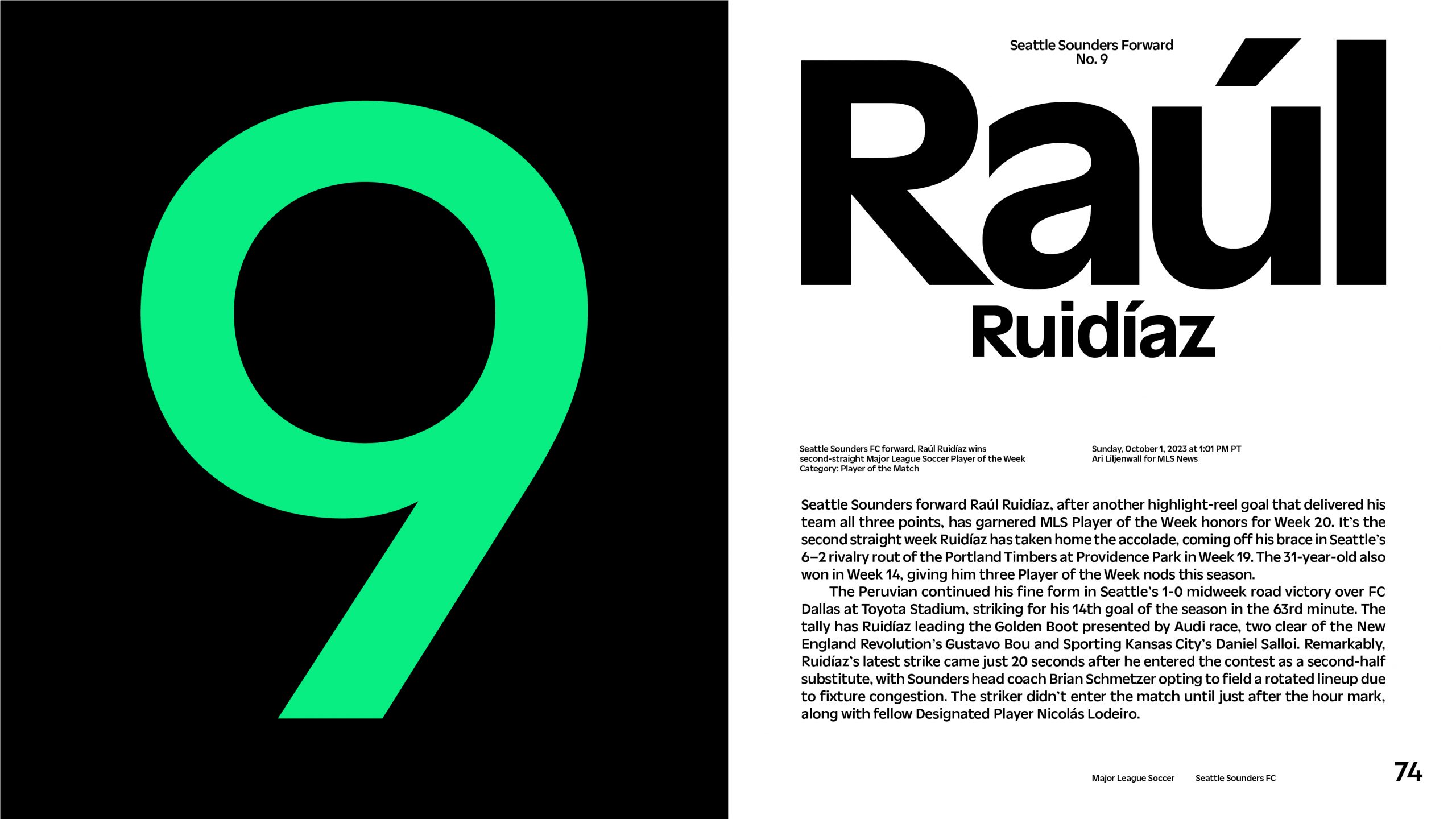
We developed a custom typeface at Column, called Sound—combining the idealism of geometric typefaces such as Futura with the pragmatism of the grotesque genre, while adding a touch of humanist influence. The Sound type family is a direct visual extension of the club’s identity system, based on the custom drawn letterforms in the new wordmark. During the design process, we took inspiration from historical club typography dating back to 1974, type on posters advertising Seattle World’s Fair in 1962—when the Space Needle was constructed to symbolize progress, as well as lettering found in Seattle’s shipyards and shorelines.
